2023-4-26 前端达人
目录
动画(animation)是CSS3中具有颠覆性的特征之一,可通过设置多个节点来精确控制一个或一组动画,常 用来实现复杂的动画效果。
相比较过渡,动画可以实现更多变化,更多控制,连续自动播放等效果。
制作动画分为两步: 1.先定义动画 2.再使用(调用)动画
1. 用keyframes 定义动画(类似定义类选择器)
@keyframes 动画名称 {
0%{
width:100px;
}
100%{
width:200px;
}
}
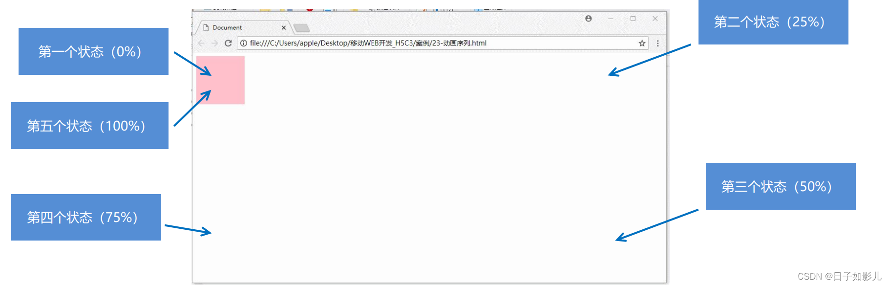
动画序列
0% 是动画的开始,100% 是动画的完成。这样的规则就是动画序列。
在 @keyframes 中规定某项 CSS 样式,就能创建由当前样式逐渐改为新样式的动画效果。
动画是使元素从一种样式逐渐变化为另一种样式的效果。您可以改变任意多的样式任意的次数。
请用百分比来规定变化发生的时间,或用关键词 "from" 和 "to",等同于 0% 和 100%。
2. 元素使用动画
div {
width: 200px;
height: 200px;
background-color: aqua;
margin: 100px auto; /* 调用动画 */
animation-name: 动画名称;
/* 持续时间 */ animation-duration: 持续时间; }
-
<!DOCTYPE html>
-
<html lang="en">
-
-
<head>
-
<meta charset="UTF-8">
-
<meta name="viewport" content="width=device-width, initial-scale=1.0">
-
<meta http-equiv="X-UA-Compatible" content="ie=edge">
-
<title>Document</title>
-
<style>
-
/* 我们想页面一打开,一个盒子就从左边走到右边 */
-
/* 1. 定义动画 */
-
-
@keyframes move {
-
/* 开始状态 */
-
0% {
-
transform: translateX(0px);
-
}
-
/* 结束状态 */
-
100% {
-
transform: translateX(1000px);
-
}
-
}
-
-
div {
-
width: 200px;
-
height: 200px;
-
background-color: pink;
-
/* 2. 调用动画 */
-
/* 动画名称 */
-
animation-name: move;
-
/* 持续时间 */
-
animation-duration: 2s;
-
}
-
</style>
-
</head>
-
-
<body>
-
<div></div>
-
</body>
-
-
</html>

-
<!DOCTYPE html>
-
<html lang="en">
-
-
<head>
-
<meta charset="UTF-8">
-
<meta name="viewport" content="width=device-width, initial-scale=1.0">
-
<meta http-equiv="X-UA-Compatible" content="ie=edge">
-
<title>Document</title>
-
<style>
-
/* from to 等价于 0% 和 100% */
-
/* @keyframes move {
-
from {
-
transform: translate(0, 0);
-
}
-
to {
-
transform: translate(1000px, 0);
-
}
-
} */
-
/* 动画序列 */
-
/* 1. 可以做多个状态的变化 keyframe 关键帧 */
-
/* 2. 里面的百分比要是整数 */
-
/* 3. 里面的百分比就是 总的时间(我们这个案例10s)的划分 25% * 10 = 2.5s */
-
-
@keyframes move {
-
0% {
-
transform: translate(0, 0);
-
}
-
25% {
-
transform: translate(1000px, 0)
-
}
-
50% {
-
transform: translate(1000px, 500px);
-
}
-
75% {
-
transform: translate(0, 500px);
-
}
-
100% {
-
transform: translate(0, 0);
-
}
-
}
-
-
div {
-
width: 100px;
-
height: 100px;
-
background-color: pink;
-
animation-name: move;
-
animation-duration: 10s;
-
}
-
</style>
-
</head>
-
-
<body>
-
<div>
-
-
</div>
-
</body>
-
-
</html>
-
<!DOCTYPE html>
-
<html lang="en">
-
-
<head>
-
<meta charset="UTF-8">
-
<meta name="viewport" content="width=device-width, initial-scale=1.0">
-
<meta http-equiv="X-UA-Compatible" content="ie=edge">
-
<title>Document</title>
-
<style>
-
@keyframes move {
-
0% {
-
transform: translate(0, 0);
-
}
-
100% {
-
transform: translate(1000px, 0);
-
}
-
}
-
-
div {
-
width: 100px;
-
height: 100px;
-
background-color: pink;
-
/* 动画名称 */
-
animation-name: move;
-
/* 持续时间 */
-
/* animation-duration: 2s; */
-
/* 运动曲线 */
-
/* animation-timing-function: ease; */
-
/* 何时开始 */
-
animation-delay: 1s;
-
/* 重复次数 iteration 重复的 conut 次数 infinite 无限 */
-
/* animation-iteration-count: infinite; */
-
/* 是否反方向播放 默认的是 normal 如果想要反方向 就写 alternate */
-
/* animation-direction: alternate; */
-
/* 动画结束后的状态 默认的是 backwards 回到起始状态 我们可以让他停留在结束状态 forwards */
-
/* animation-fill-mode: forwards; */
-
/* animation: name duration timing-function delay iteration-count direction fill-mode; */
-
/* animation: move 2s linear 0s 1 alternate forwards; */
-
/* 前面2个属性 name duration 一定要写 */
-
/* animation: move 2s linear alternate forwards; */
-
}
-
-
div:hover {
-
/* 鼠标经过div 让这个div 停止动画,鼠标离开就继续动画 */
-
animation-play-state: paused;
-
}
-
</style>
-
</head>
-
-
<body>
-
<div>
-
-
</div>
-
</body>
-
-
</html>
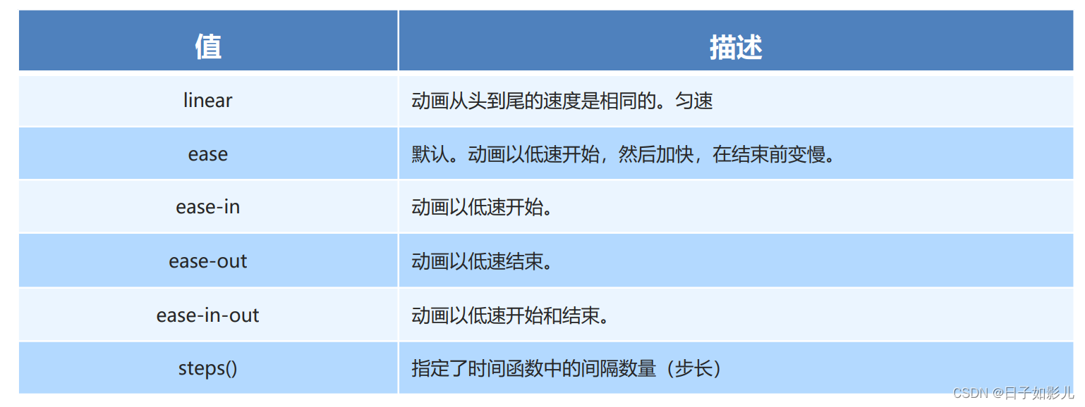
linear 匀速
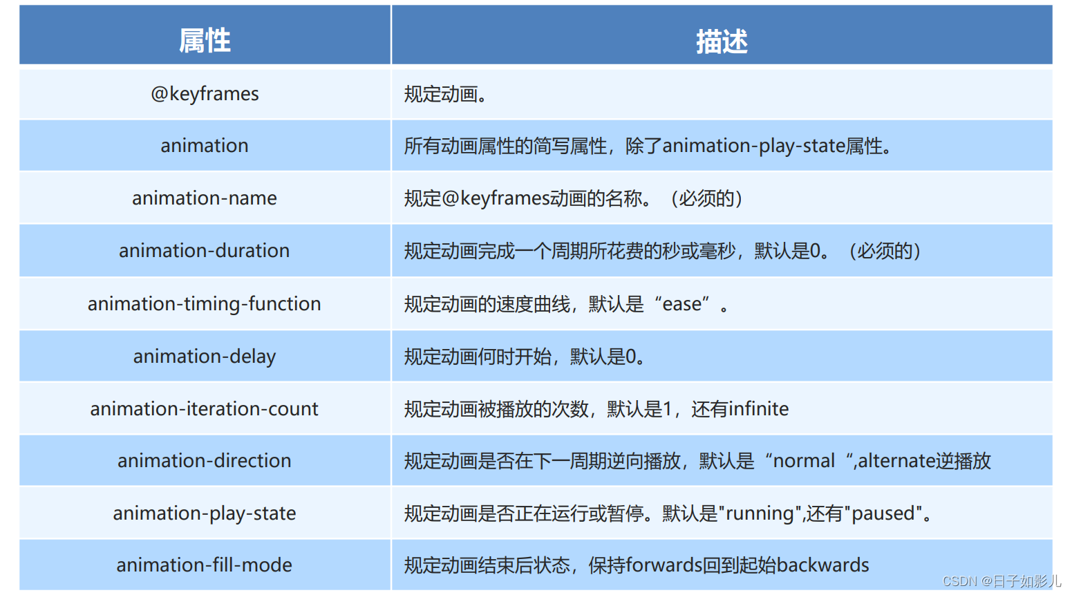
animation:动画名称 持续时间 运动曲线 何时开始 播放次数 是否反方向 动画起始或者结束的状态
animation: myfirst 5s linear 2s infinite alternate;
简写属性里面不包含 animation-play-state
暂停动画:animation-play-state: puased; 经常和鼠标经过等其他配合使用
想要动画走回来 ,而不是直接跳回来:animation-direction : alternate
盒子动画结束后,停在结束位置: animation-fill-mode : forwards
还没听。。
animation-timing-function:规定动画的速度曲线,默认是“ease“
-
<!DOCTYPE html>
-
<html lang="en">
-
-
<head>
-
<meta charset="UTF-8">
-
<meta name="viewport" content="width=device-width, initial-scale=1.0">
-
<meta http-equiv="X-UA-Compatible" content="ie=edge">
-
<title>Document</title>
-
<style>
-
div {
-
overflow: hidden;
-
font-size: 20px;
-
width: 0;
-
height: 30px;
-
background-color: pink;
-
/* 让我们的文字强制一行内显示 */
-
white-space: nowrap;
-
/* steps 就是分几步来完成我们的动画 有了steps 就不要在写 ease 或者linear 了 */
-
animation: w 4s steps(10) forwards;
-
}
-
-
@keyframes w {
-
0% {
-
width: 0;
-
}
-
100% {
-
width: 200px;
-
}
-
}
-
</style>
-
</head>
-
-
<body>
-
<div>世纪佳缘我在这里等你</div>
-
</body>
-
-
</html>
蓝蓝设计建立了UI设计分享群,每天会分享国内外的一些优秀设计,如果有兴趣的话,可以进入一起成长学习,请加微信ban_lanlan,报下信息,蓝小助会请您入群。欢迎您加入噢~~ 希望得到建议咨询、商务合作,也请与我们联系01063334945。 分享此文一切功德,皆悉回向给文章原作者及众读者. 免责声明:蓝蓝设计尊重原作者,文章的版权归原作者。如涉及版权问题,请及时与我们取得联系,我们立即更正或删除。 蓝蓝设计( www.lanlanwork.com )是一家专注而深入的界面设计公司,为期望卓越的国内外企业提供卓越的UI界面设计、BS界面设计 、 cs界面设计 、 ipad界面设计 、 包装设计 、 图标定制 、 用户体验 、交互设计、 网站建设 、平面设计服务、UI设计公司、界面设计公司、UI设计服务公司、数据可视化设计公司、UI交互设计公司、高端网站设计公司、UI咨询、用户体验公司、软件界面设计公司。
您可以选择一种方式赞助本站
支付宝转账赞助

蓝蓝 http://www.lanlanwork.com