2023-4-26 前端达人
一、CSS3 2D变形(利用Transfrom方法)
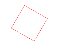
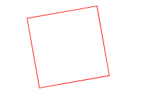
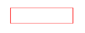
1、rotate(angle)
元素顺时针旋转给定的角度。允许负值,元素将逆时针旋转。
<!DOCTYPE html>
<html lang="en">
<head>
    <meta charset="UTF-8">
    <title>Title</title>
</head>
<style>
    div{
        width: 100px;
        height: 100px;
        border: 1px solid red;
        transform: rotate(30deg) ;
        margin: 200px auto;
    }
</style>
<body>
    <div>

    </div>
</body>
</html>
效果如图
如果当rotate里面的值为负数时,比如ratate(-10deg),效果如图:
2、 translate(x,y)方法
通过 translate() 方法,元素从其当前位置移动,根据给定的 left(x 坐标) 和 top(y 坐标) 位置参数。也就是相对于页面左部和顶部的距离
<!DOCTYPE html>
<html lang="en">
<head>
    <meta charset="UTF-8">
    <title>Title</title>
</head>
<style>
    div {
        width: 100px;
        height: 100px;
        border: 1px solid red;
        transform: translate(20px, 20px);
    }

</style>
<body>

    <div></div>
</body>
</html>
效果如下
初次之外还有其他的参数
transform: translate(200px);
如果只带一个参数,这个参数代表的是x方向位移值,y方向位移为0
transform: translateX(200px);
对X方向移动
transform: translateY(200px);
对Y方向移动
3、scale() 方法
通过 scale() 方法,元素的尺寸会增加或减少,根据给定的宽度(X 轴)和高度(Y 轴)参数
<!DOCTYPE html>
<html lang="en">
<head>
    <meta charset="UTF-8">
    <title>Title</title>
</head>
<style>
    div {
        width: 100px;
        height: 100px;
        border: 1px solid red;
        transform: scale(2,0.5);
        margin: 20px auto;
    }

</style>
<body>

    <div></div>
</body>
</html>
效果如图
可以看到,长边变为了原来的两倍,宽边变为了原来的0.5倍
transform: scale(1.5);x轴和y轴都放大1.5倍
transform: scaleX(1.5);x轴放大1.5倍
transform: scaleY(1.5);y轴放大1.5倍
transform-origin: left top;改变中心点位置为左上角,当然还可以自由搭配,右下(right bottom),右上(right top)
4、 skew() 方法
通过 skew() 方法,元素翻转给定的角度,根据给定的水平线(X 轴)和垂直线(Y 轴)参数。
<!DOCTYPE html>
<html lang="en">
<head>
    <meta charset="UTF-8">
    <title>Title</title>
</head>
<style>
    div {
        width: 100px;
        height: 100px;
        border: 1px solid red;
        transform: skew(30deg,30deg);
        margin: 200px auto;
    }

</style>
<body>

    <div></div>
</body>
</html>
效果如图
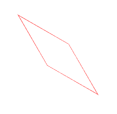
意思就是:围绕 X 轴把元素翻转 30 度,围绕 Y 轴翻转 30 度。可能看起来比较抽象
transform: skew(230deg);如果只带一个参数,只有x轴方向的扭曲
transform: skewX(230deg); 对X轴进行翻转
transform: skewY(230deg); 对Y轴进行翻转
其实还是很好理解的,比如两个图叠加在一起
<!DOCTYPE html>
<html lang="en">
<head>
    <meta charset="UTF-8">
    <title>Title</title>
</head>
<style>
    .demo{
        width: 200px;
        height: 200px;
        margin: 200px auto;
        border: 1px solid #000;
    }

    .box{
        width: 200px;
        height: 200px;
        border: 1px solid red;
        transform: skew(5deg,0deg);
    }

</style>
<body>
<div class="demo">
    <div class="box"></div>
</div>

</body>
</html>
可以看到,所谓的X轴翻转,其实就是x方向的移动,上面的线向左移动5px,下面的线向右移动5px,加入Y也一样
比如:transform: skew(0deg,5deg);
左边的线向上移动5px,右边的线向下移动5px,同时改变时 transform: skew(5deg,5deg);
最好记的方式就是对角线的同时移动,左上右下是排斥,左下右上是吸引
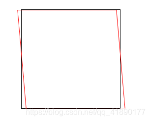
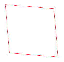
5、matrix() 方法
matrix() 方法把所有 2D 转换方法组合在一起。
matrix() 方法需要六个参数,包含数学函数,允许您:旋转、缩放、移动以及倾斜元素。
如题:将div右移100px,下移200px,旋转30度,x轴缩放1.5倍,y轴缩放2倍。
(1)transform: translate(100px, 200px) rotate(30deg) scale(1.5, 2);
(2)transform: matrix(1.299, 0.75, -1, 1.732, 100, 200)
计算方法
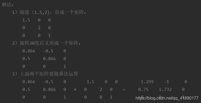
效果如图
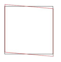
6、transform-origin 属性
允许你改变被转换元素的位置
语法: transform-origin: x-axis y-axis z-axis;
属性值:
x-axis :定义视图被置于 X 轴的何处。可能的值:left,center,right,length,%。
y-axis :定义视图被置于 Y 轴的何处。可能的值:top,center,bottom,length,%。
z-axis :定义视图被置于 Z 轴的何处。可能的值:length。
<!DOCTYPE html>
<html lang="en">
<head>
    <meta charset="UTF-8">
    <title>transform-origin</title>
    <style>
        *{
            margin: 0;
            padding: 0;
        }
        .demo{
            width: 200px;
            height: 200px;
            margin: 200px auto;
            border: 1px solid #000;
        }
        .box{
            width: 200px;
            height: 200px;
            background-color: #f00;
            transform: rotate(60deg);
            transform-origin: right bottom;
        }
    </style>
</head>
<body>
<div class="demo">
    <div class="box"></div>
</div>
</body>
</html>
效果如图

形象的来说,就是规定你从哪个角开始旋转,比如规定右下角旋转,则图形以右下角为旋转角,顺时针旋转60°
二、CSS3 3D变形
1、perspective属性
perspective 属性定义 3D 元素距视图的距离,以像素计。该属性允许您改变 3D 元素查看 3D 元素的视图。
当为元素定义 perspective 属性时,其子元素会获得透视效果,而不是元素本身。
注释:perspective 属性只影响 3D 转换元素。
语法: perspective: number|none;
属性值:
number :元素距离视图的距离,以像素计。
none :默认值。与 0 相同。不设置透视
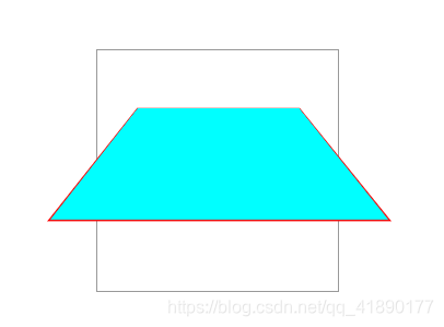
<!DOCTYPE html>
<html lang="en">
<head>
    <meta charset="UTF-8">
    <title>perspective</title>
    <style>
        .father{
            position: relative;
            width: 200px;
            height: 200px;
            padding: 10px;
            margin: 200px auto;
            border: 1px solid #999;
            perspective: 150px;
        }
        .son{
            width: 100px;
            height: 50px;
            padding: 50px;
            position: absolute;
            border: 1px solid #f00;
            background-color: #0ff;
            transform: rotateX(45deg);
        }
    </style>
</head>
<body>
<div class="father">
    <div class="son"></div>
</div>
</body>
</html>
效果如图
2、trasform-style属性
transform-style 属性规定如何在 3D 空间中呈现被嵌套的元素。
注释:该属性必须与 transform 属性一同使用。
语法: transform-style: flat|preserve-3d;
属性值:
flat :子元素将不保留其 3D 位置。
preserve-3d :子元素将保留其 3D 位置。
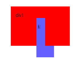
<!DOCTYPE html>
<html lang="en">
<head>
    <meta charset="UTF-8">
    <title>transform-style</title>
    <style>
        .wrapper{
            width: 200px;
            height: 100px;
            margin: 200px auto;
        }
        .div1,.div2{
            width: 200px;
            height: 100px;
            padding: 20px;
        }
        .div1{
            background-color: #f00;
            transform: rotateY(30deg);
            transform-style: preserve-3d;

        }
        .div2{
            background-color: #655fff;
            transform: rotateY(45deg);
        }
    </style>
</head>
<body>
<div class="wrapper">
    <div class="div1">div1
        <div class="div2">div2</div>
    </div>
</div>
</body>
</html>
效果如图
3、CSS3过渡
transition 属性是一个简写属性,用于设置四个过渡属性:
transition-property:规定设置过渡效果的 CSS 属性的名称。
transition-duration:规定完成过渡效果需要多少秒或毫秒。
transition-timing-function:规定速度效果的速度曲线。
transition-delay:定义过渡效果何时开始。
注释:请始终设置 transition-duration 属性,否则时长为 0,就不会产生过渡效果。
语法: transition: property duration timing-function delay;
<!DOCTYPE html>
<html lang="en">
<head>
    <meta charset="UTF-8">
    <title>transition过渡动画</title>
    <style>
        .box{
            width: 100%;
            height: 300px;
            position: relative;
            border: 1px solid #eee;
        }
        .demo{
            width: 100px;
            height: 100px;
            background-color: #f00;
            position: absolute;
            left: 100px;
            top: 100px;
            transform: rotate(0deg);
            transition-property: all;
            transition-duration: .8s;
        }
        .box:hover .demo{
            left: 500px;
            width: 300px;
            transform: rotate(45deg);
        }
    </style>
</head>
<body>
<div class="box">
    <div class="demo"></div>
</div>
</body>
</html>
或者
<!DOCTYPE html>
<html lang="en">
<head>
    <meta charset="UTF-8">
    <title>transition过渡动画</title>
    <style>
        .box{
            width: 100%;
            height: 300px;
            position: relative;
            border: 1px solid #eee;
        }
        .demo{
            width: 100px;
            height: 100px;
            background-color: #f00;
            position: absolute;
            left: 100px;
            top: 100px;
            transform: rotate(0deg);
            transition: left 2s ease 500ms, width 5s ease-in-out;
        }
        .box:hover .demo{
            left: 500px;
            width: 300px;
            transform: rotate(45deg);
        }
    </style>
</head>
<body>
<div class="box">
    <div class="demo"></div>
</div>
</body>
</html>
可以自行实验一下
4、CSS3动画
使用@keyframes
通过 @keyframes 规则,您能够创建动画。
创建动画的原理是,将一套 CSS 样式逐渐变化为另一套样式。
在动画过程中,您能够多次改变这套 CSS 样式。
以百分比来规定改变发生的时间,或者通过关键词 “from” 和 “to”,等价于 0% 和 100%。
0% 是动画的开始时间,100% 动画的结束时间。
为了获得最佳的浏览器支持,您应该始终定义 0% 和 100% 选择器。
<!DOCTYPE html>
<html lang="en">
<head>
    <meta charset="UTF-8">
    <title>关键帧动画</title>
    <style>
        .box{
            width: 100%;
            height: 800px;
            position: relative;
        }
        .demo{
            width: 100px;
            height: 100px;
            background-color: #ff0000;
            -webkit-border-radius: 50%;
            -moz-border-radius: 50%;
            border-radius: 50%;
            position: absolute;
            /*animation: move 5s ease-in-out infinite alternate ;*/
            -webkit-animation: move 5s ease-in-out 500ms 2 alternate ;
            -moz-animation: move 5s ease-in-out 500ms 2 alternate ;
            -ms-animation: move 5s ease-in-out 500ms 2 alternate ;
            -o-animation: move 5s ease-in-out 500ms 2 alternate ;
            animation: move 5s ease-in-out 500ms 2 alternate ;
        }
        @keyframes move {
            0%{
                left: 100px;
            }
            45%{
                left: 200px;
                top: 100px;
                background-color: #00f;
            }
            75%{
                left: 400px;
                top: 300px;
                background-color: #64ff77;
            }
            100%{
                left: 500px;
                top: 500px;
                background-color: #ff4975;
            }
        }
    </style>
</head>
<body>
<div class="box">
    <div class="demo"></div>
</div>
</body>
</html>
或者
<!DOCTYPE html>
<html lang="en">
<head>
    <meta charset="UTF-8">
    <title>关键帧动画</title>
    <style>
        .box{
            width: 100%;
            height: 800px;
            position: relative;
        }
        .demo{
            width: 100px;
            height: 100px;
            background-color: #ff0000;
            -webkit-border-radius: 50%;
            -moz-border-radius: 50%;
            border-radius: 50%;
            position: absolute;
            /*animation: move 5s ease-in-out infinite alternate ;*/
            -webkit-animation: move 5s ease-in-out 500ms 2 alternate ;
            -moz-animation: move 5s ease-in-out 500ms 2 alternate ;
            -ms-animation: move 5s ease-in-out 500ms 2 alternate ;
            -o-animation: move 5s ease-in-out 500ms 2 alternate ;
            animation: move 5s ease-in-out 500ms 2 alternate ;
        }
        @keyframes move {
           from{
                left: 100px;
            }
            to{
                left: 500px;
                background-color: #00f;
            }
        }

    </style>
</head>
<body>
<div class="box">
    <div class="demo"></div>
</div>
</body>
</html>
animation:move 5s ease-in-out 500ms 2 alternate
move:表示animation-name ,动画名称
5s:表示animation-duration,时长
ease-in-out:表示animation-timing-function 规定动画的速度曲线
(
除此以外还有:
linear:动画从头到尾的速度是相同的。
ease:默认。动画以低速开始,然后加快,在结束前变慢。
ease-in:动画以低速开始。
ease-out:动画以低速结束。
ease-in-out:动画以低速开始和结束。
)
500ms:表示animation-delay,规定在动画开始之前的延迟。
2 :表示animation-iteration-count,规定动画应该播放的次数。
alternate:表示animation-direction,规定是否应该轮流反向播放动画,如果 animation-direction 值是 “alternate”,则动画会在奇数次数(1、3、5 等等)正常播放,而在偶数次数(2、4、6 等等)向后播放。。
蓝蓝设计建立了UI设计分享群,每天会分享国内外的一些优秀设计,如果有兴趣的话,可以进入一起成长学习,请加微信ban_lanlan,报下信息,蓝小助会请您入群。欢迎您加入噢~~
希望得到建议咨询、商务合作,也请与我们联系01063334945。
分享此文一切功德,皆悉回向给文章原作者及众读者. 免责声明:蓝蓝设计尊重原作者,文章的版权归原作者。如涉及版权问题,请及时与我们取得联系,我们立即更正或删除。
蓝蓝设计( www.lanlanwork.com )是一家专注而深入的界面设计公司,为期望卓越的国内外企业提供卓越的UI界面设计、BS界面设计 、 cs界面设计 、 ipad界面设计 、 包装设计 、 图标定制 、 用户体验 、交互设计、 网站建设 、平面设计服务、UI设计公司、界面设计公司、UI设计服务公司、数据可视化设计公司、UI交互设计公司、高端网站设计公司、UI咨询、用户体验公司、软件界面设计公司。
您可以选择一种方式赞助本站
支付宝转账赞助

蓝蓝 http://www.lanlanwork.com