本文讲述,在使用VUE的移动端实现类似于iPhone的悬浮窗的效果。
相关知识点
touchstart 当在屏幕上按下手指时触发
touchmove 当在屏幕上移动手指时触发
touchend 当在屏幕上抬起手指时触发
mousedown mousemove mouseup对应的是PC端的事件
touchcancel 当一些更高级别的事件发生的时候(如电话接入或者弹出信息)会取消当前的touch操作,即触发touchcancel。一般会在touchcancel时暂停游戏、存档等操作。
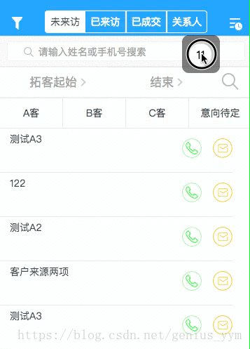
效果图
实现步骤
1.html
总结了一下评论,好像发现大家都碰到了滑动的问题。就在这里提醒一下吧。可将该悬浮 DIV 同你的 scroller web 同级。 —- (log: 2018-08-21)
html结构: <template> <div>你的web页面</div> <div>悬浮DIV</div> </template>
<template>
 <div id="webId">
 ...
 <div>你的web页面</div>
 <!-- 如果碰到滑动问题,1.1 请检查这里是否属于同一点。 -->
 <!-- 悬浮的HTML -->
 <div v-if="!isShow" class="xuanfu" id="moveDiv"
  @mousedown="down" @touchstart="down"
  @mousemove="move" @touchmove="move"
  @mouseup="end" @touchend="end"
 >
  <div class="yuanqiu">
  {{pageInfo.totalPage}}
  </div>
 </div>
 ...
 </div>
</template>
2.JS
<script>
data() {
 return {
 flags: false,
 position: { x: 0, y: 0 },
 nx: '', ny: '', dx: '', dy: '', xPum: '', yPum: '',
 }
}

methods: {
 // 实现移动端拖拽
 down(){
 this.flags = true;
 var touch;
 if(event.touches){
  touch = event.touches[0];
 }else {
  touch = event;
 }
 this.position.x = touch.clientX;
 this.position.y = touch.clientY;
 this.dx = moveDiv.offsetLeft;
 this.dy = moveDiv.offsetTop;
 },
 move(){
 if(this.flags){
  var touch ;
  if(event.touches){
   touch = event.touches[0];
  }else {
   touch = event;
  }
  this.nx = touch.clientX - this.position.x;
  this.ny = touch.clientY - this.position.y;
  this.xPum = this.dx+this.nx;
  this.yPum = this.dy+this.ny;
  moveDiv.style.left = this.xPum+"px";
  moveDiv.style.top = this.yPum +"px";
  //阻止页面的滑动默认事件;如果碰到滑动问题,1.2 请注意是否获取到 touchmove
  document.addEventListener("touchmove",function(){
   event.preventDefault();
  },false);
 }
 },
//鼠标释放时候的函数
 end(){
 this.flags = false;
 },
}
</script>
3.CSS
<style>
 .xuanfu {
 height: 4.5rem;
 width: 4.5rem;
 /* 如果碰到滑动问题,1.3 请检查 z-index。z-index需比web大一级*/
 z-index: 999;
 position: fixed;
 top: 4.2rem;
 right: 3.2rem;
 border-radius: 0.8rem;
 background-color: rgba(0, 0, 0, 0.55);
 }
 .yuanqiu {
 height: 2.7rem;
 width: 2.7rem;
 border: 0.3rem solid rgba(140, 136, 136, 0.5);
 margin: 0.65rem auto;
 color: #000000;
 font-size: 1.6rem;
 line-height: 2.7rem;
 text-align: center;
 border-radius: 100%;
 background-color: #ffffff;
 }
</style>
实现好JS逻辑,基本上,问题不大。
本文链接 http://www.luyixian.cn/javascript_show_166242.aspx
再加一点
css之display:inline-block布局
1.解释一下display的几个常用的属性值,inline , block, inline-block
图一:
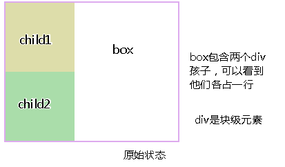
图二:


两个图可以看出,display:inline-block后块级元素能够在同一行显示,有人这说不就像浮动一样吗。没错,display:inline-block的效果几乎和浮动一样,但也有不同,接下来讲一下inline-block和浮动的比较。
2.inline-block布局 vs 浮动布局
a.不同之处:对元素设置display:inline-block ,元素不会脱离文本流,而float就会使得元素脱离文本流,且还有父元素高度坍塌的效果
b.相同之处:能在某程度上达到一样的效果
我们先来看看这两种布局:
图一:display:inline-block

图二:
对两个孩子使用float:left,我在上一篇浮动布局讲过,这是父元素会高度坍塌,所以要闭合浮动,对box使用overflow:hidden,效果如下:

>>乍一看两个都能做到几乎相同的效果,(仔细看看display:inline-block中有间隙问题,这个留到下面再讲)
c.浮动布局不太好的地方:参差不齐的现象,我们看一个效果:
图三:

图四:

>>从图3,4可以看出浮动的局限性在于,若要元素排满一行,换行后还要整齐排列,就要子元素的高度一致才行,不然就会出现图三的效果,而inline-block就不会。
3.inline-block存在的小问题:
a.上面可以看到用了display:inline-block后,存在间隙问题,间隙为4像素,这个问题产生的原因是换行引起的,因为我们写标签时通常会在标签结束符后顺手打个回车,而回车会产生回车符,回车符相当于空白符,通常情况下,多个连续的空白符会合并成一个空白符,而产生“空白间隙”的真正原因就是这个让我们并不怎么注意的空白符。
b.去除空隙的方法:
1.对父元素添加,{font-size:0},即将字体大小设为0,那么那个空白符也变成0px,从而消除空隙
现在这种方法已经可以兼容各种浏览器,以前chrome浏览器是不兼容的
图一:

c.浏览器兼容性:ie6/7是不兼容 display:inline-block的所以要额外处理一下:
在ie6/7下:
对于行内元素直接使用{dislplay:inline-block;}
对于块级元素:需添加{display:inline;zoom:1;}

4.总结:
display:inline-block的布局方式和浮动的布局方式,究竟使用哪个,我觉得应该根据实际情况来决定的:
a.对于横向排列东西来说,我更倾向与使用inline-block来布局,因为这样清晰,也不用再像浮动那样清除浮动,害怕布局混乱等等。
b.对于浮动布局就用于需要文字环绕的时候,毕竟这才是浮动真正的用武之地,水平排列的是就交给inline-block了。