以下是在 JavaScript 和 Google 地图 API 中添加点击事件,根据国家进行不同操作的示例代码:
//创建地图对象
var map = new google.maps.Map(document.getElementById('map'), {
  zoom: 4,
  center: {lat: 37.0902, lng: -95.7129}
});

//创建信息窗口(infowindow)
var infowindow = new google.maps.InfoWindow();

//创建一个数组来存储标记
var markers = [];

//为每个国家添加点击事件
google.maps.event.addListener(map, 'click', function(event) {
  //获取点击位置的经纬度坐标
  var latLng = event.latLng;

  //使用地理编码器(geocoder)将经纬度坐标转换为地址信息
  var geocoder = new google.maps.Geocoder();
  geocoder.geocode({'location': latLng}, function(results, status) {
    if (status === 'OK') {
      if (results[0]) {
        //获取点击位置所在的国家名称
        var countryName = '';
        for (var i = 0; i < results[0].address_components.length; i++) {
          var component = results[0].address_components[i];
          if (component.types.indexOf('country') !== -1) {
            countryName = component.long_name;
            break;
          }
        }

        //根据国家名称执行相应操作
        switch (countryName) {
          case 'China':
            alert('您点击了中国');
            break;
          case 'United States':
            alert('您点击了美国');
            break;
          default:
            alert('您点击了' + countryName);
        }

        //创建标记并将其添加到地图上
        var marker = new google.maps.Marker({
          position: latLng,
          map: map
        });
蓝蓝设计建立了UI设计分享群,每天会分享国内外的一些优秀设计,如果有兴趣的话,可以进入一起成长学习,请加微信ban_lanlan,报下信息,蓝小助会请您入群。欢迎您加入噢~~ 希望得到建议咨询、商务合作,也请与我们联系01063334945。 分享此文一切功德,皆悉回向给文章原作者及众读者. 免责声明:蓝蓝设计尊重原作者,文章的版权归原作者。如涉及版权问题,请及时与我们取得联系,我们立即更正或删除。 蓝蓝设计( www.lanlanwork.com )是一家专注而深入的界面设计公司,为期望卓越的国内外企业提供卓越的UI界面设计、BS界面设计 、 cs界面设计 、 ipad界面设计 、 包装设计 、 图标定制 、 用户体验 、交互设计、 网站建设 、平面设计服务、UI设计公司、界面设计公司、UI设计服务公司、数据可视化设计公司、UI交互设计公司、高端网站设计公司、UI咨询、用户体验公司、软件界面设计公司。
要用 Cesium.js 制作一个球形地图,可以按照以下步骤:
在 HTML 文件中添加 Cesium.js 库文件的引用。可以通过以下方式获取最新版的 Cesium.js 库文件链接:https://cesium.com/downloads/。
创建一个 div 元素来容纳地球场景,并设置其样式以占满整个屏幕。
在 JavaScript 文件中创建 Cesium.Viewer 对象并将其附加到之前创建的 div 元素上。这将在屏幕上显示一个球体,并启动 Cesium.js 场景。
可以通过更改 Viewer 对象的属性来自定义地球的外观和行为。例如,可以更改摄像机的位置和方向、加载不同类型的地图数据、添加标记等等。
以下是一个简单的示例代码:
<!DOCTYPE html>
<html>
<head>
    <meta charset="utf-8">
    <title>My Cesium App</title>
    <style>
        #cesiumContainer {
            width: 100%;
            height: 100%;
            margin: 0;
            padding: 0;
            overflow: hidden;
        }
    </style>
    <script src="https://cesium.com/downloads/cesiumjs/releases/1.85/Build/Cesium/Cesium.js"></script>
    <link href="https://cesium.com/downloads/cesiumjs/releases/1.85/Build/Cesium/Widgets/widgets.css" rel="stylesheet">
</head>
<body>
    <div id="cesiumContainer"></div>
    <script>
        var viewer = new Cesium.Viewer('cesiumContainer');
    </script>
</body>
</html>
这将创建一个简单的地球场景,可以在其中添加更
蓝蓝设计建立了UI设计分享群,每天会分享国内外的一些优秀设计,如果有兴趣的话,可以进入一起成长学习,请加微信ban_lanlan,报下信息,蓝小助会请您入群。欢迎您加入噢~~ 希望得到建议咨询、商务合作,也请与我们联系01063334945。 分享此文一切功德,皆悉回向给文章原作者及众读者. 免责声明:蓝蓝设计尊重原作者,文章的版权归原作者。如涉及版权问题,请及时与我们取得联系,我们立即更正或删除。 蓝蓝设计( www.lanlanwork.com )是一家专注而深入的界面设计公司,为期望卓越的国内外企业提供卓越的UI界面设计、BS界面设计 、 cs界面设计 、 ipad界面设计 、 包装设计 、 图标定制 、 用户体验 、交互设计、 网站建设 、平面设计服务、UI设计公司、界面设计公司、UI设计服务公司、数据可视化设计公司、UI交互设计公司、高端网站设计公司、UI咨询、用户体验公司、软件界面设计公司。
目录
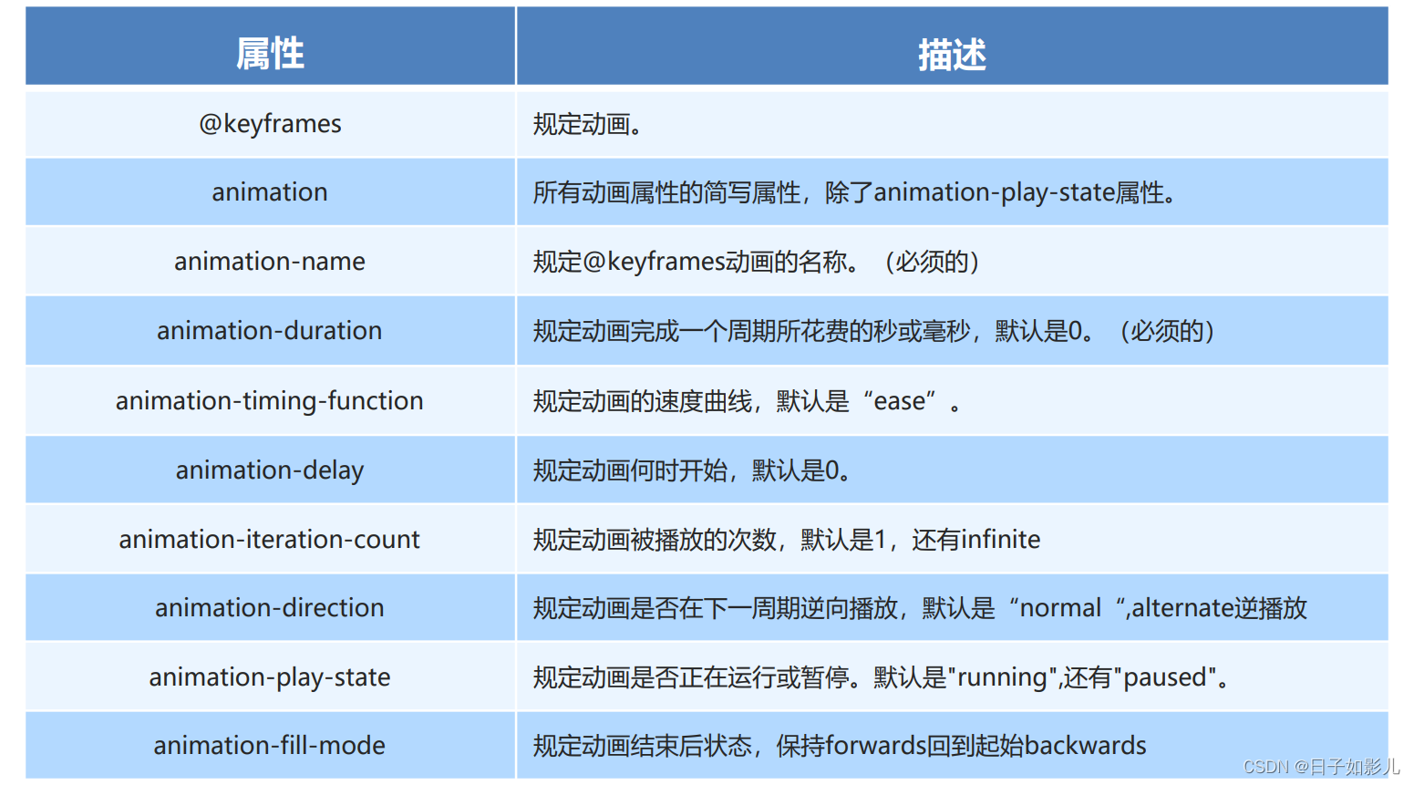
动画(animation)是CSS3中具有颠覆性的特征之一,可通过设置多个节点来精确控制一个或一组动画,常 用来实现复杂的动画效果。
相比较过渡,动画可以实现更多变化,更多控制,连续自动播放等效果。
制作动画分为两步: 1.先定义动画 2.再使用(调用)动画
1. 用keyframes 定义动画(类似定义类选择器)
@keyframes 动画名称 {
0%{
width:100px;
}
100%{
width:200px;
}
}
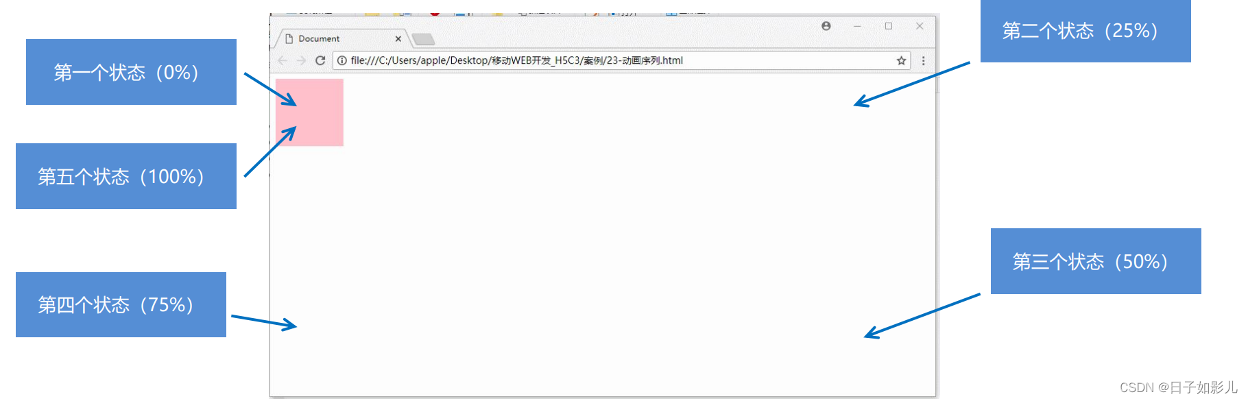
动画序列
0% 是动画的开始,100% 是动画的完成。这样的规则就是动画序列。
在 @keyframes 中规定某项 CSS 样式,就能创建由当前样式逐渐改为新样式的动画效果。
动画是使元素从一种样式逐渐变化为另一种样式的效果。您可以改变任意多的样式任意的次数。
请用百分比来规定变化发生的时间,或用关键词 "from" 和 "to",等同于 0% 和 100%。
2. 元素使用动画
div {
width: 200px;
height: 200px;
background-color: aqua;
margin: 100px auto; /* 调用动画 */
animation-name: 动画名称;
/* 持续时间 */ animation-duration: 持续时间; }
-
<!DOCTYPE html>
-
<html lang="en">
-
-
<head>
-
<meta charset="UTF-8">
-
<meta name="viewport" content="width=device-width, initial-scale=1.0">
-
<meta http-equiv="X-UA-Compatible" content="ie=edge">
-
<title>Document</title>
-
<style>
-
/* 我们想页面一打开,一个盒子就从左边走到右边 */
-
/* 1. 定义动画 */
-
-
@keyframes move {
-
/* 开始状态 */
-
0% {
-
transform: translateX(0px);
-
}
-
/* 结束状态 */
-
100% {
-
transform: translateX(1000px);
-
}
-
}
-
-
div {
-
width: 200px;
-
height: 200px;
-
background-color: pink;
-
/* 2. 调用动画 */
-
/* 动画名称 */
-
animation-name: move;
-
/* 持续时间 */
-
animation-duration: 2s;
-
}
-
</style>
-
</head>
-
-
<body>
-
<div></div>
-
</body>
-
-
</html>

-
<!DOCTYPE html>
-
<html lang="en">
-
-
<head>
-
<meta charset="UTF-8">
-
<meta name="viewport" content="width=device-width, initial-scale=1.0">
-
<meta http-equiv="X-UA-Compatible" content="ie=edge">
-
<title>Document</title>
-
<style>
-
/* from to 等价于 0% 和 100% */
-
/* @keyframes move {
-
from {
-
transform: translate(0, 0);
-
}
-
to {
-
transform: translate(1000px, 0);
-
}
-
} */
-
/* 动画序列 */
-
/* 1. 可以做多个状态的变化 keyframe 关键帧 */
-
/* 2. 里面的百分比要是整数 */
-
/* 3. 里面的百分比就是 总的时间(我们这个案例10s)的划分 25% * 10 = 2.5s */
-
-
@keyframes move {
-
0% {
-
transform: translate(0, 0);
-
}
-
25% {
-
transform: translate(1000px, 0)
-
}
-
50% {
-
transform: translate(1000px, 500px);
-
}
-
75% {
-
transform: translate(0, 500px);
-
}
-
100% {
-
transform: translate(0, 0);
-
}
-
}
-
-
div {
-
width: 100px;
-
height: 100px;
-
background-color: pink;
-
animation-name: move;
-
animation-duration: 10s;
-
}
-
</style>
-
</head>
-
-
<body>
-
<div>
-
-
</div>
-
</body>
-
-
</html>
-
<!DOCTYPE html>
-
<html lang="en">
-
-
<head>
-
<meta charset="UTF-8">
-
<meta name="viewport" content="width=device-width, initial-scale=1.0">
-
<meta http-equiv="X-UA-Compatible" content="ie=edge">
-
<title>Document</title>
-
<style>
-
@keyframes move {
-
0% {
-
transform: translate(0, 0);
-
}
-
100% {
-
transform: translate(1000px, 0);
-
}
-
}
-
-
div {
-
width: 100px;
-
height: 100px;
-
background-color: pink;
-
/* 动画名称 */
-
animation-name: move;
-
/* 持续时间 */
-
/* animation-duration: 2s; */
-
/* 运动曲线 */
-
/* animation-timing-function: ease; */
-
/* 何时开始 */
-
animation-delay: 1s;
-
/* 重复次数 iteration 重复的 conut 次数 infinite 无限 */
-
/* animation-iteration-count: infinite; */
-
/* 是否反方向播放 默认的是 normal 如果想要反方向 就写 alternate */
-
/* animation-direction: alternate; */
-
/* 动画结束后的状态 默认的是 backwards 回到起始状态 我们可以让他停留在结束状态 forwards */
-
/* animation-fill-mode: forwards; */
-
/* animation: name duration timing-function delay iteration-count direction fill-mode; */
-
/* animation: move 2s linear 0s 1 alternate forwards; */
-
/* 前面2个属性 name duration 一定要写 */
-
/* animation: move 2s linear alternate forwards; */
-
}
-
-
div:hover {
-
/* 鼠标经过div 让这个div 停止动画,鼠标离开就继续动画 */
-
animation-play-state: paused;
-
}
-
</style>
-
</head>
-
-
<body>
-
<div>
-
-
</div>
-
</body>
-
-
</html>
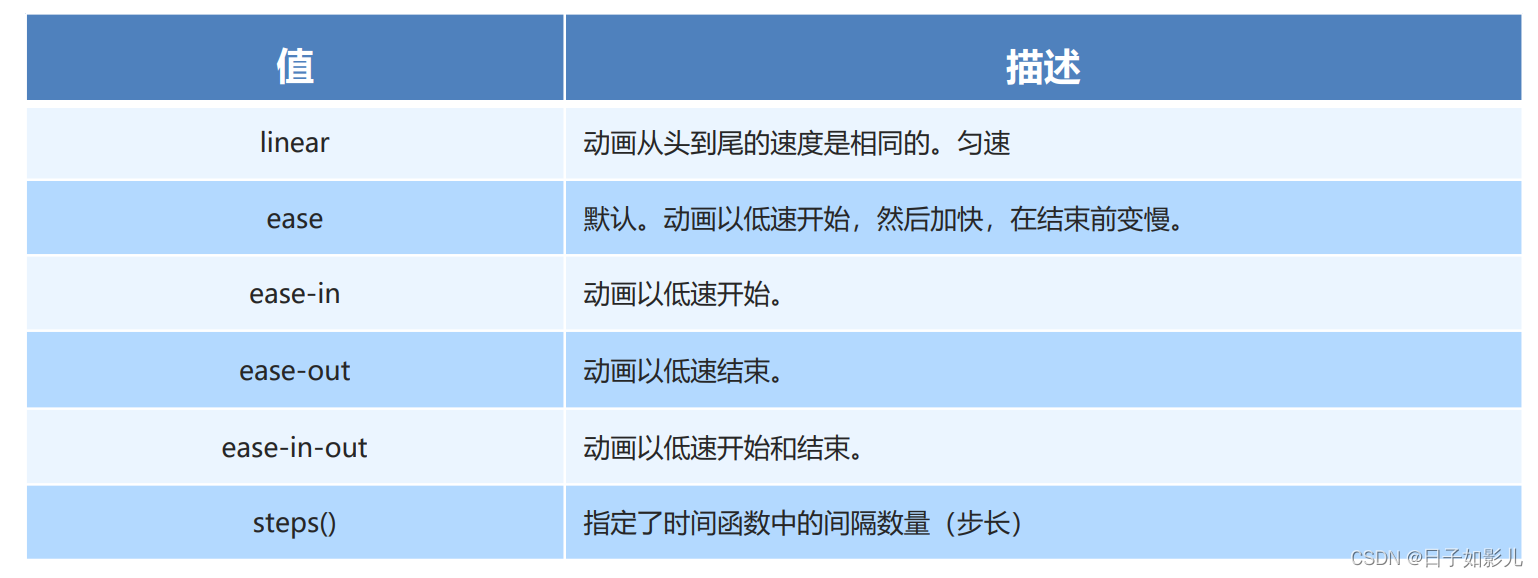
linear 匀速
animation:动画名称 持续时间 运动曲线 何时开始 播放次数 是否反方向 动画起始或者结束的状态
animation: myfirst 5s linear 2s infinite alternate;
简写属性里面不包含 animation-play-state
暂停动画:animation-play-state: puased; 经常和鼠标经过等其他配合使用
想要动画走回来 ,而不是直接跳回来:animation-direction : alternate
盒子动画结束后,停在结束位置: animation-fill-mode : forwards
还没听。。
animation-timing-function:规定动画的速度曲线,默认是“ease“
-
<!DOCTYPE html>
-
<html lang="en">
-
-
<head>
-
<meta charset="UTF-8">
-
<meta name="viewport" content="width=device-width, initial-scale=1.0">
-
<meta http-equiv="X-UA-Compatible" content="ie=edge">
-
<title>Document</title>
-
<style>
-
div {
-
overflow: hidden;
-
font-size: 20px;
-
width: 0;
-
height: 30px;
-
background-color: pink;
-
/* 让我们的文字强制一行内显示 */
-
white-space: nowrap;
-
/* steps 就是分几步来完成我们的动画 有了steps 就不要在写 ease 或者linear 了 */
-
animation: w 4s steps(10) forwards;
-
}
-
-
@keyframes w {
-
0% {
-
width: 0;
-
}
-
100% {
-
width: 200px;
-
}
-
}
-
</style>
-
</head>
-
-
<body>
-
<div>世纪佳缘我在这里等你</div>
-
</body>
-
-
</html>
蓝蓝设计建立了UI设计分享群,每天会分享国内外的一些优秀设计,如果有兴趣的话,可以进入一起成长学习,请加微信ban_lanlan,报下信息,蓝小助会请您入群。欢迎您加入噢~~ 希望得到建议咨询、商务合作,也请与我们联系01063334945。 分享此文一切功德,皆悉回向给文章原作者及众读者. 免责声明:蓝蓝设计尊重原作者,文章的版权归原作者。如涉及版权问题,请及时与我们取得联系,我们立即更正或删除。 蓝蓝设计( www.lanlanwork.com )是一家专注而深入的界面设计公司,为期望卓越的国内外企业提供卓越的UI界面设计、BS界面设计 、 cs界面设计 、 ipad界面设计 、 包装设计 、 图标定制 、 用户体验 、交互设计、 网站建设 、平面设计服务、UI设计公司、界面设计公司、UI设计服务公司、数据可视化设计公司、UI交互设计公司、高端网站设计公司、UI咨询、用户体验公司、软件界面设计公司。
一、CSS3 2D变形(利用Transfrom方法)
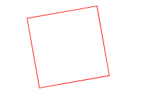
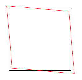
1、rotate(angle)
元素顺时针旋转给定的角度。允许负值,元素将逆时针旋转。
<!DOCTYPE html>
<html lang="en">
<head>
    <meta charset="UTF-8">
    <title>Title</title>
</head>
<style>
    div{
        width: 100px;
        height: 100px;
        border: 1px solid red;
        transform: rotate(30deg) ;
        margin: 200px auto;
    }
</style>
<body>
    <div>

    </div>
</body>
</html>
效果如图
如果当rotate里面的值为负数时,比如ratate(-10deg),效果如图:
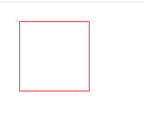
2、 translate(x,y)方法
通过 translate() 方法,元素从其当前位置移动,根据给定的 left(x 坐标) 和 top(y 坐标) 位置参数。也就是相对于页面左部和顶部的距离
<!DOCTYPE html>
<html lang="en">
<head>
    <meta charset="UTF-8">
    <title>Title</title>
</head>
<style>
    div {
        width: 100px;
        height: 100px;
        border: 1px solid red;
        transform: translate(20px, 20px);
    }

</style>
<body>

    <div></div>
</body>
</html>
效果如下
初次之外还有其他的参数
transform: translate(200px);
如果只带一个参数,这个参数代表的是x方向位移值,y方向位移为0
transform: translateX(200px);
对X方向移动
transform: translateY(200px);
对Y方向移动
3、scale() 方法
通过 scale() 方法,元素的尺寸会增加或减少,根据给定的宽度(X 轴)和高度(Y 轴)参数
<!DOCTYPE html>
<html lang="en">
<head>
    <meta charset="UTF-8">
    <title>Title</title>
</head>
<style>
    div {
        width: 100px;
        height: 100px;
        border: 1px solid red;
        transform: scale(2,0.5);
        margin: 20px auto;
    }

</style>
<body>

    <div></div>
</body>
</html>
效果如图
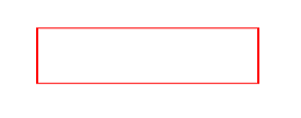
可以看到,长边变为了原来的两倍,宽边变为了原来的0.5倍
transform: scale(1.5);x轴和y轴都放大1.5倍
transform: scaleX(1.5);x轴放大1.5倍
transform: scaleY(1.5);y轴放大1.5倍
transform-origin: left top;改变中心点位置为左上角,当然还可以自由搭配,右下(right bottom),右上(right top)
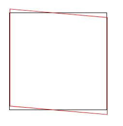
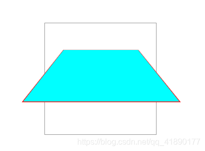
4、 skew() 方法
通过 skew() 方法,元素翻转给定的角度,根据给定的水平线(X 轴)和垂直线(Y 轴)参数。
<!DOCTYPE html>
<html lang="en">
<head>
    <meta charset="UTF-8">
    <title>Title</title>
</head>
<style>
    div {
        width: 100px;
        height: 100px;
        border: 1px solid red;
        transform: skew(30deg,30deg);
        margin: 200px auto;
    }

</style>
<body>

    <div></div>
</body>
</html>
效果如图
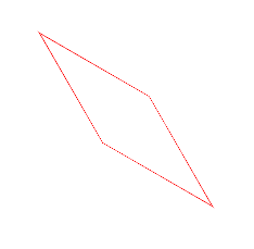
意思就是:围绕 X 轴把元素翻转 30 度,围绕 Y 轴翻转 30 度。可能看起来比较抽象
transform: skew(230deg);如果只带一个参数,只有x轴方向的扭曲
transform: skewX(230deg); 对X轴进行翻转
transform: skewY(230deg); 对Y轴进行翻转
其实还是很好理解的,比如两个图叠加在一起
<!DOCTYPE html>
<html lang="en">
<head>
    <meta charset="UTF-8">
    <title>Title</title>
</head>
<style>
    .demo{
        width: 200px;
        height: 200px;
        margin: 200px auto;
        border: 1px solid #000;
    }

    .box{
        width: 200px;
        height: 200px;
        border: 1px solid red;
        transform: skew(5deg,0deg);
    }

</style>
<body>
<div class="demo">
    <div class="box"></div>
</div>

</body>
</html>
可以看到,所谓的X轴翻转,其实就是x方向的移动,上面的线向左移动5px,下面的线向右移动5px,加入Y也一样
比如:transform: skew(0deg,5deg);
左边的线向上移动5px,右边的线向下移动5px,同时改变时 transform: skew(5deg,5deg);
最好记的方式就是对角线的同时移动,左上右下是排斥,左下右上是吸引
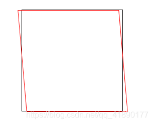
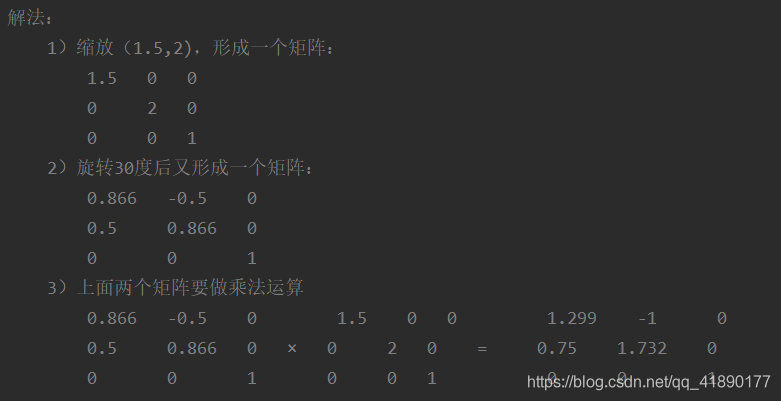
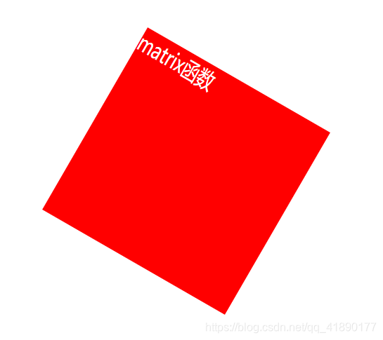
5、matrix() 方法
matrix() 方法把所有 2D 转换方法组合在一起。
matrix() 方法需要六个参数,包含数学函数,允许您:旋转、缩放、移动以及倾斜元素。
如题:将div右移100px,下移200px,旋转30度,x轴缩放1.5倍,y轴缩放2倍。
(1)transform: translate(100px, 200px) rotate(30deg) scale(1.5, 2);
(2)transform: matrix(1.299, 0.75, -1, 1.732, 100, 200)
计算方法
效果如图
6、transform-origin 属性
允许你改变被转换元素的位置
语法: transform-origin: x-axis y-axis z-axis;
属性值:
x-axis :定义视图被置于 X 轴的何处。可能的值:left,center,right,length,%。
y-axis :定义视图被置于 Y 轴的何处。可能的值:top,center,bottom,length,%。
z-axis :定义视图被置于 Z 轴的何处。可能的值:length。
<!DOCTYPE html>
<html lang="en">
<head>
    <meta charset="UTF-8">
    <title>transform-origin</title>
    <style>
        *{
            margin: 0;
            padding: 0;
        }
        .demo{
            width: 200px;
            height: 200px;
            margin: 200px auto;
            border: 1px solid #000;
        }
        .box{
            width: 200px;
            height: 200px;
            background-color: #f00;
            transform: rotate(60deg);
            transform-origin: right bottom;
        }
    </style>
</head>
<body>
<div class="demo">
    <div class="box"></div>
</div>
</body>
</html>
效果如图

形象的来说,就是规定你从哪个角开始旋转,比如规定右下角旋转,则图形以右下角为旋转角,顺时针旋转60°
二、CSS3 3D变形
1、perspective属性
perspective 属性定义 3D 元素距视图的距离,以像素计。该属性允许您改变 3D 元素查看 3D 元素的视图。
当为元素定义 perspective 属性时,其子元素会获得透视效果,而不是元素本身。
注释:perspective 属性只影响 3D 转换元素。
语法: perspective: number|none;
属性值:
number :元素距离视图的距离,以像素计。
none :默认值。与 0 相同。不设置透视
<!DOCTYPE html>
<html lang="en">
<head>
    <meta charset="UTF-8">
    <title>perspective</title>
    <style>
        .father{
            position: relative;
            width: 200px;
            height: 200px;
            padding: 10px;
            margin: 200px auto;
            border: 1px solid #999;
            perspective: 150px;
        }
        .son{
            width: 100px;
            height: 50px;
            padding: 50px;
            position: absolute;
            border: 1px solid #f00;
            background-color: #0ff;
            transform: rotateX(45deg);
        }
    </style>
</head>
<body>
<div class="father">
    <div class="son"></div>
</div>
</body>
</html>
效果如图
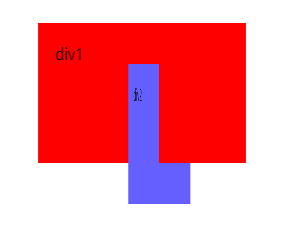
2、trasform-style属性
transform-style 属性规定如何在 3D 空间中呈现被嵌套的元素。
注释:该属性必须与 transform 属性一同使用。
语法: transform-style: flat|preserve-3d;
属性值:
flat :子元素将不保留其 3D 位置。
preserve-3d :子元素将保留其 3D 位置。
<!DOCTYPE html>
<html lang="en">
<head>
    <meta charset="UTF-8">
    <title>transform-style</title>
    <style>
        .wrapper{
            width: 200px;
            height: 100px;
            margin: 200px auto;
        }
        .div1,.div2{
            width: 200px;
            height: 100px;
            padding: 20px;
        }
        .div1{
            background-color: #f00;
            transform: rotateY(30deg);
            transform-style: preserve-3d;

        }
        .div2{
            background-color: #655fff;
            transform: rotateY(45deg);
        }
    </style>
</head>
<body>
<div class="wrapper">
    <div class="div1">div1
        <div class="div2">div2</div>
    </div>
</div>
</body>
</html>
效果如图
3、CSS3过渡
transition 属性是一个简写属性,用于设置四个过渡属性:
transition-property:规定设置过渡效果的 CSS 属性的名称。
transition-duration:规定完成过渡效果需要多少秒或毫秒。
transition-timing-function:规定速度效果的速度曲线。
transition-delay:定义过渡效果何时开始。
注释:请始终设置 transition-duration 属性,否则时长为 0,就不会产生过渡效果。
语法: transition: property duration timing-function delay;
<!DOCTYPE html>
<html lang="en">
<head>
    <meta charset="UTF-8">
    <title>transition过渡动画</title>
    <style>
        .box{
            width: 100%;
            height: 300px;
            position: relative;
            border: 1px solid #eee;
        }
        .demo{
            width: 100px;
            height: 100px;
            background-color: #f00;
            position: absolute;
            left: 100px;
            top: 100px;
            transform: rotate(0deg);
            transition-property: all;
            transition-duration: .8s;
        }
        .box:hover .demo{
            left: 500px;
            width: 300px;
            transform: rotate(45deg);
        }
    </style>
</head>
<body>
<div class="box">
    <div class="demo"></div>
</div>
</body>
</html>
或者
<!DOCTYPE html>
<html lang="en">
<head>
    <meta charset="UTF-8">
    <title>transition过渡动画</title>
    <style>
        .box{
            width: 100%;
            height: 300px;
            position: relative;
            border: 1px solid #eee;
        }
        .demo{
            width: 100px;
            height: 100px;
            background-color: #f00;
            position: absolute;
            left: 100px;
            top: 100px;
            transform: rotate(0deg);
            transition: left 2s ease 500ms, width 5s ease-in-out;
        }
        .box:hover .demo{
            left: 500px;
            width: 300px;
            transform: rotate(45deg);
        }
    </style>
</head>
<body>
<div class="box">
    <div class="demo"></div>
</div>
</body>
</html>
可以自行实验一下
4、CSS3动画
使用@keyframes
通过 @keyframes 规则,您能够创建动画。
创建动画的原理是,将一套 CSS 样式逐渐变化为另一套样式。
在动画过程中,您能够多次改变这套 CSS 样式。
以百分比来规定改变发生的时间,或者通过关键词 “from” 和 “to”,等价于 0% 和 100%。
0% 是动画的开始时间,100% 动画的结束时间。
为了获得最佳的浏览器支持,您应该始终定义 0% 和 100% 选择器。
<!DOCTYPE html>
<html lang="en">
<head>
    <meta charset="UTF-8">
    <title>关键帧动画</title>
    <style>
        .box{
            width: 100%;
            height: 800px;
            position: relative;
        }
        .demo{
            width: 100px;
            height: 100px;
            background-color: #ff0000;
            -webkit-border-radius: 50%;
            -moz-border-radius: 50%;
            border-radius: 50%;
            position: absolute;
            /*animation: move 5s ease-in-out infinite alternate ;*/
            -webkit-animation: move 5s ease-in-out 500ms 2 alternate ;
            -moz-animation: move 5s ease-in-out 500ms 2 alternate ;
            -ms-animation: move 5s ease-in-out 500ms 2 alternate ;
            -o-animation: move 5s ease-in-out 500ms 2 alternate ;
            animation: move 5s ease-in-out 500ms 2 alternate ;
        }
        @keyframes move {
            0%{
                left: 100px;
            }
            45%{
                left: 200px;
                top: 100px;
                background-color: #00f;
            }
            75%{
                left: 400px;
                top: 300px;
                background-color: #64ff77;
            }
            100%{
                left: 500px;
                top: 500px;
                background-color: #ff4975;
            }
        }
    </style>
</head>
<body>
<div class="box">
    <div class="demo"></div>
</div>
</body>
</html>
或者
<!DOCTYPE html>
<html lang="en">
<head>
    <meta charset="UTF-8">
    <title>关键帧动画</title>
    <style>
        .box{
            width: 100%;
            height: 800px;
            position: relative;
        }
        .demo{
            width: 100px;
            height: 100px;
            background-color: #ff0000;
            -webkit-border-radius: 50%;
            -moz-border-radius: 50%;
            border-radius: 50%;
            position: absolute;
            /*animation: move 5s ease-in-out infinite alternate ;*/
            -webkit-animation: move 5s ease-in-out 500ms 2 alternate ;
            -moz-animation: move 5s ease-in-out 500ms 2 alternate ;
            -ms-animation: move 5s ease-in-out 500ms 2 alternate ;
            -o-animation: move 5s ease-in-out 500ms 2 alternate ;
            animation: move 5s ease-in-out 500ms 2 alternate ;
        }
        @keyframes move {
           from{
                left: 100px;
            }
            to{
                left: 500px;
                background-color: #00f;
            }
        }

    </style>
</head>
<body>
<div class="box">
    <div class="demo"></div>
</div>
</body>
</html>
animation:move 5s ease-in-out 500ms 2 alternate
move:表示animation-name ,动画名称
5s:表示animation-duration,时长
ease-in-out:表示animation-timing-function 规定动画的速度曲线
(
除此以外还有:
linear:动画从头到尾的速度是相同的。
ease:默认。动画以低速开始,然后加快,在结束前变慢。
ease-in:动画以低速开始。
ease-out:动画以低速结束。
ease-in-out:动画以低速开始和结束。
)
500ms:表示animation-delay,规定在动画开始之前的延迟。
2 :表示animation-iteration-count,规定动画应该播放的次数。
alternate:表示animation-direction,规定是否应该轮流反向播放动画,如果 animation-direction 值是 “alternate”,则动画会在奇数次数(1、3、5 等等)正常播放,而在偶数次数(2、4、6 等等)向后播放。。
蓝蓝设计建立了UI设计分享群,每天会分享国内外的一些优秀设计,如果有兴趣的话,可以进入一起成长学习,请加微信ban_lanlan,报下信息,蓝小助会请您入群。欢迎您加入噢~~
希望得到建议咨询、商务合作,也请与我们联系01063334945。
分享此文一切功德,皆悉回向给文章原作者及众读者. 免责声明:蓝蓝设计尊重原作者,文章的版权归原作者。如涉及版权问题,请及时与我们取得联系,我们立即更正或删除。
蓝蓝设计( www.lanlanwork.com )是一家专注而深入的界面设计公司,为期望卓越的国内外企业提供卓越的UI界面设计、BS界面设计 、 cs界面设计 、 ipad界面设计 、 包装设计 、 图标定制 、 用户体验 、交互设计、 网站建设 、平面设计服务、UI设计公司、界面设计公司、UI设计服务公司、数据可视化设计公司、UI交互设计公司、高端网站设计公司、UI咨询、用户体验公司、软件界面设计公司。
本篇文章通过代码示例介绍一下使用纯CSS画圆环的方法。有一定的参考价值,有需要的朋友可以参考一下,希望对大家有所帮助。
画圆环思想很简单:首先画两个圆,设置不同的背景色;然后让两个圆的圆心重合即可。
难度系数
☆☆
HTML
解析:此处有父容器
CSS.container {
position: relative;
top: 0;
left: 0;
width: 300px;
height: 300px;
background-color: lightgrey;
}
.ring-style {
display: inline-block;
position: absolute;
top: 50%;
left: 50%;
transform: translate(-50%, -50%);
background-color: blue;
width: 260px;
height: 260px;
border-radius: 260px;
}
.ring-style::before {
content: ' ';
display: inline-block;
position: absolute;
top: 50%;
left: 50%;
transform: translate(-50%, -50%);
background-color: white;
width: 200px;
height: 200px;
border-radius: 200px;
}
解析:设置元素的宽高、圆角效果,即可画出一个圆
通过 ::before 伪元素和本体元素,创建两个圆
通过基于父容器的绝对定位,设置 top、left、translate 属性,让元素基于父容器水平、竖直居中,即可让两个圆的圆心重合
【推荐教程:CSS视频教程 】
效果图
知识点border-radius
::before && ::after
元素水平、竖直居中
蓝蓝设计建立了UI设计分享群,每天会分享国内外的一些优秀设计,如果有兴趣的话,可以进入一起成长学习,请加微信ban_lanlan,报下信息,蓝小助会请您入群。欢迎您加入噢~~
希望得到建议咨询、商务合作,也请与我们联系01063334945。
分享此文一切功德,皆悉回向给文章原作者及众读者. 免责声明:蓝蓝设计尊重原作者,文章的版权归原作者。如涉及版权问题,请及时与我们取得联系,我们立即更正或删除。
蓝蓝设计( www.lanlanwork.com )是一家专注而深入的界面设计公司,为期望卓越的国内外企业提供卓越的UI界面设计、BS界面设计 、 cs界面设计 、 ipad界面设计 、 包装设计 、 图标定制 、 用户体验 、交互设计、 网站建设 、平面设计服务、UI设计公司、界面设计公司、UI设计服务公司、数据可视化设计公司、UI交互设计公司、高端网站设计公司、UI咨询、用户体验公司、软件界面设计公司。
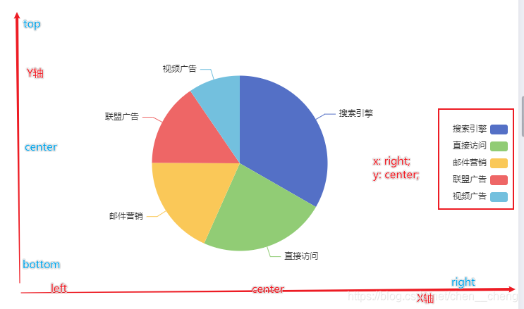
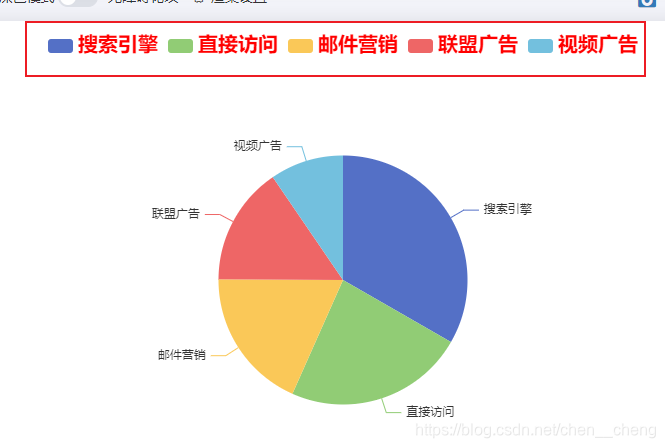
Echarts的legend属性是对图例组件的相关配置
而legend就是Echarts图表中对图形的解释部分:
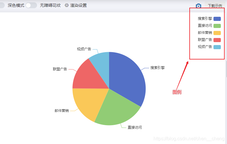
其中legend自身常用的配置属性如下:
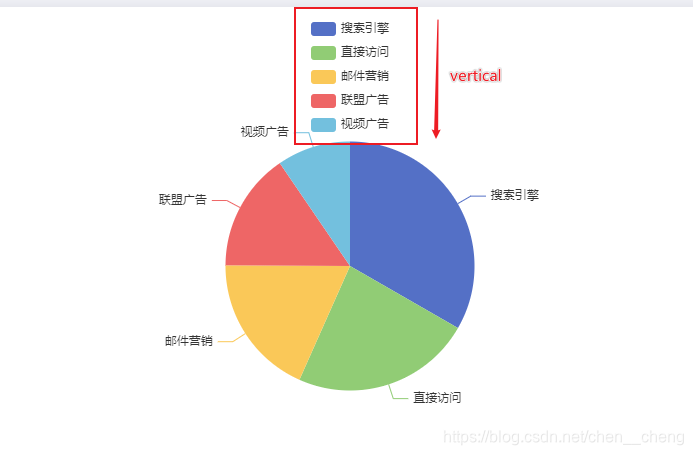
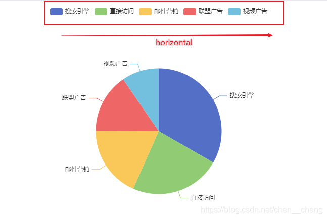
设置图例的朝向
属性值:
vertical // 垂直显示
或者
horizontal // 水平显示
legend: { orient: 'vertical' }
legend: { orient: 'horizontal' }
设置图例在X轴方向上的位置以及在Y轴方向上的位置
| 位置 | 取值 |
|---|---|
| x/left | left/center/right |
| y /top | top/center/bottom |
例子:
legend: { orient: 'vertical', x:'right', y:'center' }
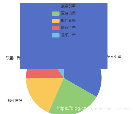
| 属性 | 说明 |
|---|---|
| backgroundColor | 背景颜色 |
| borderColor | 边框颜色 |
| borderWidth | 边框宽度 |
| padding | 内边距 |
注意:边框宽度和内边距属性值为数值,不加单位。
legend: { orient: 'vertical', x:'center', y:'top', backgroundColor: '#fac858', borderColor: '#5470c6', borderWidth: '200', }
控制每一项的间距,也就是图例之间的距离
属性值为数值,不带单位
legend: { orient: 'horizontal', x:'center', y:'top', itemGap: 40 }
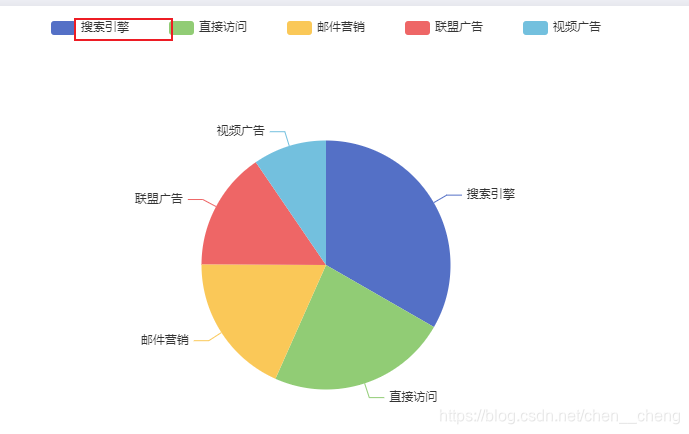
控制图例图形的高度
属性值为数字,不加单位
legend: { orient: 'horizontal', x:'center', y:'top', itemHeight: 5 }
设置图例文字样式
属性值为一个对象
legend: { orient: 'horizontal', x:'center', y:'top', textStyle: { color: 'red', fontSize: '20px', fontWeight: 700 } }
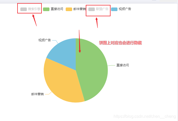
设置图例的某个选项的数据默认是显示还是隐藏。
false: 隐藏
属性值:对象,属性值内容:图例上的数据与boolean构成键值对
如果某选项设置为false,那么图标上的数据也会默认不显示,而图例会以灰色样式显示
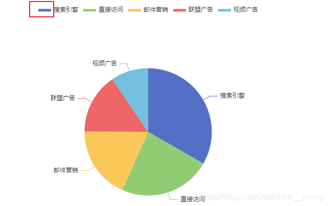
legend: { orient: 'horizontal', x:'center', y:'top', selected:{ '搜索引擎': false, '联盟广告': false } }
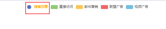
图例上显示的文字信息,如果不设置该项,默认会以series设置的信息作为图例信息。如果设置该项,必须与series设置的信息一致,才会生效。
而该属性的作用:可以单独对图例中某个选项进行单独设置样式
比如:
legend: { orient: 'horizontal', x:'center', y:'top', data:[{ name: '搜索引擎', icon: 'circle', textStyle: {fontWeight: 'bold', color: 'orange'} },'直接访问','邮件营销','联盟广告','视频广告'] }
以上单独设置中
name:指定该项的名称,必填
icon:指定图例项的icon,可以为内置的图形7个图形,或者自定义图标的形式:'image://url'
textStyle::设置文本样式
蓝蓝设计建立了UI设计分享群,每天会分享国内外的一些优秀设计,如果有兴趣的话,可以进入一起成长学习,请加微信ban_lanlan,报下信息,蓝小助会请您入群。欢迎您加入噢~~
希望得到建议咨询、商务合作,也请与我们联系01063334945。
分享此文一切功德,皆悉回向给文章原作者及众读者. 免责声明:蓝蓝设计尊重原作者,文章的版权归原作者。如涉及版权问题,请及时与我们取得联系,我们立即更正或删除。
蓝蓝设计( www.lanlanwork.com )是一家专注而深入的界面设计公司,为期望卓越的国内外企业提供卓越的UI界面设计、BS界面设计 、 cs界面设计 、 ipad界面设计 、 包装设计 、 图标定制 、 用户体验 、交互设计、 网站建设 、平面设计服务、UI设计公司、界面设计公司、UI设计服务公司、数据可视化设计公司、UI交互设计公司、高端网站设计公司、UI咨询、用户体验公司、软件界面设计公司。
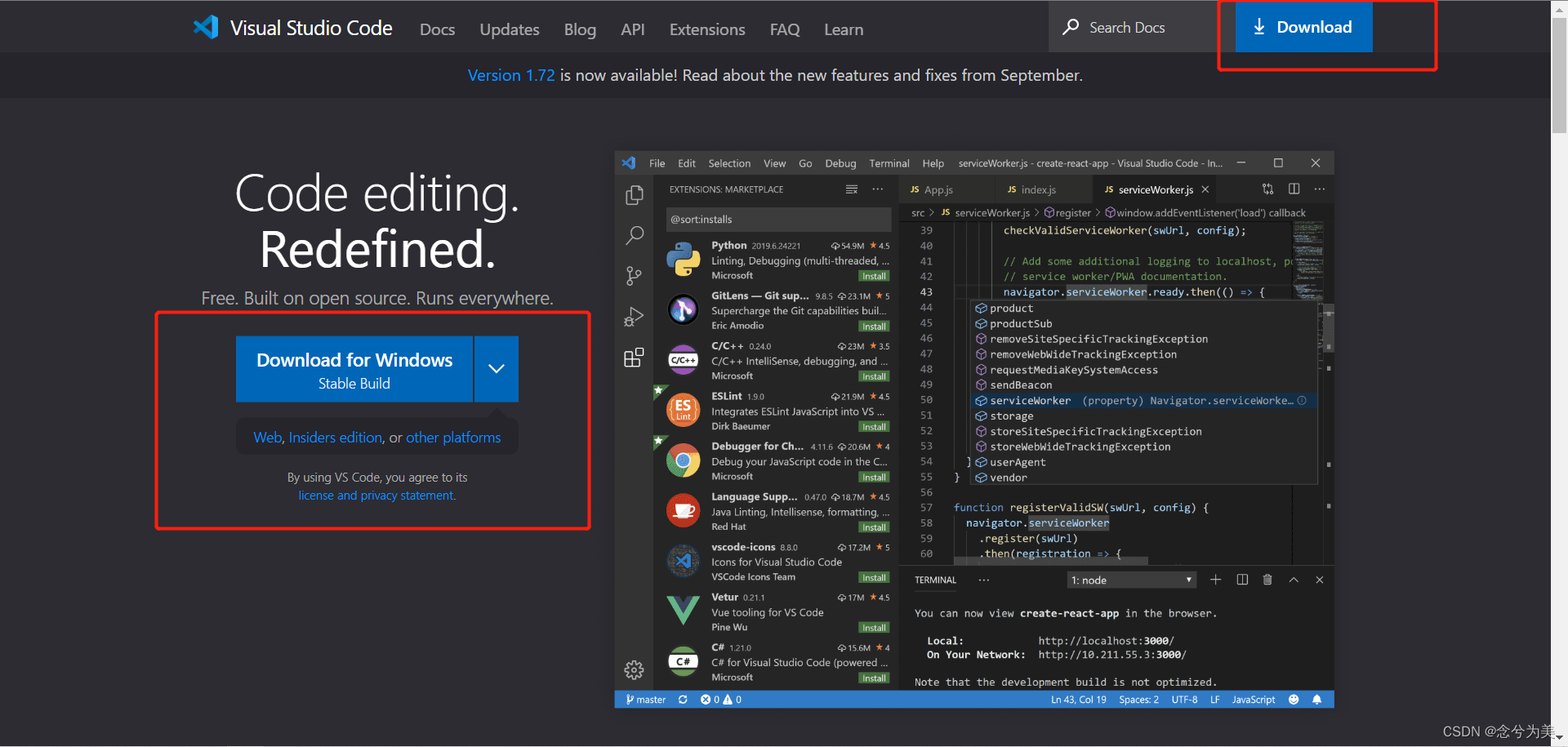
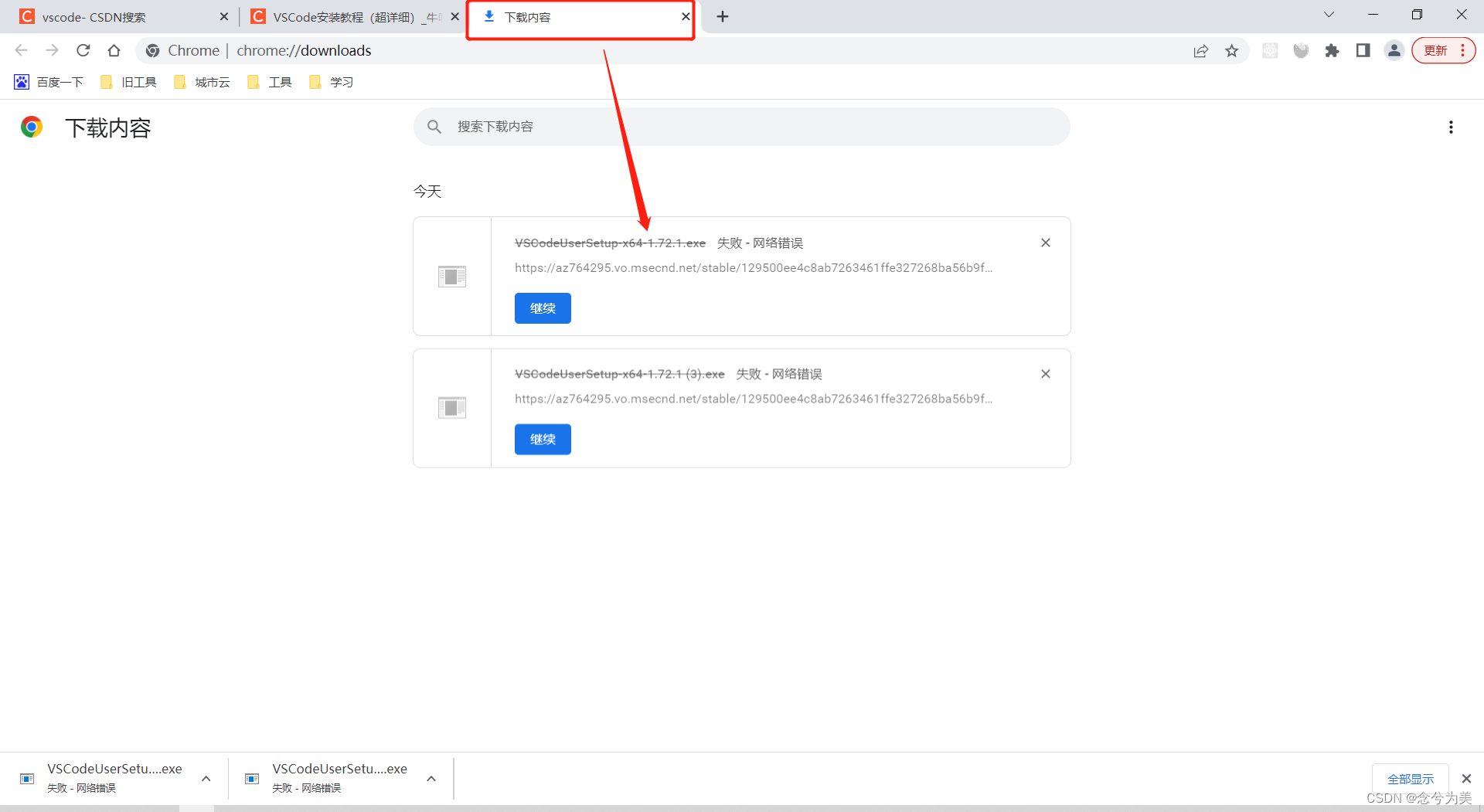
今天用WebStorm运行前端代码时,发现不太好打断点。
于是,打算改用VSCode来运行前端代码,但前提是要安装VSCode,如下便是超详细的VSCode安装教程以及解决VSCode下载速度特别慢的问题。
VSCode官网
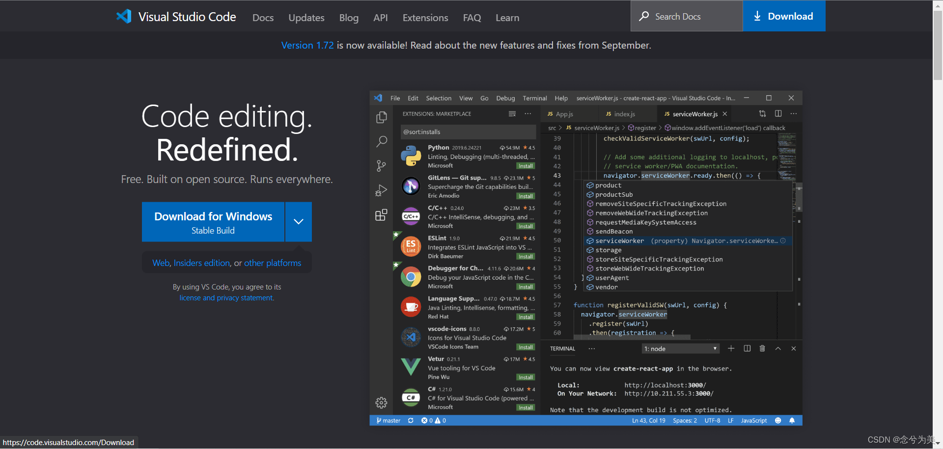
download下载
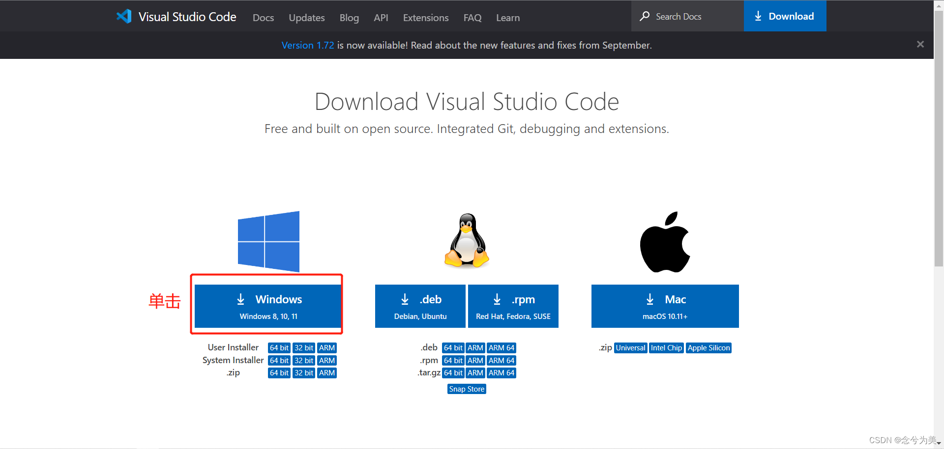
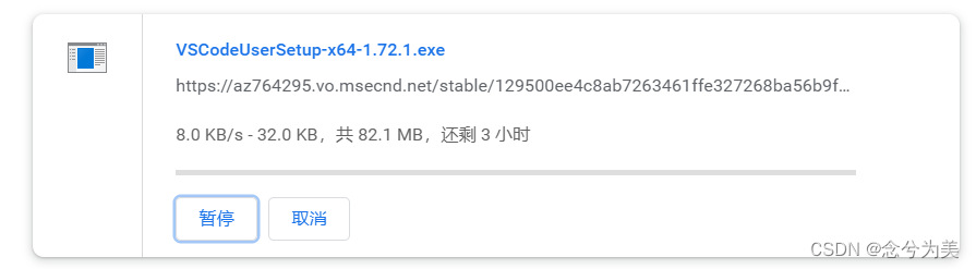
你会发现VSCode官网地址下载很慢,或者下着下着就暂停了,如下图所示:
如果下载完成,那得等到猴年马月。
我是用chrome浏览器,点击右下角的全部显示按钮,可以跳转到下载内容页面。
如果你是用其他浏览器,可能使用其他方式跳转到下载内容页面。

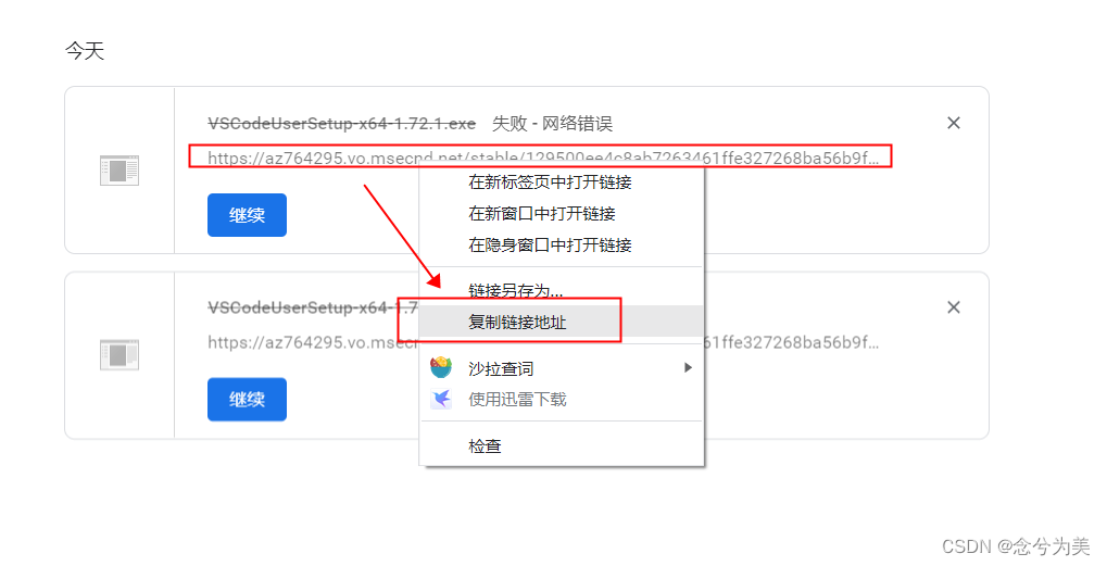
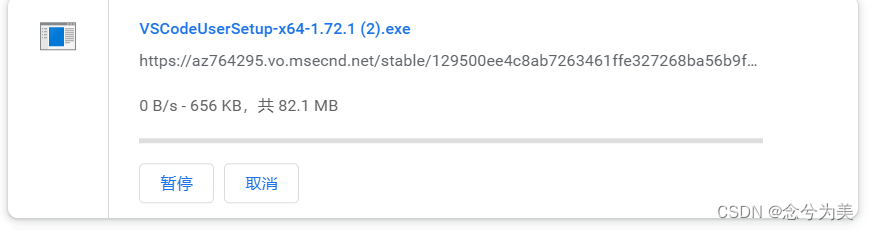
vscode.cdn.azure.cn

即https://az764295.vo.msecnd.net/stable/129500ee4c8ab7263461ffe327268ba56b9f210d/VSCodeUserSetup-x64-1.72.1.exe修改为https://vscode.cdn.azure.cn/stable/129500ee4c8ab7263461ffe327268ba56b9f210d/VSCodeUserSetup-x64-1.72.1.exe
将替换后的地址输入到浏览器的地址栏中,如下图所示,按enter键即可快速下载。

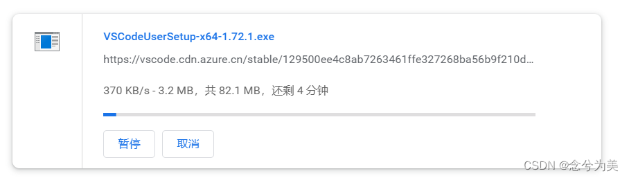
速度是不是立刻提升了。
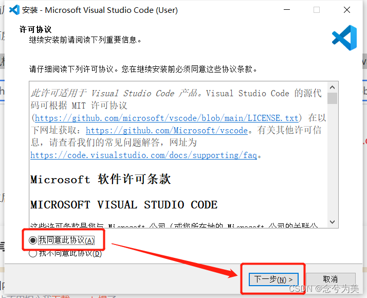
因为我的系统盘(C盘)的内存不够用了,需要更换到其他盘符,我更换到D盘中。
如果你不想更换到其他盘符,可以直接下一步即可。
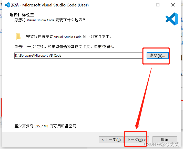
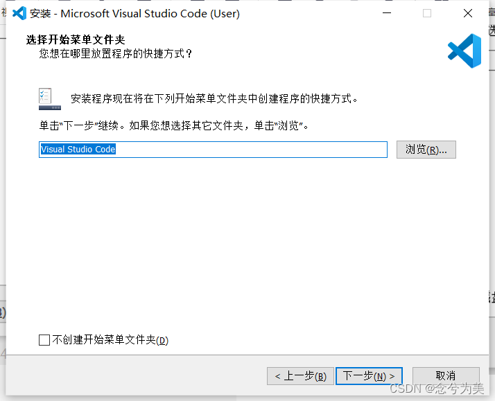
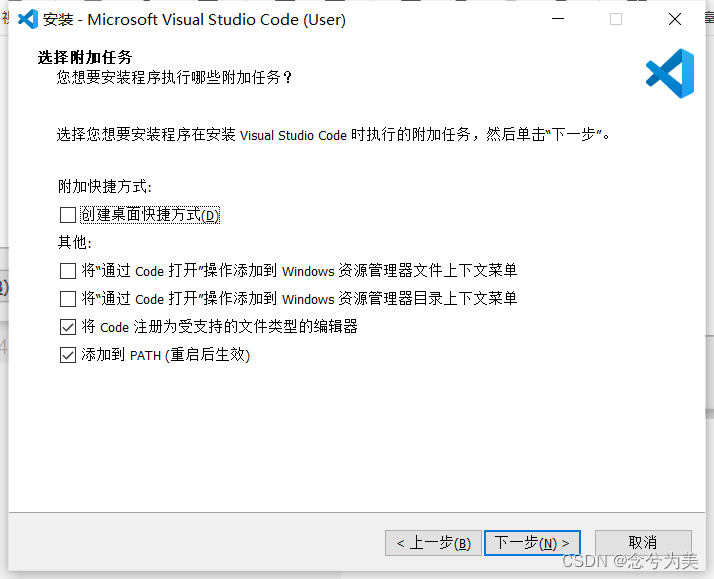
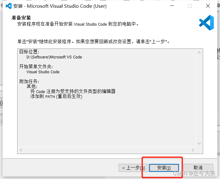
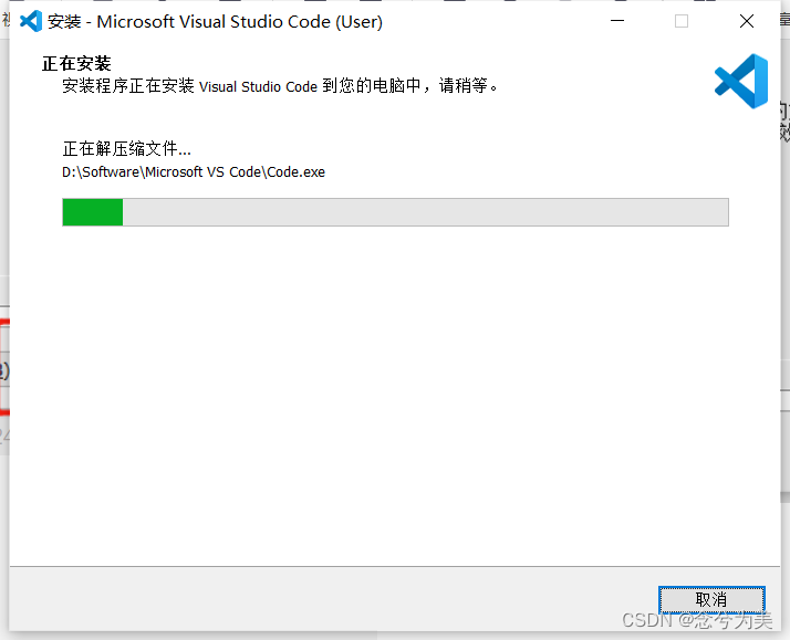
VSCode
蓝蓝设计建立了UI设计分享群,每天会分享国内外的一些优秀设计,如果有兴趣的话,可以进入一起成长学习,请加微信ban_lanlan,报下信息,蓝小助会请您入群。欢迎您加入噢~~
希望得到建议咨询、商务合作,也请与我们联系01063334945。
分享此文一切功德,皆悉回向给文章原作者及众读者. 免责声明:蓝蓝设计尊重原作者,文章的版权归原作者。如涉及版权问题,请及时与我们取得联系,我们立即更正或删除。
蓝蓝设计( www.lanlanwork.com )是一家专注而深入的界面设计公司,为期望卓越的国内外企业提供卓越的UI界面设计、BS界面设计 、 cs界面设计 、 ipad界面设计 、 包装设计 、 图标定制 、 用户体验 、交互设计、 网站建设 、平面设计服务、UI设计公司、界面设计公司、UI设计服务公司、数据可视化设计公司、UI交互设计公司、高端网站设计公司、UI咨询、用户体验公司、软件界面设计公司。
本章用到......uni-app页面跳转uni.navigateTo方法、uni.navigateBack方法。uni-app简单实现邮箱验证码发送点击后读秒样式。登录账号、密码正则表达式验证等
适合刚入门的小伙伴,大佬就没必要看了
静态页面!静态页面!没有绑定后端数据接口
目录
https://dcloud.io/hbuilderx.html

官网直接下载解压即可
文件-新建-项目
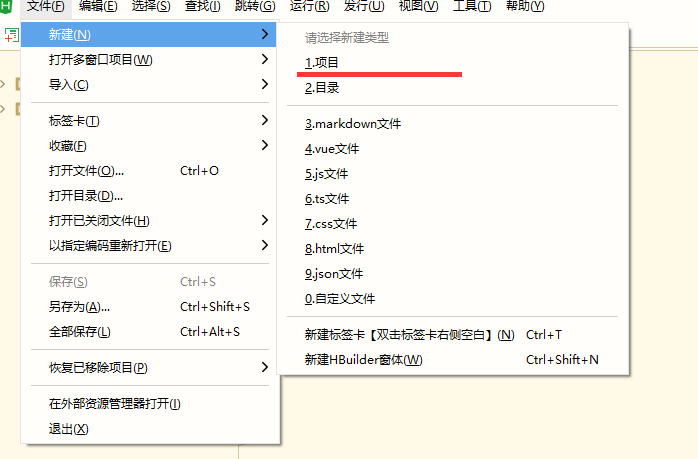
我这里直接选择默认模板,Vue版本、uniCloud自行选择即可

创建完成后自动生成文件夹

文件名这里自动生成原本是index,文件名自行定义即可
页面文件自己新建Vue文件即可
注意!!这个文件后续如果需要新添加新页面时这个文件里一定要配置参数不然页面出不来,代码格式看下面代码↓↓↓↓↓↓↓↓↓
类似navigationBarTitleText(导航栏text)、navigationBarBackgroundColor(导航栏背景色)等等属性可以查看相关资料自行配置即可
pages里设置单页面参数,每个页面配置对应path路径参数
globalStyle里设置全局页面参数
js、josn、scss文件等等其他配置文件这里就不多说了自行研究吧!!!因为我也还没搞清楚到底怎么用哈哈哈
进入正题↓↓↓↓↓↓↓↓↓↓↓↓↓代码看着有些乱........凑合看慢慢理解吧
代码里的src图片链接自行修改!!!!(还有css里的URL)
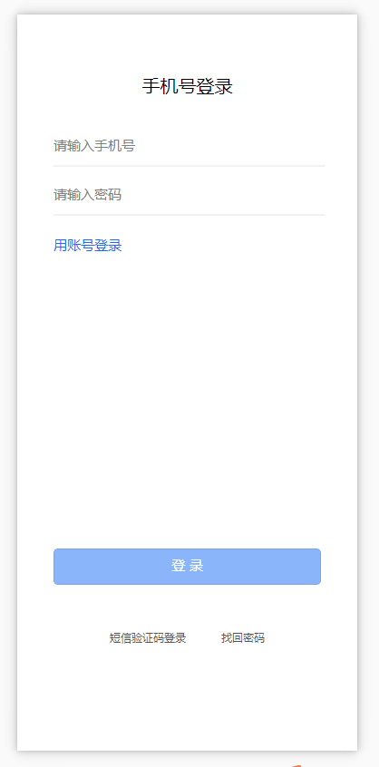
先看一下效果图
-
<!-- 登录页面 -->
-
<template>
-
<view class="flex-col flex-auto group">
-
<text class="self-center text_2" v-if="type==1000">手机号登录</text>
-
<text class="self-center text_2" v-if="type==2000">账号登录</text>
-
<!-- 手机号登录 -->
-
<view class="" v-if="type==1000">
-
<view class="flex-col justify-start items-start text-wrapper">
-
<input type="text" class="font_1" @input="onInput" placeholder="请输入手机号" v-model="phoneNumber">
-
</view>
-
<!-- svg画线 -->
-
<view style="height: 1px;">
-
<svg xmlns="http://www.w3.org/2000/svg" version="1.1">
-
<line x1="0" y1="0" x2="400" y2="0" style="stroke:rgb(0,0,0);stroke-width:0.2" />
-
</svg>
-
</view>
-
-
<view class="flex-col justify-start items-start text-wrapper_2">
-
<input type="text" password="true" class="font_1" @input="onInput" placeholder="请输入密码" v-model="phonePassword">
-
</view>
-
-
<!-- svg画线 -->
-
<view style="height: 1px;">
-
<svg xmlns="http://www.w3.org/2000/svg" version="1.1">
-
<line x1="0" y1="0" x2="400" y2="0" style="stroke:rgb(0,0,0);stroke-width:0.2" />
-
</svg>
-
</view>
-
</view>
-
<!-- 账号登录 -->
-
<view class="" v-if="type==2000">
-
<view class="flex-col justify-start items-start text-wrapper">
-
<input type="text" class="font_1" @input="onInput" placeholder="请输入用户名" v-model="idNumber">
-
</view>
-
<!-- svg画线 -->
-
<view style="height: 1px;">
-
<svg xmlns="http://www.w3.org/2000/svg" version="1.1">
-
<line x1="0" y1="0" x2="400" y2="0" style="stroke:rgb(0,0,0);stroke-width:0.2" />
-
</svg>
-
</view>
-
<view class="flex-col justify-start items-start text-wrapper_2">
-
<input type="text" password="true" class="font_1" @input="onInput" placeholder="请输入用户密码" v-model="idPassword">
-
</view>
-
<!-- svg画线 -->
-
<view style="height: 1px;">
-
<svg xmlns="http://www.w3.org/2000/svg" version="1.1">
-
<line x1="0" y1="0" x2="400" y2="0" style="stroke:rgb(0,0,0);stroke-width:0.2" />
-
</svg>
-
</view>
-
</view>
-
-
<view class="self-start font_1 text_3" @click="type=2000" v-if="type==1000">用账号登录</view>
-
<view class="self-start font_1 text_3" @click="type=1000" v-if="type==2000">用手机号登录</view>
-
<!-- 登录按钮1 -->
-
<view class="flex-col justify-start items-center button" v-if="btnShow">
-
<button class="font_1 text_4" @click="onSubmit">登 录</button>
-
</view>
-
<!-- 登录按钮2 -->
-
<view class="flex-col justify-start items-center button2" v-else>
-
<button class="font_1 text_66">登 录</button>
-
</view>
-
-
-
<view class="flex-row justify-between group_2" v-if="type==1000">
-
<text class="font_2" @click="onPageJump('/pages/login/phoneVerify')">短信验证码登录</text>
-
<text class="font_2" @click="onPageJump('/pages/login/findBack')">找回密码</text>
-
</view>
-
<view class="flex-row justify-between group_3" v-else>
-
<text class="font_2" @click="onPageJump('/pages/login/findBack')">找回密码</text>
-
</view>
-
</view>
-
-
</template>
-
-
<script>
-
export default {
-
components:{
-
-
},
-
data() {
-
return {
-
type: 1000, //判断登录类型手机登录或账号登录
-
phoneNumber:'', //手机账号
-
phonePassword:'', //手机密码
-
idNumber:'', //账号
-
idPassword:'', //账号密码
-
btnShow:false, //判断登录按钮显示隐藏
-
timeOut:null, //添加定时器
-
}
-
},
-
onLoad() {
-
-
},
-
created() {
-
-
},
-
// 方法
-
methods: {
-
// 找回密码跳转页面
-
onPageJump(url) {
-
uni.navigateTo({
-
url: url
-
});
-
},
-
// 判断显示登录按钮
-
onInput() {
-
this.timeOut && clearTimeout(this.timeOut)
-
this.timeOut = setTimeout(() => {
-
if (this.type == 1000) {
-
if (this.phoneNumber && this.phonePassword) {
-
this.btnShow = true;
-
} else {
-
this.btnShow = false;
-
}
-
} else {
-
if (this.idNumber && this.idPassword) {
-
this.btnShow = true;
-
} else {
-
this.btnShow = false;
-
}
-
}
-
}, 100);
-
},
-
// 点击登录
-
onSubmit(){
-
// 判断登录方式为手机号登录
-
if(this.type==1000){
-
// 判断验证手机号
-
if(!this.phoneNumber){
-
uni.showToast({
-
title: '请输入手机号',
-
icon: 'none',
-
});
-
return;
-
}
-
const phoneNumber= /^(0|86|17951)?(13[0-9]|15[012356789]|17[678]|18[0-9]|14[57])[0-9]{8}$/;
-
if(!phoneNumber.test(this.phoneNumber)){
-
uni.showToast({
-
title: '手机号输入不正确',
-
icon: 'none',
-
});
-
return;
-
}
-
// 判断验证手机密码
-
if(!this.phonePassword){
-
uni.showToast({
-
title: '请输入密码',
-
icon: 'none',
-
});
-
return;
-
}
-
uni.showToast({
-
title: '正在登录',
-
icon: 'loading',
-
});
-
}else{
-
// 判断验证账号
-
if(!this.idNumber){
-
uni.showToast({
-
title: '请输入账号',
-
icon: 'none',
-
});
-
return;
-
}
-
// 判断验证账号密码
-
if(!this.idPassword){
-
uni.showToast({
-
title: '请输入账号密码',
-
icon: 'none',
-
});
-
return;
-
}
-
uni.showToast({
-
title: '正在登录',
-
icon: 'loading',
-
});
-
}
-
},
-
-
-
-
-
}
-
}
-
</script>
-
-
<style>
-
@import"../../style/css/login.css";
-
</style>
一个小tips:
先说一下这个页面↑↑↑↑↑↑↑↑↑↑↑↑↑↑
svg因为我这里账号、密码input输入框的border边框要设置成小数1px以下0.1px、0.2px、0.3px等等,所以这里用了svg的画图,如果有小伙伴碰到同样问题可以参考一下,不需要的直接style里直接设置border参数即可
uni.showToast是uni-app弹出框的方法直接用就行,参数么。。自己研究研究就行 (例:icon图标参数有四种类型none、loading、success、error)
style外部引用css样式直接用@import相对路径即可
style样式最好还是用自己写的就别直接复制了,我这里用的是平台自动生成的所以比较乱随便看看就行了看多了头疼(仅供参考全局样式可以直接略过)
-
/************************************************************
-
** 全局样式 ** **
-
************************************************************/
-
html {
-
font-size: 16px;
-
}
-
-
body {
-
margin: 0;
-
font-family: -apple-system, BlinkMacSystemFont, 'Segoe UI', 'Roboto', 'Oxygen', 'Ubuntu', 'Cantarell', 'Fira Sans',
-
'Droid Sans', 'Helvetica Neue', 'Microsoft Yahei', sans-serif;
-
-webkit-font-smoothing: antialiased;
-
-moz-osx-font-smoothing: grayscale;
-
}
-
-
view,
-
image,
-
text {
-
box-sizing: border-box;
-
flex-shrink: 0;
-
}
-
-
#app {
-
width: 100vw;
-
height: 100vh;
-
}
-
-
.flex-row {
-
display: flex;
-
flex-direction: row;
-
}
-
-
.flex-col {
-
display: flex;
-
flex-direction: column;
-
}
-
-
.justify-start {
-
justify-content: flex-start;
-
}
-
-
.justify-end {
-
justify-content: flex-end;
-
}
-
-
.justify-center {
-
justify-content: center;
-
}
-
-
.justify-between {
-
justify-content: space-between;
-
}
-
-
.justify-around {
-
justify-content: space-around;
-
}
-
-
.justify-evenly {
-
justify-content: space-evenly;
-
}
-
-
.items-start {
-
align-items: flex-start;
-
}
-
-
.items-end {
-
align-items: flex-end;
-
}
-
-
.items-center {
-
align-items: center;
-
}
-
-
.items-baseline {
-
align-items: baseline;
-
}
-
-
.items-stretch {
-
align-items: stretch;
-
}
-
-
.self-start {
-
align-self: flex-start;
-
}
-
-
.self-end {
-
align-self: flex-end;
-
}
-
-
.self-center {
-
align-self: center;
-
}
-
-
.self-baseline {
-
align-self: baseline;
-
}
-
-
.self-stretch {
-
align-self: stretch;
-
}
-
-
.flex-1 {
-
flex: 1 1 0%;
-
}
-
-
.flex-auto {
-
flex: 1 1 auto;
-
}
-
-
.grow {
-
flex-grow: 1;
-
}
-
-
.grow-0 {
-
flex-grow: 0;
-
}
-
-
.shrink {
-
flex-shrink: 1;
-
}
-
-
.shrink-0 {
-
flex-shrink: 0;
-
}
-
-
.relative {
-
position: relative;
-
}
-
-
/* ---------------------------------------------------------------------- */
-
-
.group {
-
padding: 20px 40px 10px;
-
overflow-y: auto;
-
}
-
.text_2 {
-
color: #020202;
-
font-size: 20px;
-
font-family: 'PingFang SC';
-
line-height: 28px;
-
text-align: center;
-
}
-
.text-wrapper {
-
margin-top: 42px;
-
padding-bottom: 12px;
-
/* border-bottom: solid 1px #888888; */
-
}
-
.font_1 {
-
width: 100%;
-
font-size: 15px;
-
font-family: 'PingFang SC';
-
line-height: 21px;
-
color: #00000;
-
}
-
.text-wrapper_2 {
-
padding: 20px 0 12px;
-
/* border-bottom: solid 1px #888888; */
-
}
-
.text_3 {
-
margin-top: 22px;
-
color: #166bf8;
-
}
-
/* 登录按钮1 */
-
.button button {
-
margin-top: 324px;
-
padding: 8px 0 11px;
-
/* background-color: #166bf880; */
-
background-image: url('。。。。。。。。。。。。。。。。。。。。');
-
background-size: 100% 100%;
-
background-repeat: no-repeat;
-
border-radius: 5px;
-
width: 100%;
-
}
-
.text_4 {
-
color: #ffffff;
-
}
-
.group_2 {
-
padding: 50px 62px;
-
}
-
.group_3 {
-
padding: 50px 42%;
-
}
-
.font_2 {
-
font-size: 12px;
-
font-family: 'PingFang SC';
-
line-height: 17px;
-
color: #555555;
-
}
-
/* 登录按钮2*/
-
.button2 button{
-
width: 100%;
-
margin-top: 324px;
-
padding: 8px 0 11px;
-
background-color: #166bf880;
-
border-radius: 5px;
-
line-height: 21px;
-
font-size: 15px;
-
}
-
.text_66 {
-
color: #ffffff;
-
}
点击登录页面上的短信验证码登录后跳转到此页,跳转方法会用到uni.navigateTo方法在登录页面看代码自行理解吧↑↑↑↑↑↑↑↑↑↑↑
跳转、返回的方法参考文档:
注意!!添加新页面的时候上面的↑↑↑↑↑↑↑↑↑↑↑pages.json配置文件也需要添加对应的页面配置才行不然页面出不来
效果图:
-
<!-- 手机验证找回密码 -->
-
<template>
-
<view class="flex-col flex-auto group">
-
<text class="self-center text_2">手机号+短信验证码登录</text>
-
<view class="flex-col group_2 space-y-10">
-
<input type="number" class="self-start font_1" @input="onInput" placeholder="请输入手机号码" v-model="phoneNumber">
-
<!-- svg画线 -->
-
<view style="height: 1px;">
-
<svg xmlns="http://www.w3.org/2000/svg" version="1.1">
-
<line x1="0" y1="0" x2="400" y2="0" style="stroke:rgb(0,0,0);stroke-width:0.2" />
-
</svg>
-
</view>
-
-
<view class="flex-row justify-between group_3">
-
<input type="number" class="self-start font_1 text_4" maxlength="6" @input="onInput" placeholder="请输入验证码" v-model="code">
-
<view class="flex-col justify-start items-center self-center text-wrapper">
-
<!-- <text class="font_1 text_3" @click="onSetCode()">获取验证码</text> -->
-
<text v-bind:class="{acquire:isGrey,again:!isGrey}"
-
v-bind:disabled="dis" type="primary"
-
@click="onSetCode">
-
<span v-if="show">获取验证码</span>
-
<span v-else>重新发送({{count}}s)</span>
-
</text>
-
</view>
-
</view>
-
-
<!-- svg画线 -->
-
<view style="height: 1px;">
-
<svg xmlns="http://www.w3.org/2000/svg" version="1.1">
-
<line x1="0" y1="0" x2="400" y2="0" style="stroke:rgb(0,0,0);stroke-width:0.2" />
-
</svg>
-
</view>
-
</view>
-
<view class="self-start font_1 text_5" @click="onPageJump('/pages/login/login')">用密码登录</view>
-
<view class="flex-col justify-start items-center button" v-if="btnShow">
-
<button class="font_1 text_6" @click="onSubmit()">登 录</button>
-
</view>
-
<!-- 登录按钮2 -->
-
<view class="flex-col justify-start items-center button2" v-else>
-
<button class="font_1 text_66">登 录</button>
-
</view>
-
<text class="self-center text_7" @click="onPageJump('/pages/login/findBack')">找回密码</text>
-
</view>
-
-
</template>
-
-
<script>
-
export default {
-
components: {
-
-
},
-
data() {
-
return {
-
phoneNumber:'', //手机号验证
-
code:'', //验证码
-
dis: false, //判断是否禁用状态
-
show: true, //判断显示为发送还是重新发送
-
isGrey: false, //class判断按钮样式
-
timer: null, //设置计时器,
-
count: "", //定义常量
-
num:'', //判断是否为第一次点击
-
btnShow:false, //判断登录按钮显示隐藏
-
timeOut:null, //添加定时器
-
};
-
},
-
// 方法
-
methods: {
-
// 找回密码跳转页面
-
onPageJump(url) {
-
uni.navigateTo({
-
url: url
-
});
-
},
-
-
// 发送验证码
-
onSetCode() {
-
let TIME_COUNT = 60;
-
if (!this.timer) {
-
uni.showToast({
-
title: '已发送验证码',
-
icon: 'success',
-
});
-
this.count = TIME_COUNT;
-
this.isGrey = true;
-
this.show = false;
-
this.dis = true;
-
this.timer = setInterval(() => {
-
if (this.count > 0 && this.count <= TIME_COUNT) {
-
this.count--;
-
} else {
-
this.dis = false;
-
this.isGrey = false;
-
this.show = true;
-
clearInterval(this.timer);
-
this.timer = null;
-
}
-
}, 1000);
-
}
-
},
-
// 判断显示登录按钮
-
onInput() {
-
this.timeOut && clearTimeout(this.timeOut)
-
this.timeOut = setTimeout(() => {
-
if (this.phoneNumber && this.code) {
-
this.btnShow = true;
-
} else {
-
this.btnShow = false;
-
}
-
}, 100);
-
},
-
//点击登录
-
onSubmit(){
-
// 判断验证手机号
-
if(!this.phoneNumber){
-
uni.showToast({
-
title: '请输入手机号',
-
icon: 'none',
-
});
-
return;
-
}
-
const phoneNumber= /^(0|86|17951)?(13[0-9]|15[012356789]|17[678]|18[0-9]|14[57])[0-9]{8}$/;
-
if(!phoneNumber.test(this.phoneNumber)){
-
uni.showToast({
-
title: '手机号输入不正确',
-
icon: 'none',
-
});
-
return;
-
}
-
// 判断验证码
-
if(!this.code){
-
uni.showToast({
-
title: '请输入验证码',
-
icon: 'none',
-
});
-
return;
-
}
-
uni.showToast({
-
title: '请稍后...',
-
icon: 'loading',
-
});
-
},
-
-
},
-
};
-
</script>
-
-
<style>
-
@import"../../style/css/phoneVerify.css";
-
/* 验证码按钮样式 */
-
.acquire{
-
padding: 3px 0px;
-
background-color: #eeeeee;
-
border-radius: 5px;
-
width: 92px;
-
height: 29px;
-
color: #666;
-
font-size: 14px;
-
line-height: 20px;
-
text-align: center;
-
}
-
.again{
-
padding: 3px 0px;
-
background-color: #eeeeee;
-
border-radius: 5px;
-
width: 92px;
-
height: 29px;
-
color: #000000;
-
font-size: 14px;
-
line-height: 20px;
-
text-align: center;
-
}
-
-
</style>
这个页面因为是静态的没有后端接口只是做的样式,所以验证码读秒这块内容刷新页面时会重置重新开始读秒这里注意一下就行,如果接后端接口实现的话原理也差不多自己慢慢理解就行
大概就长这样:

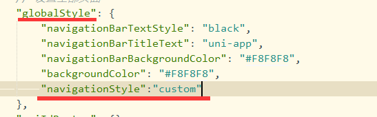
至于左上角这个返回键的小钮钮是uni-app创建项目时自带的 pages.json配置文件可以配置关闭 用("navigationStyle":"custom")这个参数就能关闭,单页面关闭在pages里配置,全部关闭在globalStyle里配置。
大概长这样:

也可以在Vue页面的方法里用uni.navigateBack方法自己写一个返回的方法。uni.navigateBack返回页面的方法具体怎么用↓↓↓↓↓↓↓↓↓↓↓↓↓↓↓↓↓↓↓后面的页面会有用到
-
/************************************************************
-
** 全局样式 **
-
************************************************************/
-
html {
-
font-size: 16px;
-
}
-
-
body {
-
margin: 0;
-
font-family: -apple-system, BlinkMacSystemFont, 'Segoe UI', 'Roboto', 'Oxygen', 'Ubuntu', 'Cantarell', 'Fira Sans',
-
'Droid Sans', 'Helvetica Neue', 'Microsoft Yahei', sans-serif;
-
-webkit-font-smoothing: antialiased;
-
-moz-osx-font-smoothing: grayscale;
-
}
-
-
view,
-
image,
-
text {
-
box-sizing: border-box;
-
flex-shrink: 0;
-
}
-
-
#app {
-
width: 100vw;
-
height: 100vh;
-
}
-
-
.flex-row {
-
display: flex;
-
flex-direction: row;
-
}
-
-
.flex-col {
-
display: flex;
-
flex-direction: column;
-
}
-
-
.justify-start {
-
justify-content: flex-start;
-
}
-
-
.justify-end {
-
justify-content: flex-end;
-
}
-
-
.justify-center {
-
justify-content: center;
-
}
-
-
.justify-between {
-
justify-content: space-between;
-
}
-
-
.justify-around {
-
justify-content: space-around;
-
}
-
-
.justify-evenly {
-
justify-content: space-evenly;
-
}
-
-
.items-start {
-
align-items: flex-start;
-
}
-
-
.items-end {
-
align-items: flex-end;
-
}
-
-
.items-center {
-
align-items: center;
-
}
-
-
.items-baseline {
-
align-items: baseline;
-
}
-
-
.items-stretch {
-
align-items: stretch;
-
}
-
-
.self-start {
-
align-self: flex-start;
-
}
-
-
.self-end {
-
align-self: flex-end;
-
}
-
-
.self-center {
-
align-self: center;
-
}
-
-
.self-baseline {
-
align-self: baseline;
-
}
-
-
.self-stretch {
-
align-self: stretch;
-
}
-
-
.flex-1 {
-
flex: 1 1 0%;
-
}
-
-
.flex-auto {
-
flex: 1 1 auto;
-
}
-
-
.grow {
-
flex-grow: 1;
-
}
-
-
.grow-0 {
-
flex-grow: 0;
-
}
-
-
.shrink {
-
flex-shrink: 1;
-
}
-
-
.shrink-0 {
-
flex-shrink: 0;
-
}
-
-
.relative {
-
position: relative;
-
}
-
-
/* ------------------------------------------------ */
-
.group {
-
padding: 30px 40px 60px;
-
overflow-y: auto;
-
}
-
.text_2 {
-
color: #020202;
-
font-size: 20px;
-
font-family: 'PingFang SC';
-
line-height: 28px;
-
}
-
.group_2 {
-
margin-top: 42px;
-
/* border-bottom: solid 1px #888888; */
-
}
-
.space-y-10 > view:not(:first-child),
-
.space-y-10 > text:not(:first-child),
-
.space-y-10 > image:not(:first-child) {
-
margin-top: 10px;
-
}
-
.font_1 {
-
font-size: 15px;
-
font-family: 'PingFang SC';
-
line-height: 21px;
-
color: #000000;
-
}
-
.group_3 {
-
padding: 5px 0;
-
/* border-top: solid 1px #888888; */
-
}
-
.text_4 {
-
margin-top: 8px;
-
}
-
.text-wrapper {
-
padding: 4px 0;
-
background-color: #eeeeee;
-
border-radius: 5px;
-
width: 92px;
-
height: 29px;
-
}
-
.text_3 {
-
color: #000000;
-
font-size: 14px;
-
line-height: 20px;
-
}
-
.text_5 {
-
margin-top: 22px;
-
color: #166bf8;
-
}
-
.button button{
-
margin-top: 324px;
-
padding: 8px 0 11px;
-
/* background-color: #166bf880; */
-
background-image: url('。。。。。。。。。。。。。。。。。。。。。。');
-
background-size: 100% 100%;
-
background-repeat: no-repeat;
-
border-radius: 5px;
-
width: 100%;
-
}
-
.text_6 {
-
color: #ffffff;
-
}
-
.text_7 {
-
margin-top: 50px;
-
color: #555555;
-
font-size: 12px;
-
font-family: 'PingFang SC';
-
line-height: 17px;
-
}
-
/* 登录按钮2*/
-
.button2 button{
-
width: 100%;
-
margin-top: 324px;
-
padding: 8px 0 11px;
-
background-color: #166bf880;
-
border-radius: 5px;
-
line-height: 21px;
-
font-size: 15px;
-
}
-
.text_66 {
-
color: #ffffff;
-
}
在登录页面点击找回密码后跳转到此页面
同样在pages.json文件里配置对应页面参数↑↑↑↑↑↑↑↑↑
效果图:
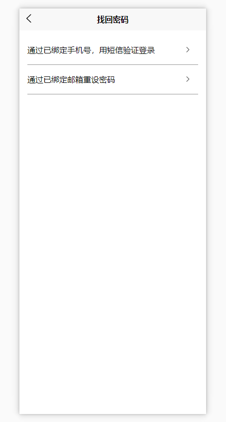
点击通过手机号跳转到手机短信验证页面 也就是第四步的页面点击通过邮箱验证跳转到邮箱验证页面 也就是第六步的页面
-
<!-- 找回密码 -->
-
<template>
-
<view class="flex-col justify-start flex-auto group_3">
-
<view class="flex-col section">
-
<view class="flex-row justify-between items-center group_4" @click="onPageJump('/pages/login/phoneVerify')">
-
<text class="font_1">通过已绑定手机号,用短信验证登录</text>
-
<image
-
class="image_5"
-
src="https://codefun-proj-user-res-1256085488.cos.ap-guangzhou.myqcloud.com/637d8bf95a7e3f031010c80e/63e351ec66570000128a304a/16758423632990405565.png"
-
/>
-
</view>
-
<view class="flex-row justify-between items-center group_4" @click="onPageJump('/pages/login/mailFindBack')">
-
<text class="font_1">通过已绑定邮箱重设密码</text>
-
<image
-
class="image_5"
-
src="。。。。。。。。。。。。。。。"
-
/>
-
</view>
-
</view>
-
</view>
-
</template>
-
-
<script>
-
export default {
-
components: {},
-
data() {
-
return {
-
-
};
-
-
},
-
-
methods: {
-
onPageJump(url) {
-
uni.navigateTo({
-
url:url
-
})
-
},
-
},
-
};
-
</script>
-
-
<style>
-
@import"../../style/css/findBack.css";
-
</style>
-
/************************************************************
-
** 全局样式 **
-
************************************************************/
-
html {
-
font-size: 16px;
-
}
-
-
body {
-
margin: 0;
-
font-family: -apple-system, BlinkMacSystemFont, 'Segoe UI', 'Roboto', 'Oxygen', 'Ubuntu', 'Cantarell', 'Fira Sans',
-
'Droid Sans', 'Helvetica Neue', 'Microsoft Yahei', sans-serif;
-
-webkit-font-smoothing: antialiased;
-
-moz-osx-font-smoothing: grayscale;
-
}
-
-
view,
-
image,
-
text {
-
box-sizing: border-box;
-
flex-shrink: 0;
-
}
-
-
#app {
-
width: 100vw;
-
height: 100vh;
-
}
-
-
.flex-row {
-
display: flex;
-
flex-direction: row;
-
}
-
-
.flex-col {
-
display: flex;
-
flex-direction: column;
-
}
-
-
.justify-start {
-
justify-content: flex-start;
-
}
-
-
.justify-end {
-
justify-content: flex-end;
-
}
-
-
.justify-center {
-
justify-content: center;
-
}
-
-
.justify-between {
-
justify-content: space-between;
-
}
-
-
.justify-around {
-
justify-content: space-around;
-
}
-
-
.justify-evenly {
-
justify-content: space-evenly;
-
}
-
-
.items-start {
-
align-items: flex-start;
-
}
-
-
.items-end {
-
align-items: flex-end;
-
}
-
-
.items-center {
-
align-items: center;
-
}
-
-
.items-baseline {
-
align-items: baseline;
-
}
-
-
.items-stretch {
-
align-items: stretch;
-
}
-
-
.self-start {
-
align-self: flex-start;
-
}
-
-
.self-end {
-
align-self: flex-end;
-
}
-
-
.self-center {
-
align-self: center;
-
}
-
-
.self-baseline {
-
align-self: baseline;
-
}
-
-
.self-stretch {
-
align-self: stretch;
-
}
-
-
.flex-1 {
-
flex: 1 1 0%;
-
}
-
-
.flex-auto {
-
flex: 1 1 auto;
-
}
-
-
.grow {
-
flex-grow: 1;
-
}
-
-
.grow-0 {
-
flex-grow: 0;
-
}
-
-
.shrink {
-
flex-shrink: 1;
-
}
-
-
.shrink-0 {
-
flex-shrink: 0;
-
}
-
-
.relative {
-
position: relative;
-
}
-
-
.font_1 {
-
font-size: 16px;
-
font-family: 'PingFang SC';
-
line-height: 22px;
-
color: #020202;
-
}
-
.group_3 {
-
padding: 10px 0 586px;
-
overflow-y: auto;
-
}
-
.section {
-
padding: 0px 16px;
-
background-color: #ffffff;
-
}
-
.group_4 {
-
padding: 18px 0;
-
border-bottom: solid 1px #979797;
-
}
-
.image_5 {
-
margin-right: 14px;
-
width: 12px;
-
height: 12px;
-
}
效果图:

-
<!-- 邮件找回密码 -->
-
<template>
-
<view class="flex-col flex-auto group">
-
<text class="self-center text_2">通过邮箱找回密码</text>
-
<input type="text" class="self-start font_1 text_3" @input="onInput" placeholder="请输入您绑定的邮箱地址" v-model="email">
-
<!-- svg画线 -->
-
<view style="height: 1px;">
-
<svg xmlns="http://www.w3.org/2000/svg" version="1.1">
-
<line x1="0" y1="0" x2="400" y2="0" style="stroke:rgb(0,0,0);stroke-width:0.2" />
-
</svg>
-
</view>
-
-
<view class="flex-col justify-start items-center button" v-if="btnShow">
-
<text class="font_1 text_4" @click="onSubmit()">下一步</text>
-
</view>
-
<!-- 下一步按钮2 -->
-
<view class="flex-col justify-start items-center button2" v-else>
-
<button class="font_1 text_66">下一步</button>
-
</view>
-
</view>
-
</template>
-
-
<script>
-
export default {
-
components: {
-
-
},
-
data() {
-
return {
-
email:'', //邮箱
-
btnShow:false, //判断登录按钮显示隐藏
-
timeOut:null, //添加定时器
-
};
-
},
-
-
methods: {
-
// 判断显示下一步按钮
-
onInput() {
-
this.timeOut && clearTimeout(this.timeOut)
-
this.timeOut = setTimeout(() => {
-
if (this.email) {
-
this.btnShow = true;
-
} else {
-
this.btnShow = false;
-
}
-
}, 100);
-
},
-
// 点击下一步
-
onSubmit(){
-
if(!this.email){
-
uni.showToast({
-
title: '请输入邮箱',
-
icon: 'none',
-
});
-
return;
-
}
-
const email= /^\w{3,}@\w{2,}\.(com|cn|net|com\.cn)$/;
-
if(!email.test(this.email)){
-
uni.showToast({
-
title: '邮箱输入不正确',
-
icon: 'none',
-
});
-
return;
-
}
-
uni.showToast({
-
title: '请稍后...',
-
icon: 'loading',
-
-
});
-
// 添加定时器延时跳转页面
-
setTimeout(function(){
-
uni.navigateTo({
-
url: '/pages/login/emailFinish'
-
});
-
},2000)
-
-
}
-
},
-
};
-
</script>
-
-
<style>
-
@import"../../style/css/mailFindBack.css";
-
</style>
-
/************************************************************
-
** 全局样式 **
-
************************************************************/
-
-
html {
-
font-size: 16px;
-
}
-
-
body {
-
margin: 0;
-
font-family: -apple-system, BlinkMacSystemFont, 'Segoe UI', 'Roboto', 'Oxygen', 'Ubuntu', 'Cantarell', 'Fira Sans',
-
'Droid Sans', 'Helvetica Neue', 'Microsoft Yahei', sans-serif;
-
-webkit-font-smoothing: antialiased;
-
-moz-osx-font-smoothing: grayscale;
-
}
-
-
view,
-
image,
-
text {
-
box-sizing: border-box;
-
flex-shrink: 0;
-
}
-
-
#app {
-
width: 100vw;
-
height: 100vh;
-
}
-
-
.flex-row {
-
display: flex;
-
flex-direction: row;
-
}
-
-
.flex-col {
-
display: flex;
-
flex-direction: column;
-
}
-
-
.justify-start {
-
justify-content: flex-start;
-
}
-
-
.justify-end {
-
justify-content: flex-end;
-
}
-
-
.justify-center {
-
justify-content: center;
-
}
-
-
.justify-between {
-
justify-content: space-between;
-
}
-
-
.justify-around {
-
justify-content: space-around;
-
}
-
-
.justify-evenly {
-
justify-content: space-evenly;
-
}
-
-
.items-start {
-
align-items: flex-start;
-
}
-
-
.items-end {
-
align-items: flex-end;
-
}
-
-
.items-center {
-
align-items: center;
-
}
-
-
.items-baseline {
-
align-items: baseline;
-
}
-
-
.items-stretch {
-
align-items: stretch;
-
}
-
-
.self-start {
-
align-self: flex-start;
-
}
-
-
.self-end {
-
align-self: flex-end;
-
}
-
-
.self-center {
-
align-self: center;
-
}
-
-
.self-baseline {
-
align-self: baseline;
-
}
-
-
.self-stretch {
-
align-self: stretch;
-
}
-
-
.flex-1 {
-
flex: 1 1 0%;
-
}
-
-
.flex-auto {
-
flex: 1 1 auto;
-
}
-
-
.grow {
-
flex-grow: 1;
-
}
-
-
.grow-0 {
-
flex-grow: 0;
-
}
-
-
.shrink {
-
flex-shrink: 1;
-
}
-
-
.shrink-0 {
-
flex-shrink: 0;
-
}
-
-
.relative {
-
position: relative;
-
}
-
/* ------------------------------------------------------------------------------ */
-
-
.group {
-
padding: 25px 40px 127px;
-
overflow-y: auto;
-
}
-
.text_2 {
-
color: #020202;
-
font-size: 20px;
-
font-family: 'PingFang SC';
-
line-height: 28px;
-
}
-
.font_1 {
-
font-size: 15px;
-
font-family: 'PingFang SC';
-
line-height: 21px;
-
}
-
.text_3 {
-
margin-top: 42px;
-
margin-bottom: 12px;
-
color: #999999;
-
}
-
/* .section {
-
margin-top: 12px;
-
background-color: #888888;
-
height: 1px;
-
} */
-
.button {
-
margin-top: 324px;
-
padding: 8px 0 11px;
-
/* background-color: #166bf880; */
-
background-image: url('。。。。。。。。。。。。');
-
background-size: 100% 100%;
-
background-repeat: no-repeat;
-
border-radius: 5px;
-
}
-
.text_4 {
-
color: #ffffff;
-
}
-
/* 下一步按钮2*/
-
.button2 button{
-
width: 100%;
-
margin-top: 324px;
-
padding: 8px 0 11px;
-
background-color: #166bf880;
-
border-radius: 5px;
-
line-height: 21px;
-
font-size: 15px;
-
}
-
.text_66 {
-
color: #ffffff;
-
}
效果图:

-
<template>
-
<view class="flex-col flex-auto group">
-
<view class="flex-col group_2">
-
<image
-
class="self-center image_5"
-
src="。。。。。。。。。。。。。。"
-
/>
-
<text class="self-center text_2">请访问邮件中给出的网页链接地址,根据页面提示完成密码重设。</text>
-
<view class="flex-col justify-start items-center button">
-
<button class="text_3" @click="Back">确定</button>
-
</view>
-
</view>
-
</view>
-
</template>
-
-
<script>
-
export default {
-
components: {
-
-
},
-
data() {
-
return {
-
-
};
-
},
-
-
methods: {
-
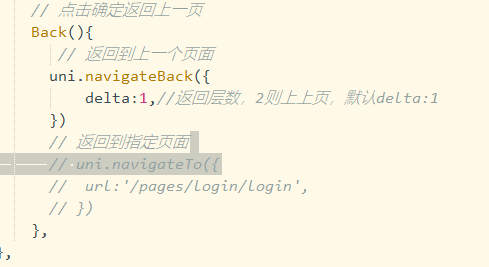
// 点击确定返回上一页
-
Back(){
-
// 返回到上一个页面
-
uni.navigateBack({
-
delta:1,//返回层数,2则上上页,默认delta:1
-
})
-
},
-
},
-
};
-
-
</script>
-
-
<style>
-
@import"../../style/css/emailFinish.css";
-
</style>
点击返回上一页面可以用uni.navigateBack方法
点击跳转到指定页面可以用uni.navigateTo方法(因为都属于跳转页面也可以用这个方法返回上一页自行理解吧)
大概长这样:
-
/************************************************************
-
** 全局样式 **
-
************************************************************/
-
-
html {
-
font-size: 16px;
-
}
-
-
body {
-
margin: 0;
-
font-family: -apple-system, BlinkMacSystemFont, 'Segoe UI', 'Roboto', 'Oxygen', 'Ubuntu', 'Cantarell', 'Fira Sans',
-
'Droid Sans', 'Helvetica Neue', 'Microsoft Yahei', sans-serif;
-
-webkit-font-smoothing: antialiased;
-
-moz-osx-font-smoothing: grayscale;
-
}
-
-
view,
-
image,
-
text {
-
box-sizing: border-box;
-
flex-shrink: 0;
-
}
-
-
#app {
-
width: 100vw;
-
height: 100vh;
-
}
-
-
.flex-row {
-
display: flex;
-
flex-direction: row;
-
}
-
-
.flex-col {
-
display: flex;
-
flex-direction: column;
-
}
-
-
.justify-start {
-
justify-content: flex-start;
-
}
-
-
.justify-end {
-
justify-content: flex-end;
-
}
-
-
.justify-center {
-
justify-content: center;
-
}
-
-
.justify-between {
-
justify-content: space-between;
-
}
-
-
.justify-around {
-
justify-content: space-around;
-
}
-
-
.justify-evenly {
-
justify-content: space-evenly;
-
}
-
-
.items-start {
-
align-items: flex-start;
-
}
-
-
.items-end {
-
align-items: flex-end;
-
}
-
-
.items-center {
-
align-items: center;
-
}
-
-
.items-baseline {
-
align-items: baseline;
-
}
-
-
.items-stretch {
-
align-items: stretch;
-
}
-
-
.self-start {
-
align-self: flex-start;
-
}
-
-
.self-end {
-
align-self: flex-end;
-
}
-
-
.self-center {
-
align-self: center;
-
}
-
-
.self-baseline {
-
align-self: baseline;
-
}
-
-
.self-stretch {
-
align-self: stretch;
-
}
-
-
.flex-1 {
-
flex: 1 1 0%;
-
}
-
-
.flex-auto {
-
flex: 1 1 auto;
-
}
-
-
.grow {
-
flex-grow: 1;
-
}
-
-
.grow-0 {
-
flex-grow: 0;
-
}
-
-
.shrink {
-
flex-shrink: 1;
-
}
-
-
.shrink-0 {
-
flex-shrink: 0;
-
}
-
-
.relative {
-
position: relative;
-
}
-
/* ------------------------------------------------------------------------------ */
-
-
.group {
-
padding: 25px 40px 127px;
-
overflow-y: auto;
-
}
-
.text_2 {
-
color: #020202;
-
font-size: 20px;
-
font-family: 'PingFang SC';
-
line-height: 28px;
-
}
-
.font_1 {
-
font-size: 15px;
-
font-family: 'PingFang SC';
-
line-height: 21px;
-
}
-
.text_3 {
-
margin-top: 42px;
-
margin-bottom: 12px;
-
color: #999999;
-
}
-
/* .section {
-
margin-top: 12px;
-
background-color: #888888;
-
height: 1px;
-
} */
-
.button {
-
margin-top: 324px;
-
padding: 8px 0 11px;
-
/* background-color: #166bf880; */
-
background-image: url('。。。。。。。。。。。。。。。');
-
background-size: 100% 100%;
-
background-repeat: no-repeat;
-
border-radius: 5px;
-
}
-
.text_4 {
-
color: #ffffff;
-
}
-
/* 下一步按钮2*/
-
.button2 button{
-
width: 100%;
-
margin-top: 324px;
-
padding: 8px 0 11px;
-
background-color: #166bf880;
-
border-radius: 5px;
-
line-height: 21px;
-
font-size: 15px;
-
}
-
.text_66 {
-
color: #ffffff;
-
}
本章也是自己参考相关资料和各位大佬的文章自行整理仅供参考,希望可以帮助到和我一样菜鸡的小伙伴
参考资料:
https://blog.csdn.net/weixin_40614372/article/details/101537653
uni-app官网:
https://uniapp.dcloud.net.cn/component/
登录页面完成后我用的是Strophe.js对接Openfire的接口,然后把Strophe.js的用法加到↑本文的登录页里使用
蓝蓝设计建立了UI设计分享群,每天会分享国内外的一些优秀设计,如果有兴趣的话,可以进入一起成长学习,请加微信ban_lanlan,报下信息,蓝小助会请您入群。欢迎您加入噢~~
希望得到建议咨询、商务合作,也请与我们联系01063334945。
分享此文一切功德,皆悉回向给文章原作者及众读者. 免责声明:蓝蓝设计尊重原作者,文章的版权归原作者。如涉及版权问题,请及时与我们取得联系,我们立即更正或删除。
蓝蓝设计( www.lanlanwork.com )是一家专注而深入的界面设计公司,为期望卓越的国内外企业提供卓越的UI界面设计、BS界面设计 、 cs界面设计 、 ipad界面设计 、 包装设计 、 图标定制 、 用户体验 、交互设计、 网站建设 、平面设计服务、UI设计公司、界面设计公司、UI设计服务公司、数据可视化设计公司、UI交互设计公司、高端网站设计公司、UI咨询、用户体验公司、软件界面设计公司。


作者:蓝蓝设计 图片来源:花瓣网
蓝蓝设计建立了UI设计分享群,每天会分享国内外的一些优秀设计,如果有兴趣的话,可以进入一起成长学习,请加微信ban_lanlan,报下信息,蓝小助会请您入群。欢迎您加入噢~~
希望得到建议咨询、商务合作,也请与我们联系01063334945。
分享此文一切功德,皆悉回向给文章原作者及众读者. 免责声明:蓝蓝设计尊重原作者,文章的版权归原作者。如涉及版权问题,请及时与我们取得联系,我们立即更正或删除。
蓝蓝设计( www.lanlanwork.com )是一家专注而深入的界面设计公司,为期望卓越的国内外企业提供卓越的UI界面设计、BS界面设计 、 cs界面设计 、 ipad界面设计 、 包装设计 、 图标定制 、 用户体验 、交互设计、 网站建设 、平面设计服务、UI设计公司、界面设计公司、UI设计服务公司、数据可视化设计公司、UI交互设计公司、高端网站设计公司、UI咨询、用户体验公司、软件界面设计公司。
蓝蓝设计的小编 http://www.lanlanwork.com
 https://www.bookstack.cn/read/uniapp-api/spilt.5.ead34267bd06d88a.md