转载蓝蓝设计(
www.lanlanwork.com
)是一家专注而深入的设计机构 ,为期望卓越的国内外企业提供有效的
BS界面设计
、
cs界面设计
、
ipad界面设计
、
包装设计
、
图标定制
、
用户体验
、交互设计、
网站建设
、平面设计服务
http://article.yeeyan.org/view/136960/230592
跟你所知的相反,布满漂亮的按钮、颜色和字体,再加上一大把jQuery插件的表单并不一定好用。真的,这么做只能(零散地)体现表单可用性的1/3。
In this article, we’ll provide practical guidelines that you can easily follow. These guidelines have been crafted from usability testing, field testing, website tracking, eye tracking, Web analytics and actual complaints made to customer support personnel by disgruntled users.
本文中,我们将为你提供简单实用的指南。这些精心制作的指南,囊括了可用性测试、实地测试、网站跟踪,眼球跟踪、网络分析,甚至还有用户对客服人员的抱怨等诸多方面。
Why Web Form Usability Is Important
表单可用性缘何重要?
The ISO 9241 standard defines website usability as the “effectiveness, efficiency and satisfaction with which specified users achieve specified goals in particular environments.” When using a website, users have a particular goal. If designed well, the website will meet that goal and align it with the goals of the organization behind the website. Standing between the user’s goal and the organization’s goals is very often a form, because, despite the advances in human-computer interaction, forms remain the predominant form of interaction for users on the Web. In fact, forms are often considered to be the last and most important stage of the journey to the completion of goals.
ISO 9241标准中对网站可用性的定义是:特定用户在特定环境下,能够快速、有效且满意地完成特定的目标。用户使用网站都是有目标的。 如果设计得好,网站不但会达到用户的目标,还会将其与自身公司的目标联系起来。介乎用户目标和公司目标之间的往往就是表单
,因为,尽管人机交互发展迅速,表单仍然是用户与网站交互的主要方式。实际上,表单经常被认作是完成目标的最后也是最重要的一站。
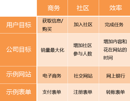
Let’s clarify this last point by discussing the three main uses of forms. As Luke Wroblewski states in his book Web Form Design: Filling in the Blanks, every form exists for one of three main reasons: commerce, community or productivity. The following table translates each of these reasons into the user and business objectives that lie behind them:
让我们通过讨论表单的三个主要作用来阐述下最后这一点。就像Luke Wroblewski在他的《web表单设计:点石成金的艺术
》一书中说的一样,每个表单的存在必有如下三个原因之一:商务、社区或效率。下面的表单把这三个原因转化成了其背后的用户目标和公司目标:
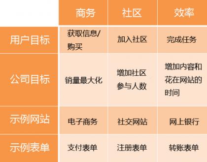
Uses of forms, based on Luke Wroblewski’s Web Form Design: Filling in the Blanks.
表单的作用,基于Luke Wroblewski的《
web表单设计:点石成金的艺术
》。
Thus, the relationship between forms and usability have two aspects:
如此可见,表单和可用性有如下两方面的关系:
1. Forms can make a website usable or unusable, because they stand in the way of the user achieving their goal;
1. 表单可以使网站好用
或不好用,因为它们挡在用户达成目标的路上。
2. Forms need to be usable in order to help the user achieve that goal.
2. 为了帮助用户达成目标,表单必须要好用
。
This post will focus on the second point, because a usable form will naturally contribute to the overall usability of the website, hence the first aspect.
本文将重点讲述第二点,因为表单好用了,网站的整体可用性自然会提升,也就是上面的第一点。
The Six Components Of Web Forms
表单的六个组成部分
Web forms are a necessity and often a pain point for both designers and users. Over time, users have formed expectations of how a form should look and behave. They typically expect Web forms to have the following six components:
对于设计师和用户来说,表单让人爱恨交加。随着时间的流逝,对于表单的表现形式和操作方式,用户已有了自己的期望。基本上,他们期望表单包含如下六个部分:
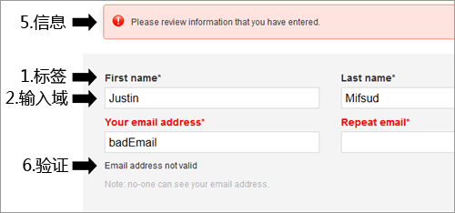
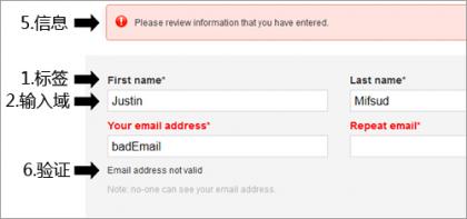
1. Labels These tell users what the corresponding input fields mean.
1.标签。
告诉用户相应的输入域里应该填什么。
2. Input Fields Input fields enable users to provide feedback. They include text fields, password fields, check boxes, radio buttons, sliders and more.
2.输入域。
供用户提供反馈。包括文本输入框、密码输入框、多选框、单选框和滑块等。
3. Actions These are links or buttons that, when pressed by the user, perform an action, such as submitting the form.
3.操作。
包括链接和按钮,用户点击后,会执行一项操作,比如提交表单。
4. Help This provides assistance on how to fill out the form.
4.帮助。
为填写表单提供帮助。
5. Messages Messages give feedback to the user based on their input. They can be positive (such as indicating that the form was submitted successfully) or negative (“The user name you have selected is already taken”).
5.信息。
用户输入内容的反馈信息。可能是肯定的(比如提示表单提交成功),也可能是否定的(“该用户名已被注册”)。
6. Validation These measures ensure that the data submitted by the user conforms to acceptable parameters.
6.验证。
确保用户提交的数据符合参数规则。
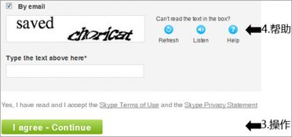
Skype’s registration form contains all six components.
Skype的注册表单包含了以上六个部分。
Tackling Usability Via Three Aspects Of Forms
通过三方面来解决表单的可用性问题
Despite differences in layout, functionality and purpose, all forms have three main aspects, as noted by Caroline Jarrett and Gerry Gaffney in their book Forms That Work: Designing Web Forms for Usability:
尽管在布局、功能和目的上各有不同,所有的表单都有三个主要的方向,就像在Caroline Jarrett与Gerry Gaffney合著的《Web表单设计:创建高可用性的网页表单
》中写的一样:
1. Relationship Forms establish a relationship between the user and the organization.
1.关系。
表单在用户与公司之间建立关系。
2. Conversation They establish a dialogue between the user and the organization.
2.对话。
表单在用户与公司之间建立对话。
3. Appearance By the way they look, they establish a relationship and a conversation.
3.界面。
通过其展现方式,表单建立了关系和对话。
For a form to be usable, all three aspects need to be tackled. Let’s look at each aspect in turn to figure out how to make a form truly usable, along with practical guidelines that you can easily follow.
一个好用的表单,需要解决这三个方面的问题
。让我们依次来看,要让一个表单真正好用需要遵循哪些指导方针,这样你也能轻易上手。
Aspect 1: The Relationship
第一方面:关系
“No man is an island,” the 17th-century English poet, satirist, lawyer and priest John Donne once said. Indeed, human beings thrive on relationships, be they amorous, friendly, professional or business. A form is a means to establish or enhance a relationship between the user and the organization. When done badly, it can pre-empt or terminate such a relationship.
17世纪的英国诗人、讽刺作家、律师和牧师约翰•多恩
曾说过:没人是一座孤岛。确实,人类在关系中成长,不管它是恋爱关系、友好关系、职业关系还是商务关系。表单是建立或增强用户与公司关系的一种方式。如果做得不好,它就会终结此关系。
With this in mind, a number of principles emerge:
既然如此,以下规则就显而易见了:
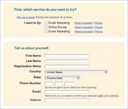
* Relationships are based on trust, so establishing trust in your form is critical. This can be achieved through the logo, imagery, color, typography and wording. The user will feel at ease knowing that the form comes from a sincere organization.
● 关系要基于信任
,因此在表单中建立信任至关重要。可以通过logo、图像、配色、字体和措辞来表达诚意。当用户知道表单所属公司是以诚相待时,他们就会放松警惕。
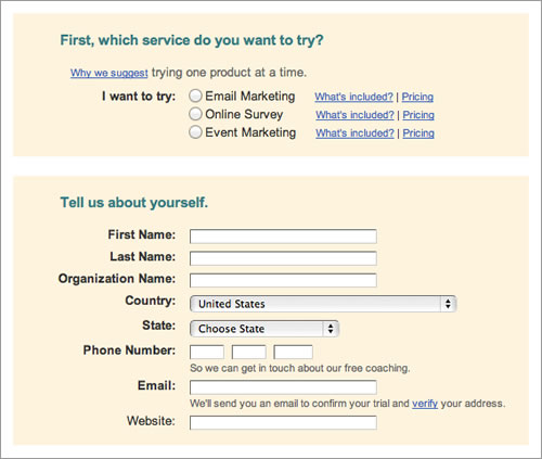
* Every relationship has a goal, be it love and happiness in a romantic relationship or financial gain in a business relationship. Ask yourself, what is the goal of your form?
● 每一种关系都有目标
,浪漫关系的目标是爱和幸福,商业关系的目标是财务增长。自问一下,你的表单目标何在?
* Base the name of the form on its purpose. That name will inform users what the form is about and why they should fill it in.
● 表单名字要能表达其意图
。表单名要告知用户表单是什么,他们为什么要填写。
* Just as in a relationship, getting to know the other person is essential. Get to know your users and always consider whether the questions you’re asking are appropriate and, if so, whether they are timely. This will instill a natural flow to your form.
● 一段关系中,了解对方
很重要。要了解你的用户并且深入思考,表单上的问题在形式上是否合理,在位置上是否合适。经过这样思考的表单,流程自然很顺畅。
* Knowing your users will also help you choose appropriate language and remove superfluous text. And it will help you craft an interface that balances your needs and the user’s.
● 了解用户,对于选择合适的语言和剔除冗余的文字
同样有帮助。这样打造的界面,才能在用户需求与你的需求之间找到平衡。
* Do not ask questions beyond the scope of the form. In a relationship, you would become distrustful of someone who asked questions that were out of place. The same thing happens online. Consult with relevant stakeholders to see what information really is required.
● 不要问表单范围以外的问题
。一段关系里,问话不合时宜的人会不被信任。网上亦然。跟相关股东们商量下究竟需要哪些信息吧。
* Sudden changes in behavior or appearance will make users edgy. Likewise, never introduce sudden changes between forms or between steps in a form.
● 性能或界面的突变会让用户无所适从
。同样的,各表单之间或者一个表单的几个步骤之间,绝对不能有突变。
Know your users. Make it easy for registered users to log in and for new users to register. Debenhams makes this distinction barely noticeable.
了解你的用户。让注册用户易登录,让新用户易注册。在
Debenhams
网站上,这两种表单几乎没有区别。
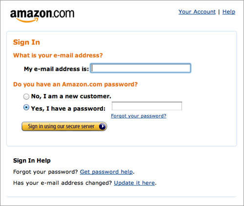
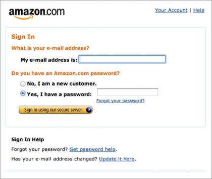
Amazon, on the other hand, simplifies the process for registered and new customers.
另一方面,
亚马逊
的表单把注册用户和新用户合二为一了。
Aspect 2: The Conversation
第二方面:对话
A form is a conversation. And like a conversation, it represents two-way communication between two parties, in this case, the user and the organization. In fact, the user has filled out the form in order to initiate communication with the organization.
表单即对话。对话代表两方的相互交流,此例中的双方即用户与公司。实际上,用户填写表单就是为了与公司交流。
For instance, with a social network, a user would fill out a registration form to inform the organization that they would like to join. In inviting their request (whether automatically or manually), the organization would ask the user a number of questions (in the form of labels), such as their first name, last name, email address and so forth. Upon acceptance (or denial), the company would inform the user of the outcome, thus completing the communication process.
例如,社交网站中,用户通过填写注册表单来告诉公司他们愿意加入。在接受用户申请时(不管是自动还是手动的),公司会(以标签的形式)问用户一系列问题,如姓氏、名字、电邮地址等。一旦用户接受条款(或拒绝),公司就会反馈结果,完成对话全过程。
Viewing forms from this perspective yields some useful guidelines:
来看看从这方面得出的一些实用指南:
* As mentioned, a form is a conversation, not an interrogation. Aggressive wording in labels will make users feel edgy, and (if they do not leave) they will most likely give you the answers that you want to hear, rather than the truth.
● 前面已经提到,表单是对话,而不是问话
。强势的用语会让用户难以接受,因此,(如果他们不就此离开的话)他们会给出一个你想要的答案,而不是他们的真实感受。
* Order the labels logically, reflecting the natural flow of a conversation. For example, wouldn’t it be weird to ask someone their name only after having asked a number of other questions? More involved questions should come towards the end of the form.
● 标签的排序要有逻辑性
,要能反映对话的流程。例如,先问别人一大堆的问题,然后再问姓名,不觉得这很奇怪吗?相关度越高的问题越应该要放到后面问。
* Group related information, such as personal details. The flow from one set of questions to the next will better resemble a conversation.
● 归类同种信息
,比如个人介绍可归为一类。好的对话是由一组问题接一组问题组成的。
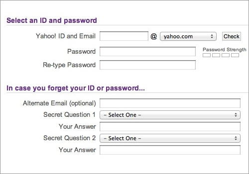
Yahoo’s registration form effectively groups related content through purple headings and fine lines.
雅虎
的注册表单通过紫色标题和细线把相关信息进行了有效的归类。
While Constant Contact groups related content, it separates the groups too much, which could confuse the user.
Constant Contact
的类别太多了,这样会让用户困惑的。
* As in a real conversation, each label should address one topic at a time, helping the user to respond in the corresponding input field.
● 跟真实对话一样,每个标签每次只应突出一个主题
,这样才能帮助用户在相应的输入域中作出应答。
* The natural pauses in a conversation will indicate where to introduce white space, how to group labels and whether to break the form up over multiple pages.
● 对话中会有自然的停顿
,表单中则表现为应该在哪里留白,如何归类标签,以及是否分页。
* In any conversation, people get distracted by background noise. So, remove clutter such as banners and unnecessary navigation that might distract users from filling out the form.
● 任何对话,人们都会因背景噪音而分心。因此,去除
诸如banner和不必要的导航之类的杂乱信息
,避免让用户分心。
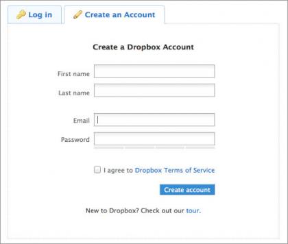
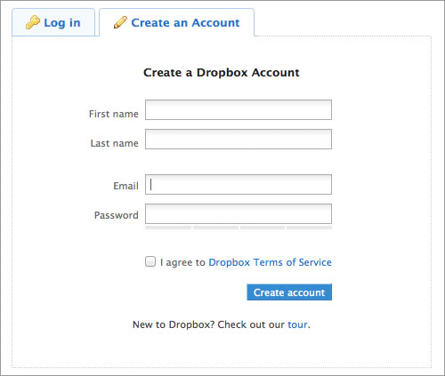
Dropbox provides a fine example of what a registration form should look like. The white space is effective, and the page uncluttered.
Dropbox
的注册表单堪称模范。留白适宜,页面简洁。
Aspect 3: The Appearance
第三方面:界面
The appearance or user interface (UI) is central to the usability of a Web form, and there are several guidelines for this. To simplify the discussion, let’s group them into the six components presented earlier.
界面或者UI对于web表单的可用性极为重要,为此列出如下指南。简便起见,我们将其按照前面说的六个部分进行了归类。
1. Labels
1.标签
* Individual words vs. sentences If the purpose of a label is simple to understand, such as to ask for a name or telephone number, then a word or two should suffice. But a phrase or sentence might be necessary to eliminate ambiguity.
● 单词或句子
。如果标签容易理解,比如询问姓名或电话号码,一到两个单词就足矣。但是词语或句子更能准确表述。
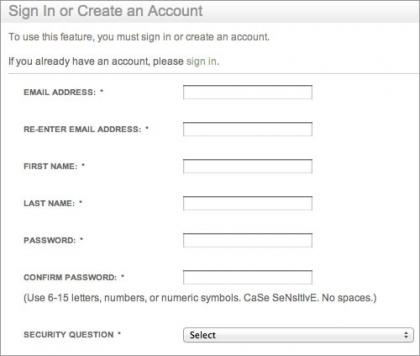
Amazon’s registration form contains full sentences, whereas individual words would have sufficed.
亚马逊
的注册表单用的全是句子,尽管有些地方单个词语就能搞定。
* Sentence case vs. title case Should it be “Name and Surname” or “Name and surname”? Sentence case is slightly easier — and thus faster — to follow grammatically than title case. One thing is for sure: never use all caps, or else the form would look unprofessional and be difficult to scan.
● 句子形式或标题形式
。是像“Name and S
urname” 还是像 “Name and s
urname”?句子形式从语法角度比标题更容易(也就更快)理解。还有一点要明确:一定不要用大写,不然表单会看起来不专业且难以阅读。
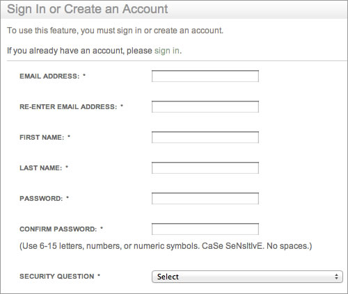
See how difficult it is to quickly scan the labels in Barnes & Noble’s registration form?
要快速浏览
Barnes & Noble
的注册表单得有多难啊?
* Colons at the end of labels UI guidelines for some desktop applications and operating systems such as Windows recommend adding colons at the end of form labels. Some designers of online forms adhere to this, primarily because old screen readers mostly rely on the colon symbol to indicate a label. Modern screen readers rely on mark-up (specifically, the label tag). Otherwise, the colon is a matter of preference and neither enhances nor detracts from the form’s usability, as long as the style is consistent.
● 标签后面加冒号
。一些桌面程序和诸如Windows之类的操作系统建议在表单标签后面加冒号。一些web表单的设计师也信奉此准则,主要是因为老的屏幕阅读器(供盲人使用的一种工具)是依据冒号来鉴别标签。而新的屏幕阅读器则依据标示(尤其是标签tag)。也就是说,冒号的存在,既不会增强也不会减弱表单的可用性,只要形式统一就行了。
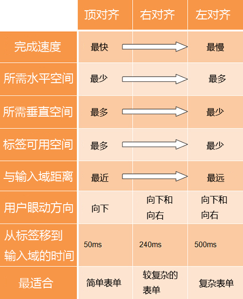
* Alignment of labels: top vs. left vs. right Contrary to common advice, above the input field is not always the most usable location for a label. It’s ideal if you want users to fill in the form as fast as possible. But there are times when you’ll want to deliberately slow them down, so that they notice and read the labels attentively. Also, keeping a long form to a single column and making users scroll down the page is better than breaking it up into columns in an attempt to keep everything “above the fold.” Each style of alignment has its advantages and disadvantages:
● 标签的对齐:上对齐、左对齐还是右对齐
。跟一般的建议相反,输入域上方并不总是放置标签的最佳位置。如果想让用户尽快填完表单,这样做是最最好的。但有时为了让用户阅读标签,你会故意想让他们慢下来。还有,把长表单用一页显示,让用户滚动页面,要比分成几页,每页只有一屏的效果好。每一种的对齐方式都有其利弊。
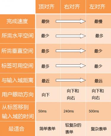
*Times retrieved from “Label Placement in Forms” by Matteo Penzo.
从Matteo Penzo的《
表单标签的放置
》获取的数据。
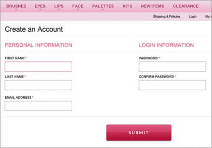
Forms should never consist of more than one column. Notice how easy it is to ignore the column on the right here on Makeup Geek (not to mention the note about “Required fields” at the bottom).
表单绝对不能分多列显示。看看
Makeup Geek
这个表单的右列,很容易被忽略掉(更别说底部的“必填项”声明了)。
2. Input Fields
2.输入域
* Type of input field Provide the appropriate type of input field based on what is being requested. Each type of input field has its own characteristics, which users are accustomed to. For instance, use radio buttons if only one option of several is permitted, and check boxes if multiple choices are allowed.
● 输入域类型
。要根据需要选择合适的输入域类型。每种输入域都有一些用户习以为常的特性。例如,如果只能选中一个,就用单选按钮,如果可以多选则用复选框。
* Customizing input fields Do not invent new types of input fields. This was common in the early days of Flash websites, and it seems to be making a comeback; I have seen some odd input fields implemented with jQuery. Simple is often the most useful. Keep input fields as close to their unaltered HTML rendering as possible.
● 定制输入域
。不要发明新的输入域类型。在早期的flash网站上这很常见,现在似乎又有回归的迹象:我看到了一些超烂的使用jQuery的输入域。简单最实用。尽量让输入域看起来跟HTML中展现的一个样。

Altering the interface of input fields will confuse users.
改变输入域的界面会让用户困惑。
* Restricting the format of input fields If you need to restrict the format of data inputted by users, then at least do so in a way that won’t irritate users. For example, instead of displaying MM/DD/YYYY next to a text field for a date, consider using three drop-down fields or, better yet, a calendar control.
● 限制输入域的格式
。如果不得不限制用户输入数据的格式,那么一定要用一种不触怒用户的方法。例如,与其用文本框+“MM/DD/YYYY”标签来表示日期,不如用三个下拉框或者更合适的日历控件来代替。
* Mandatory vs. optional fields Clearly distinguish which input fields cannot be left blank by the user. The convention is to use an asterisk (*). Any symbol will do, as long as a legend is visible to indicate what it means (even if it’s an asterisk).
● 必填和选填
。要让用户清楚地知道哪些输入域不能留空。一般都用*号表示必填。其他符号也可以用,只要能看到其文字说明就好(即使是*号要有说明)。
3. Actions
3.操作
* Primary vs. secondary actions Primary actions are links and buttons in a form that perform essential “final” functionality, such as “Save” and “Submit.” Secondary actions, such as “Back” and “Cancel,” enable users to retract data that they have entered. If clicked by mistake, secondary actions typically have undesired consequences, so use only primary actions where possible. If you must include secondary actions, give them less visual weight than primary actions.
● 主要操作和次要操作
。主要操作就是执行最后功能的链接和按钮,例如“保存”和“提交”。次要操作,诸如“后退”和“取消”,可以让用户撤消已经输入的数据。如果被误点了,次要操作一般会产生不愉快的结果,所以尽量只用主要操作。如果必须要有次要操作,那么也要让它们看起来没主要操作那么显眼。
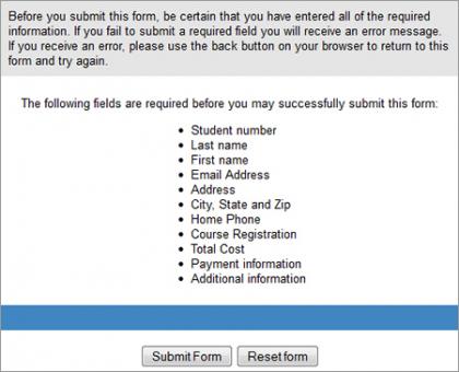
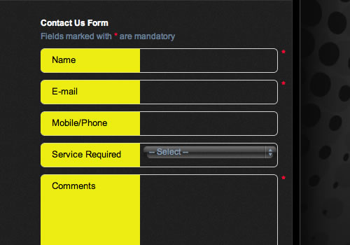
Not clearly distinguishing between primary and secondary actions can easily lead to failure. The above action buttons are found at the end of a lengthy form for enrolling in St. Louis Community College. Just imagine pressing the “Reset Form” button by accident.
不明确区分主次操作会很容易出事。上面的操作按钮,是在
圣路易斯社区大学
长长的报名单的最后面,想想看误按了“重设表单(reset form)”的后果吧。
* Naming conventions Avoid generic words such as “Submit” for actions, because they give the impression that the form itself is generic. Descriptive words and phrases, such as “Join LinkedIn,” are preferred.
● 命名规则
。避免使用“注册”之类的常规词语,这样会让用户觉得整个表单都没意思。用“加入LinkedIn”之类的描述性单词或短语会更好一些。
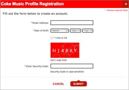
Although Coca-Cola correctly gives more importance to the primary action button, it settles for the generic word “Submit.” “Register with us” would have been more helpful.
尽管
可口可乐
在主次操作的处理上做得很好,但是却用了一个很平常的“注册(submit)”,换成“加入我们(register with us)”或许会更有效。
4. Help
4.帮助
* Text to accompany forms Your should never have to explain to users how to fill out a form. If it does not look like a form or it’s too complicated to fill out, then redesigning it is your only option. Accompanying text should be used only where needed, such as to explain why credit card data is being requested or how a birth date will be used or to link to the “Terms and conditions.” Such text tends to be ignored, so make it succinct and easy to read. As a rule of thumb, do not exceed 100 words of explanation (combined).
● 表单说明文字
。好的表单不需要解释。如果那看起来不像表单或者很难填写,那么只有重新设计了。帮助文字只应出现在需要的地方,比如解释为什么需要信用卡信息,或者解释出生日期的用途,或者链接到“条款和条件”。这些文字很容易被忽视,所以要做得简洁易读。第一准则就是,解释文字(总共)不要超过100字。
* User-triggered and dynamic help Rather than include help text next to each input field, show it only where required. You could show an icon next to an input field that the user can click on when they need help for that field. Even better, show help dynamically when the user clicks into an input field to enter data. Such implementation is becoming more common and is relatively easy to implement with JavaScript libraries such as jQuery.
● 用户触发和动态帮助
。与其在每个输入域后都加上帮助文字,不如让其只在需要时才出现。可以在输入域旁边放个小图标,让用户在需要时自行点击。或者用这个更好的,当用户在输入域里输入数据时,动态显示帮助信息。这种应用越来越普遍,使用JavaScript的库,诸如jQuery之类的,很容易实现这种效果。
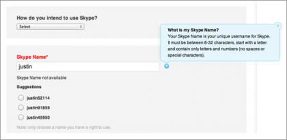
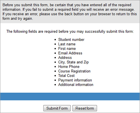
Skype’s registration form contains both user-triggered help (the blue box that is triggered by clicking the question mark) and dynamic help (the suggested user names).
Skype
的注册表单既包含了用户触发帮助(蓝色的文本框是通过点击问号图标触发的),也包含了动态帮助(建议用户名)。
5. Messages
5.信息
* Error message This notifies the user that an error has occurred, and it usually prevents them from proceeding further in the form. Emphasize error messages through color (typically red), familiar iconography (such as a warning sign), prominence (typically at the top of the form or beside where the error occurred), large font, or a combination of these.
● 错误信息
。告知用户有错误,通常会阻止用户继续填写表单。可以通过如下方法来强调错误信息:颜色(一般是红色),熟知图形(如警告标志),突出显示(通常在表单上方或是发生错误的侧边),大字体,或者以上综合。
* Success message Use this to notify users that they have reached a meaningful milestone in the form. If the form is lengthy, a success message encourages the user to continue filling it out. Like error messages, success messages should be prominent. But they should not hinder the user from continuing.
● 成功信息
。用以告知用户其已经完成了表单的一个重要部分。如果表单很长,成功信息可以鼓励用户继续填写。跟错误信息一样,成功信息也应突出显示。但是不能阻止用户继续填写表单。
6. Validation
6.验证
* Only where needed Excessive validation is as bad as its complete absence, because it will frustrate users. Restrict validation to confirming key points (such as the availability of a user name), ensuring realistic answers (such as not allowing ages above 130) and suggesting responses where the range of possible data is finite but too long to include in a drop-down menu (such as a country-code prefix).
● 只在需要时验证
。过多的验证跟完全没有的效果一样差,都会让用户受挫。验证仅限用于确认重点信息(比如验证一个用户名是否可用),确保答案真实(不允许填写130岁以上的年龄),当数据的范围有限但是太长,用一个下拉菜单显示不全时,给出反馈建议(例如一个国家的代码前缀)。
* Smart defaults Use smart defaults to make the user’s completion of the form faster and more accurate. For example, pre-select the user’s country based on their IP address. But use these with caution, because users tend to leave pre-selected fields as they are.
● 智能缺省
。使用智能缺省是为了让用户更快更准确地完成填表。例如,根据用户的IP地址事先选定其国家。但是使用这些时要格外小心,因为用户一般不会去改这些事先选定项。
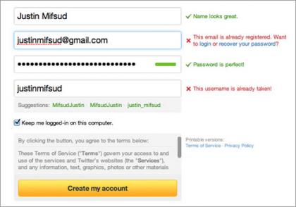
Twitter’s registration form uses both dynamic validation (for the name, email address, password and user name) and smart defaults (“Keep me logged in”).
Twitter
的注册表单使用了动态验证(在姓名、邮箱、密码和用户名上)和智能缺省(“保持登录状态”)。
Conclusion The Beginning
结束语
开端
The word “conclusion” is not right here. Let this be your starting point to take what I have written about and apply it to your own forms. The good news is that there is much more to say about all this; you can find an abundance of resources on each point made here. For starters, three books are listed below that inspired me when writing this post. As I stated at the beginning, taking shortcuts by only tweaking the UI will not make your forms more usable. What more can I say? The theory is now with you. Go get your hands dirty.
结束这个词用在这里不准确。就让这里成为你学以致用的起点吧。所有这些还有很多可以研究,这里的每一点都可以找到丰富的资源。就像我在文章开始时说的,通过修改UI走捷径的方法,不会让你的表单更好用。你问我还要说点什么?现在你已经掌握这些理论了,放手干吧。