转载蓝蓝设计(
www.lanlanwork.com
)是一家专注而深入的设计机构 ,为期望卓越的国内外企业提供有效的
BS界面设计
、
cs界面设计
、
ipad界面设计
、
包装设计
、
图标定制
、
用户体验
、交互设计、
网站建设
、平面设计服务
原文:http://article.yeeyan.org/view/231170/200810
相对主义的概念是指一个观点不会是绝对的真理或正确。对于网页设计师来说,这有非常重要的含义。什么是美观?哪个字体最适合这个设计?红色还是蓝色?为了在变得疯狂之前完成一个项目,我们在日常接触到的问题往往会让我们自觉不自觉的回归到了相对主义观念。对于我们中间的完美主义者来说(我们大都是完美主义者,不是吗?!),这只是一个小小的安慰。今天我们会讨论适用的相对主义理论...请看年轻的爱因斯坦!
My grandfather told me this story once: He was buying some cloth and when looking at one of the cloth designs… and he thought to himself “that is so ugly!” He barely finished the thought when another customer came running in with her fiancé and mother-in-law and went directly to that same design he was thinking about shouting, “Here it is, the design we were looking for!” and bought the whole lot!
我的祖父曾给我讲过一个故事:有一次他去买布。在浏览一块布的式样时,他对自己说“这块布真难看!”他还没有想完的时候,另外一个客人带着他的未婚妻和丈母娘冲进来直接走到同一款布前喊了起来,“就是这块,这就是我们一直在找的!”然后他们买走整整一卷布!
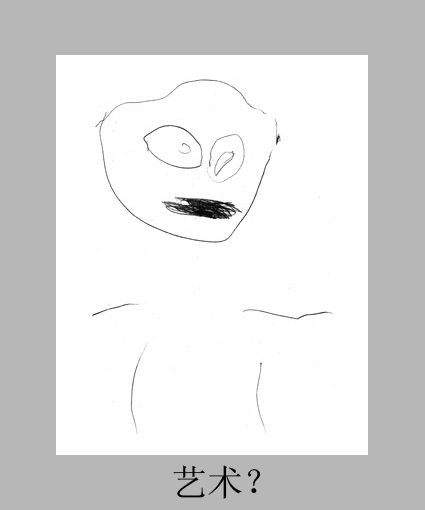
What if I showed you this drawing and asked your opinion about it?
如果我给你看这幅图,然后问你的看法是怎么样的?
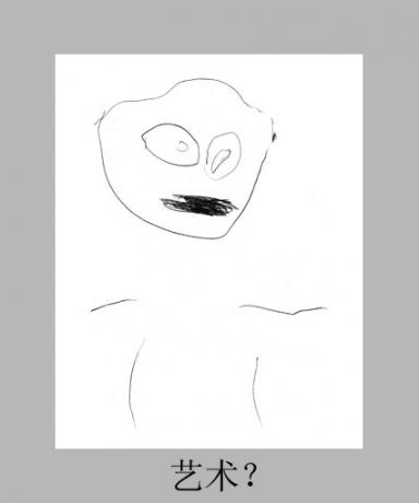
Most probably you would say it’s very poor – however if I told you it was done by a 3yr old child, you would probably change you r mind and say “WOW, that’s very nice!”
很有可能你会说它画的很差劲,但是如果我告诉你这是一个三岁小孩画的,你可能会改变你的看法而改口说“哇,这真棒!”
Relativism is the concept that points of view have no absolute truth or validity, having only relative, subjective value according to differences in perception and consideration, Clearly what some people may think of as “ugly” others see as “beautiful” – so how does this “Relativism” apply to the design world?
相对主义的概念是指一个观点不会是绝对的真理或正确,根据不同的感觉和想法具有相对的,主观的的价值观。明显的某些人看来是“丑陋的”的东西其他人会认为是“美丽的”;因此这个“相对主义论”在设计行业中是如何应用的呢?
How then, can you ensure you’re creating a beautiful design? Understand your target audience through 4 main points before implementing your design: Goal, Culture, Demographics, and Technology.
那么你怎么能够保证你作出了一个美观的设计呢?在开始设计之前你要从四个方面了解你的目标群体:目标,文化,人口统计学背景,和技术。
1. Establish a Goal
1. 确立一个目标
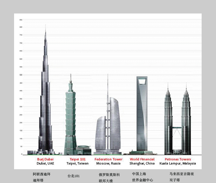
Imagine that you were asked to design a tall tower building, and you came up with a few great designs – yet all were refused, and you had to go back to the drawing board only to keep on failing! Then you find another maybe not-so-beautiful design winning, why?
假设你被要求设计一个高层塔楼,而且你作出了几个设计,但是都被否决了。你不得不在画板上一次一次的设计,但是都失败了!然后你发现有一个不是太美观的设计通过了,为什么?
The main goal of that competition was not beauty, but it was length – so the main approval criteria was being the highest, then beauty comes second, without high length all other features of your design don’t matter.
竞赛的目的不是美观,而是高度,所以获得通过的最高标准是要先设计出最高的楼,然后才是美观。没有高度,你的设计里所有的特点都不重要。

Sometimes as designers, we focus on different aspects of our designs, yet our client and audience really want a specific goal, and if it’s not met, then whatever else we do in the design will never count until we first meet that goal – so in this case a successful design relative to the client’s point of view, is the design that will meet their goal.
有时候作为一个设计师,我们专注于设计的各个方面,而我们的客户和观众则只考虑一个特定的目标。如果他们的目标没有被满足,那么无论我们怎样设计都不会成功,直到我们达到那个要求。因此在这种情况下,相对于客户的观点,一个成功的设计就是能够符合他们要求的设计。
2. Consider The Culture
2. 考虑文化因素
Symbols, Body Language and Gestures have different meanings across different cultures.
标志,肢体语言和手势在不同的文化背景里有不同的含义。

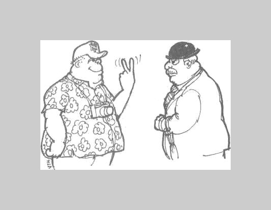
Take a look at the example above, for most people the gesture means “2″ but for a German it would mean Victory, a Frenchman it would mean Peace and for Brits and Australians… well you’d better just not do it – the same principle applies to design and color, and if you’re working on an international design or for another part of the world – then you must be familiar with such cultural differences.
看看上面的例图,对于大部分人来说这个手势表示“2”。但是对德国人来说,这意味着“胜利”;对法国人来说,这表示“和平”;而对英国佬和澳大利亚人来说...,你最好不要做这个动作。同样的原则也适用于设计和颜色。如果你参与一个国际合作的设计项目,或者为世界的另外一部分设计项目,那么你必须熟悉这些文化差异。
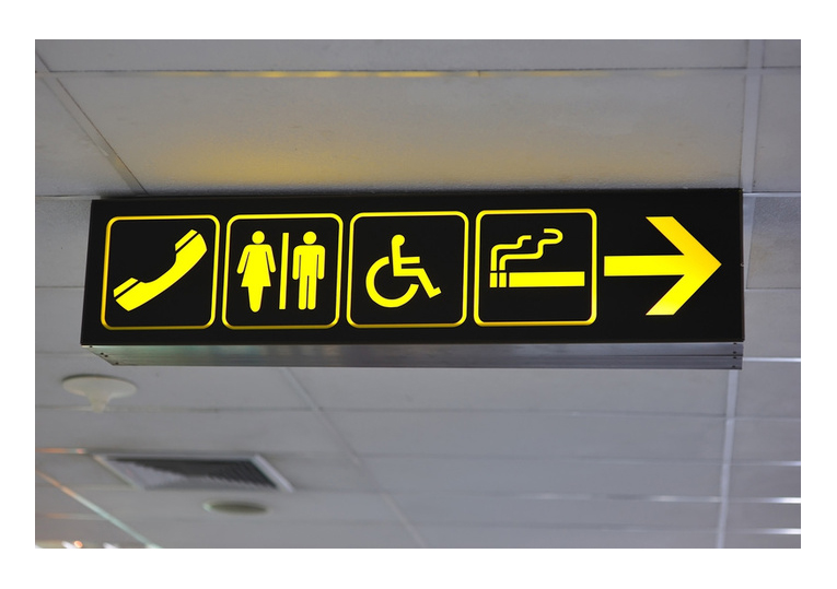
Such differences are apparent in the design of Airport signage for example, millions of different ethnic groups and culture backgrounds pass through airports daily – signs must be easily and globally understood and have the same meaning across the world. (See ISO 7001)
这些差异在机场的指示标牌的设计上很明显。每天都有成百万的来自不同民族和文化背景的人们通过机场。标牌必须让全世界人民容易辨认理解,而且仍然保持同一个含义。(参考ISO 7001)

In order to achieve this designers have to conduct several field tests with random passengers and specific methods of testing the comprehensibility of graphical symbols are available on the ISO.org site (ISO 9186).
为了达到这个目的,设计师需要向随机遇到的旅客做实地调查。在ISO.org的网站上提供了用于测试如何理解图形标志的专门方法。
If we apply this to the world of design and color, studies done by Medical News Today in 2007 confirm that East Asians and Westerners process visual information in different ways. For example, East Asians are more likely to pay attention to the context and relationships in a design than Westerners, who more often notice physical features or groupings of similar objects. Westerners are more attentive to central, or dominant, objects, while East Asians pay more attention to the background.
如果我们把这些应用到设计和颜色行业,2007年《今日医学新闻》发表的研究证实了东亚人和西方人处理视觉信息的方式是不同的。例如,东亚人比西方人更关注一项设计中的内容和相互之间的联系,而西方人则更关注具体的外观特征或者类似物体的集合。西方人更注意中心或主要的物体,而东亚人则更注意背景。
Colors also have different meanings across cultures, for example while White is usually associated with the following in most of the world: spirituality, peace, purity, cleanliness, innocence, youth, goodness, light, fairness, Marriage, …etc. , in Eastern cultures such as in China, India or Japan, the color white is a symbol for Mourning, Death, Unhappiness, and Funerals.
在不同的文化背景中,颜色也有不同的含义。例如,大多数地方的人通常都把“白色”和“灵性,和平,纯洁,干净,无辜,年轻,善良,光,公平,婚姻等”相联系;而在中国,印度或者日本等东方文化中,“白色”则表示“悲哀,死亡,不幸,和葬礼”。
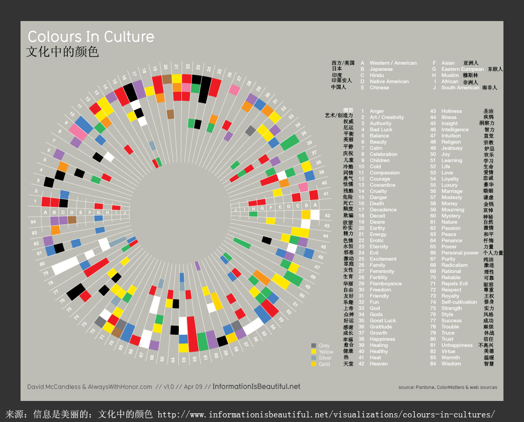
The Chart below encompasses 10 different cultures, and 62 emotions. The cultures are represented by concentric rings, and the emotions are represented by slices of the circle. Thus, if you want to understand about Japanese color sensibilities, you read around the graph. And if you want to learn what colors mean “danger” across cultures for example, you just read vertically.
下面的图表里包含了十种不同的文化,和62种情绪。同心圆代表不同的文化,而小方片代表了不同的情绪。因此,如果你想了解热日本人对颜色的感觉,你就要看看这幅图。如果你想知道在不同文化中什么颜色表示“危险”的话,你就要纵向的看这幅图。

3. Understand The Demographics
3. 理解人口统计学背景
In my article How to Get the Right Creative Requirements From Your Client I talked about knowing and understanding your target audience and gave a sample on how designing for Adults is different than designing for Kids who generally prefer large icons, bright colors funny fonts…etc. , the same applies to Gender, and Education level.
在我写的《如何从你的客户获得正确的创造力要求》的文章里,我讨论了如何认识理解你的目标人群,并提供了一个例子说明为成年人设计和为儿童设计是不同的。儿童喜欢更大的图标,明亮的色彩,有趣的字体,等等;同样的原则也适用于不同的性别和教育水平的人群。
Less educated audiences for example may find it hard to understand simpler and cleaner designs, they tend to judge the design by the amount of “bells and whistles” and tend to like strong colors – I used to tell some of my clients “it’s not how many liters of paint you put in a design, it’s the amount of thought that matters” – usually a highly educated audience would appreciate clean and simple design concepts and want more thought done rather than just a colorful painting.
比如受教育不多的人群会觉得理解简洁设计很困难,他们喜欢那些“花里胡哨”的设计和浓重的色彩;我以前跟我的一些客户说过“重要的不是你在设计图里倒了多少升的颜料,而是你花费了多少心思”。通常受过高等教育的人群比较喜欢欣赏简洁明快的设计理念,希望能看到更多的思想而不仅仅是一幅花哨的图片。
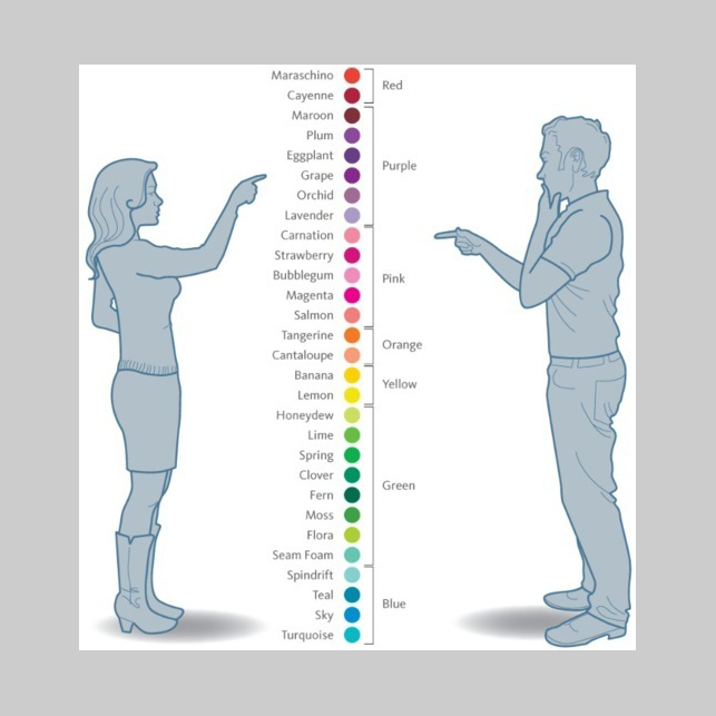
The example below shows how gender could have an effect on color perception and choice
下面这个例子说明了性别差异是如何影响对颜色的感觉和选择。

4. Adapt to The Technology
4. 适应技术进步
As a designer, you might think what has “technology” got to do with my designs? I would answer “everything”.
作为一个设计师,你可能会想“技术”和我的设计有什么关系?我会说“一切都有关系”。
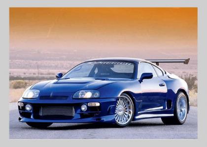
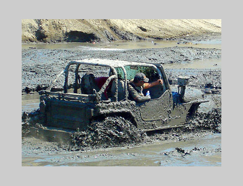
Imagine you were the designer of this very cool car in the image above, yet you were not aware that it will be used off-road on rugged terrain – this beautiful car just does not have the “technology” to handle such roads – however what do you think about these “ugly” cars?
假设你是上面图片里那款酷车的设计师,尽管你还不知道这辆车也可以在崎岖路面上越野;只是因为这款美丽的汽车没有具备适应这种路面的“技术”。但是你是如何看待下面这些“丑陋”的车型呢?


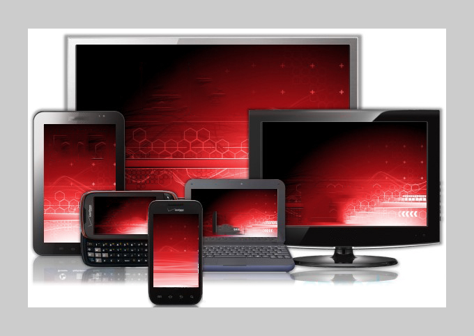
The same concept applies to your web designs, if they don’t work on all platforms and devices, then no matter how “beautiful” your designs are, they will simply just not work!
同样的观念也适用于你的网页设计,如果它们不能在所有的平台和设备上正常显示,那么不管你的设计有多么“美观”,它们就是没有用!
Don’t preview your designs on a 24″ 1920x1080px screen while they are intended for use on average 1024x768px screens, don’t use a desktop or laptop if your designs are intended for a mobile or tablet device.
如果你设计的网页主要是在1024X768像素显示器上浏览,就不要在一台24寸的1920X1080像素的显示器上测试浏览效果。如果你的设计是针对移动或平板用户,就不要用台式机或笔记本电脑测试浏览效果。
I have a friend of mine who just recently did an application design for a 1024px tablet, however he was working on a laptop and previewing the work in 1024px screen resolution on his 15″ screen, they application was initially rejected because while both the tablet and the laptop were 1024px in size, the tablet had only a 7″ screen while the laptop had a 15″ screen, so the objects turned out too tiny for the application to be functional.
我有一个朋友最近为1024像素的平板电脑做了一个应用程序界面设计。然而他是在一台带有1024像素的15寸屏幕的笔记本电脑上设计的原图。这个设计一开始就被否决了,因为虽然平板电脑和笔记本电脑的像素都是1028,但是平板只有7寸的屏幕而笔记本的则是15寸。因此设计里的物体因为太小而使得这个应用不可用。

It is very critical that you understand and test on your target devices – there are several platforms and form factors out there, so you need to be sure that your design functions the same on all platforms and sizes.
你要非常明白在目标设备上测试的重要性;因为现在的平台和式样各种各样,你要确保你的设计在所有的平台和尺寸下都能达到同样的功能。
Conclusion: Context is Everything!
结论:内容是关键!
Designs are not absolute. Our job is not to become Picasso’s or Salvador Dali’s, we are not creating paintings or artwork, we can’t design without taking into consideration our limitations and our client’s goals – design differs from art in that designers create something that should be functional, usable and suites the culture and environment of the people who will use your design.
设计不是绝对的。我们的作品不是毕加索或达利的作品,我们不是在创作绘画或艺术作品。如果不考虑我们的能力限制和我们的客户需求,我们就设计不出好作品;设计与艺术是如此不同,设计师需要创作出可行的可用的设计,而且这些设计适合将要使用我们设计的人群的文化背景。
A successful design is one that meets the expected goals and functions flawlessly as expected – a beautiful design that does not work is a failure. As with all things in life, context is everything: taking the time to understand the contextual filters that stand between you and your audience will help prevent you from creating “beautiful flops”.
一项成功的设计能完美无缺的符合预期的目标和功能要求;一个美观但不实用的设计是一个失败。考虑到所有因素,内容是关键因素:花些时间去了解一些你和你的目标人群的文化差异可以防止你设计出一些“美丽的失败”。