2023-1-28 前端达人
| 方 案 | 实现方式 | 优点 | 缺点 |
|---|---|---|---|
| vm vh | 1.按照设计稿的尺寸,将px按比例计算转为vw和vh | 1.可以动态计算图表的宽高,字体等,灵活性较高 2.当屏幕比例跟 ui 稿不一致时,不会出现两边留白情况 | 1.每个图表都需要单独做字体、间距、位移的适配,比较麻烦 |
| scale | 1.通过 scale 属性,根据屏幕大小,对图表进行整体的等比缩放 | 1.代码量少,适配简单2.一次处理后不需要在各个图表中再去单独适配 3.文字,图片等大小均能自动适配 | 1.因为是根据 ui 稿等比缩放,当大屏跟 ui 稿的比例不一样时,会出现周边留白情况2.当缩放比例过大时候,字体会有一点点模糊,就一点点3.当缩放比例过大时候,事件热区会偏移。 |
| 插件v-scale-screen | 是使用 css 属性 transform 实现缩放效果的一个大屏自适应组件,通过 scale 进行等比例计算,达到等比例缩放的效果 | 可以通过api调整原稿的宽高 |
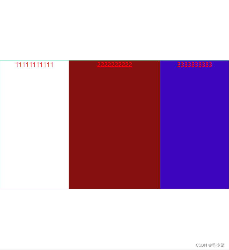
1.当屏幕正好为16:9的时候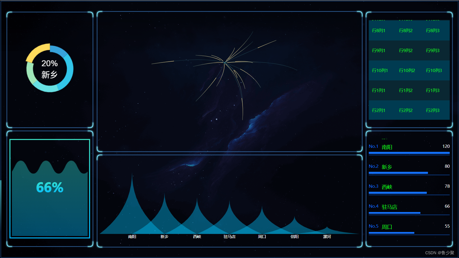
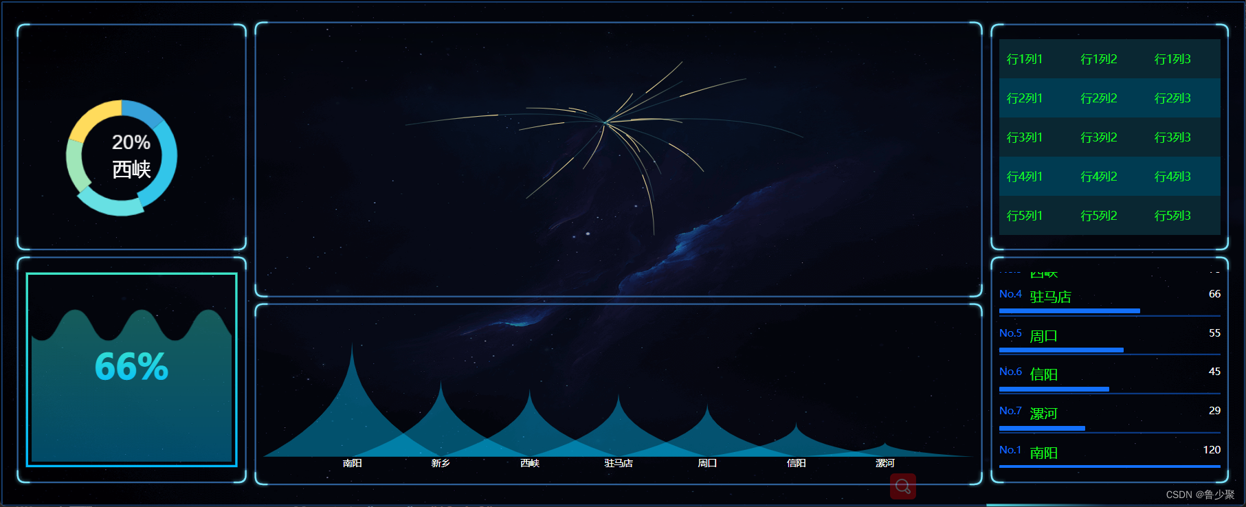
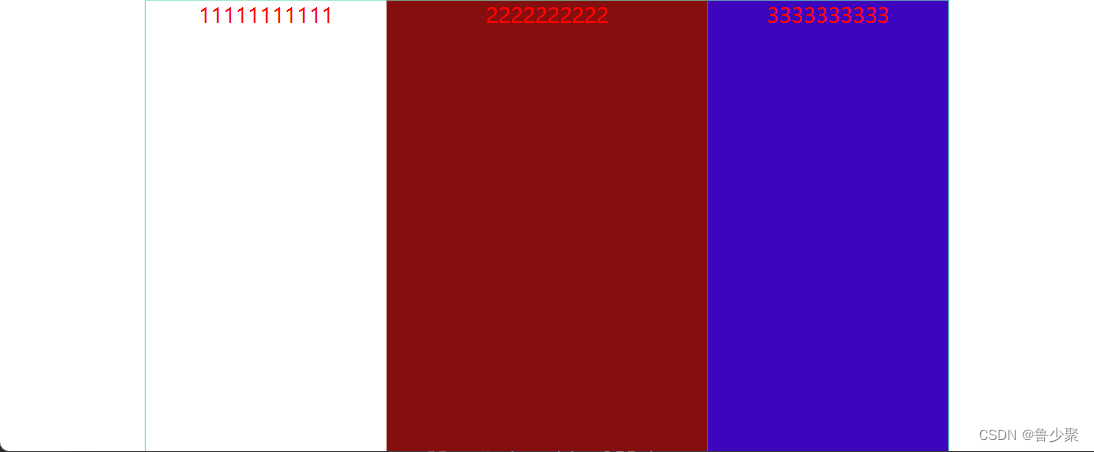
2.当屏幕的尺寸比例大于 16:9 (左右拉长)
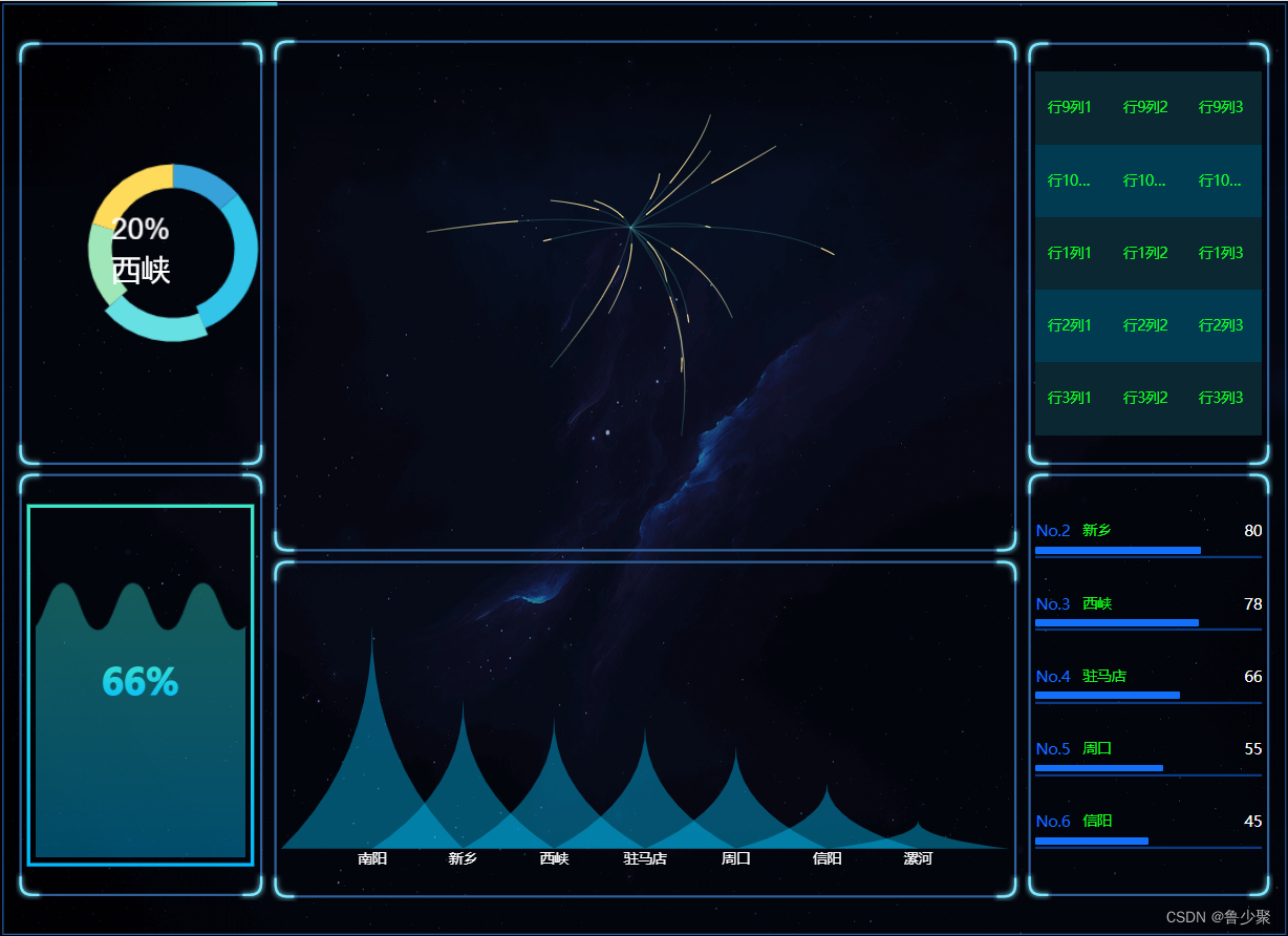
3.当屏幕的尺寸比例小于 16:9 时(左右变窄或者上下拉高)
实现方法:
css 方案 - sass
utils.scss
// 使用 scss 的 math 函数,https://sass-lang.com/documentation/breaking-changes/slash-div @use "sass:math"; // 默认设计稿的宽度 $designWidth: 1920; // 默认设计稿的高度 $designHeight: 1080; // px 转为 vw 的函数 @function vw($px) { @return math.div($px, $designWidth) * 100vw; } // px 转为 vh 的函数 @function vh($px) { @return math.div($px, $designHeight) * 100vh; } 复制代码
路径配置只需在vue.config.js里配置一下utils.scss的路径,就可以全局使用了
vue.config.js
module.exports = { css: { loaderOptions: { sass: { prependData: `@import "@/assets/css/utils.scss";` } } }, } 在 .vue 中使用 <template> <div class="box"> </div> </template> <script> export default{ name: "Box", } </script> <style lang="scss" scoped="scoped"> /*
 直接使用 vw 和 vh 函数,将像素值传进去,得到的就是具体的 vw vh 单位
 */ .box{ width: vw(300); height: vh(100); font-size: vh(16); background-color: black; margin-left: vw(10); margin-top: vh(10); border: vh(2) solid red; } </style>
css 方案 - less
utils.less
@charset "utf-8"; // 默认设计稿的宽度 @designWidth: 1920; // 默认设计稿的高度 @designHeight: 1080; .px2vw(@name, @px) { @{name}: (@px / @designWidth) * 100vw; } .px2vh(@name, @px) { @{name}: (@px / @designHeight) * 100vh; } .px2font(@px) { font-size: (@px / @designWidth) * 100vw; } 路径配置在vue.config.js里配置一下utils.less <style lang="less" scoped="scoped"> /*
 直接使用 vw 和 vh 函数,将像素值传进去,得到的就是具体的 vw vh单位
 */ .box{ .px2vw(width, 300); .px2vh(height, 100); .px2font(16); .px2vw(margin-left, 300); .px2vh(margin-top, 100); background-color: black; } </style> 定义 js 样式处理函数 // 定义设计稿的宽高 const designWidth = 1920; const designHeight = 1080; // px转vw export const px2vw = (_px) => { return (_px * 100.0) / designWidth + 'vw'; }; export const px2vh = (_px) => { return (_px * 100.0) / designHeight + 'vh'; }; export const px2font = (_px) => { return (_px * 100.0) / designWidth + 'vw'; };
屏幕变化后,图表自动调整
这种使用方式有个弊端,就是屏幕尺寸发生变化后,需要手动刷新一下才能完成自适应调整
为了解决这个问题,你需要在各个图表中监听页面尺寸变化,重新调整图表,在 vue 项目中,也可以借助element-resize-detector,最好封装个 resize 的指令,在各图表中就只要使用该指令就可以了,毕竟作为程序员,能偷懒就偷懒
解决方案一
npm install element-resize-detector --save
// directive.js import * as ECharts from "echarts"; import elementResizeDetectorMaker from "element-resize-detector"; import Vue from "vue"; const HANDLER = "_vue_resize_handler"; function bind(el, binding) { el[HANDLER] = binding.value ? binding.value : () => { let chart = ECharts.getInstanceByDom(el); if (!chart) { return; } chart.resize(); }; // 监听绑定的div大小变化,更新 echarts 大小 elementResizeDetectorMaker().listenTo(el, el[HANDLER]); } function unbind(el) { // window.removeEventListener("resize", el[HANDLER]); elementResizeDetectorMaker().removeListener(el, el[HANDLER]); delete el[HANDLER]; } // 自定义指令:v-chart-resize 示例:v-chart-resize="fn" Vue.directive("chart-resize", { bind, unbind });
import '@/directive/directive';
<template> <div class="linechart"> <div ref="chart" v-chart-resize class="chart"></div> </div> </template>
这里要注意的是,图表中如果需要 tab 切换动态更新图表数据,在更新数据时一定不要用 echarts 的 dispose 方法先将图表移除,再重新绘制,因为 resize 指令中挂载到的图表实例还是旧的,就监听不到新的 chart 元素的 resize 了,更新数据只需要用 chart 的 setOption 方法重新设置配置项即可。
解决方案二
1.在echarts中可以echarts.init(chatDom).resize()来解决宽高的自适应问题
let chatDom = document.getElementById('main'); let myChart = this.$echarts.init(chatDom); //根据父盒子的尺寸调整echarts的大小 setTimeout(() => { window.addEventListener('resize', () => { this.$echarts.init(chatDom).resize(); }); }, 20);
2.在DataV中可以添加key来解决
<dv-water-level-pond :config="config2" :key="key" ref="pie2" /> data(){ return { key: 1 } }, mounted() { this.pieOutlineFunc(); }, methods: { pieOutlineFunc() { var _this = this; window.addEventListener('resize', function (e) { _this.$nextTick(() => { console.log(_this.$refs.pie2); _this.key++; }); }); } }
通过 css 的 scale 属性,根据屏幕大小,用js监测屏幕的大小变化对图表进行整体的等比缩放,从而达到自适应效果
当屏幕的尺寸比例刚好是 16:9 时,页面能刚好全屏展示,内容占满显示器
当屏幕尺寸比例大于 16:9 时,上下左右留白,左右占满并居中,显示比例保持 16:9
当屏幕尺寸比例大于 16:9 时,页面左右留白,上下占满并居中,显示比例保持 16:9
上代码
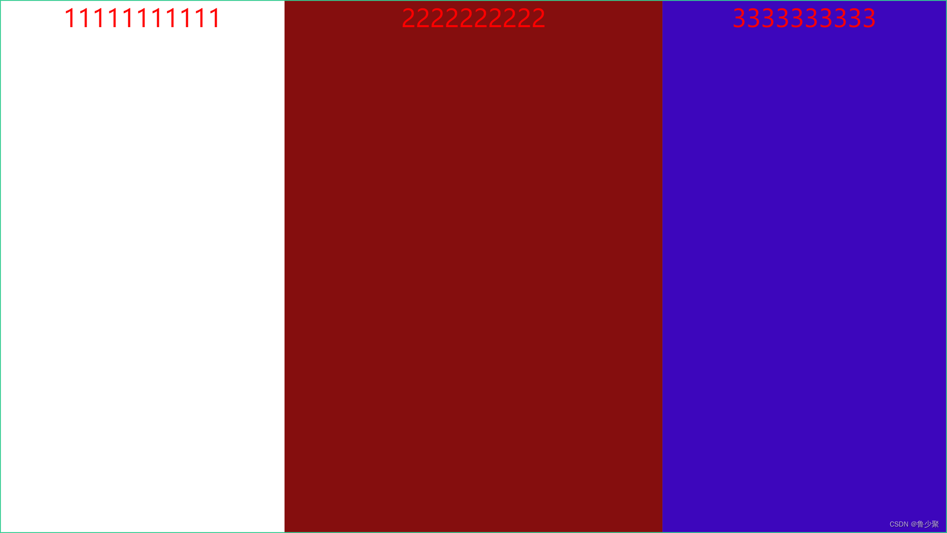
html
<template> <div class="screen-root"> <div class="screen" id="screen"> <div class="div1"> <h1>11111111111</h1> </div> <div class="div2"> <h1>2222222222</h1> </div> <div class="div3"> <h1>3333333333</h1> </div> </div> </div> </template>
js
<script> export default { mounted() { // 初始化自适应 ----在刚显示的时候就开始适配一次 this.handleScreenAuto(); // 绑定自适应函数 ---防止浏览器栏变化后不再适配 window.onresize = () => this.handleScreenAuto(); }, deleted() { window.onresize = null; }, methods: { // 数据大屏自适应函数 handleScreenAuto() { const designDraftWidth = 1920; //设计稿的宽度 const designDraftHeight = 1080; //设计稿的高度 // 根据屏幕的变化适配的比例 const scale = document.documentElement.clientWidth / document.documentElement.clientHeight < designDraftWidth / designDraftHeight ? document.documentElement.clientWidth / designDraftWidth : document.documentElement.clientHeight / designDraftHeight; // 缩放比例 document.querySelector('#screen').style.transform = `scale(${scale}) translate(-50%,-50%)`; return 1; } } }; </script>
css
<style lang="scss" scoped> /*
  除了设计稿的宽高是根据您自己的设计稿决定以外,其他复制粘贴就完事
*/ h1 { color: red; font-size: 50px; } .screen-root { height: 100vh; width: 100vw; .screen { display: inline-block; width: 1920px; //设计稿的宽度 height: 1080px; //设计稿的高度 transform-origin: 0 0; position: absolute; left: 50%; top: 50%; border: 2px solid rgb(31, 210, 145); box-sizing: border-box; display: flex; .div1 { background-color: #fff; height: 100%; text-align: center; flex: 0 1 30%; } .div2 { background-color: rgb(133, 14, 14); height: 100%; text-align: center; flex: 0 1 40%; } .div3 { background-color: rgb(61, 6, 188); height: 100%; text-align: center; flex: 0 1 30%; } } } </style>
它其实也是通过 scale 进行等比例计算放大和缩小的,和方案二的原理是一样的,还可以通过api调整样式,源码地址和对应的API
使用方法:
1.vue2请使用v-scale-screen@1.0.0版本,vue3请使用v-scale-screen@2.0.0版本
npm install v-scale-screen@1.0.0 -save
# or
yarn add v-scale-screen
2.使用-vue2中使用插件导入,vue3以组件导入
vue2 // main.js import VScaleScreen from 'v-scale-screen' Vue.use(VScaleScreen) 组件内使用 //html <v-scale-screen width="1920" height="1080" :boxStyle="boxStyle"> <div> <v-chart>....</v-chart> <v-chart>....</v-chart> <v-chart>....</v-chart> <v-chart>....</v-chart> <v-chart>....</v-chart> </div> </v-scale-screen> //js data() { return { boxStyle: { backgroundColor: 'green' }, }
vue3 <v-scale-screen width="1920" height="1080"> <div> <v-chart>....</v-chart> <v-chart>....</v-chart> <v-chart>....</v-chart> <v-chart>....</v-chart> <v-chart>....</v-chart> </div> </v-scale-screen> <script> import VScaleScreen from 'v-scale-screen' export default { components:{ VScaleScreen } } </script>
著作权归作者所有。商业转载请联系作者获得授权,非商业转载请注明出处。
分享此文一切功德,皆悉回向给文章原作者及众读者.
免责声明:蓝蓝设计尊重原作者,文章的版权归原作者。如涉及版权问题,请及时与我们取得联系,我们立即更正或删除。
蓝蓝设计( www.lanlanwork.com )是一家专注而深入的界面设计公司,为期望卓越的国内外企业提供卓越的UI界面设计、BS界面设计 、 cs界面设计 、 ipad界面设计 、 包装设计 、 图标定制 、 用户体验 、交互设计、 网站建设 、平面设计服务、UI设计公司、界面设计公司、UI设计服务公司、数据可视化设计公司、UI交互设计公司、高端网站设计公司、UI咨询、用户体验公司、软件界面设计公司
蓝蓝设计的小编 http://www.lanlanwork.com